Using Color Schemes in Interior Design
-
font size
decrease font size
 increase font size
Changing the color scheme of your home or business can completely transform it. Colors communicate aspects of a personality or brand and have the power to produce psychological and physiological effects.
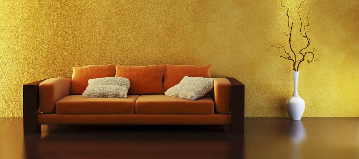
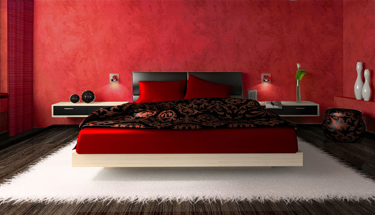
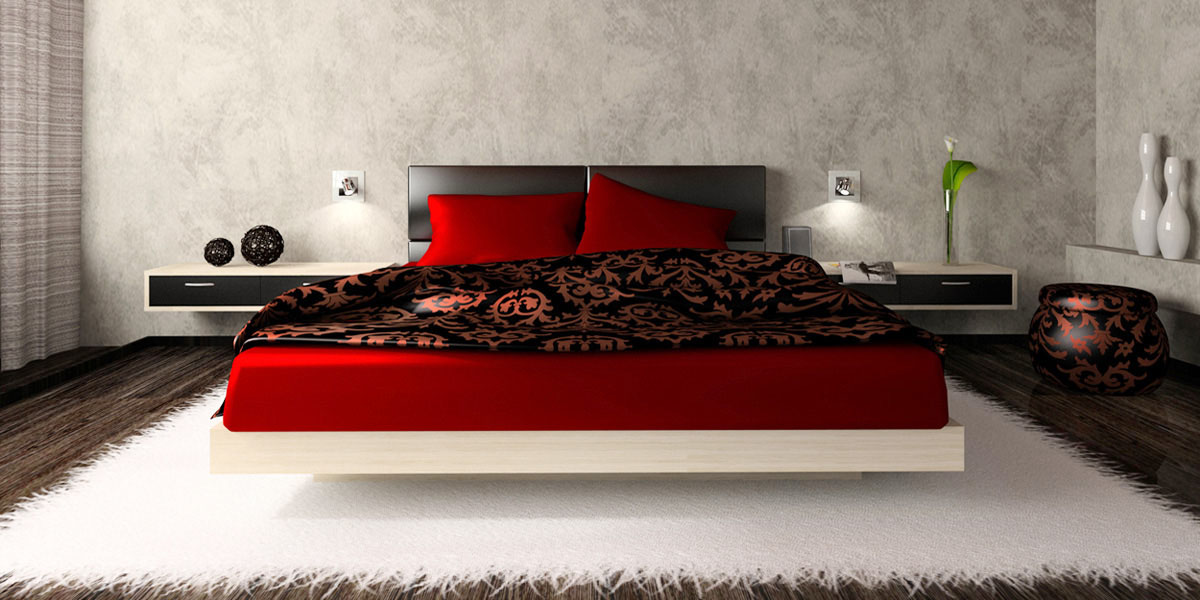
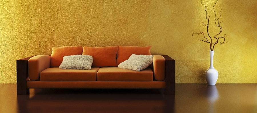 Image courtesy of Color Matters for the Home

This infographic is brought to you by Macys.com
According to Jill Morton, founder of Colorcom and author of Color Matters for the Home, color is the single most important component of interior design. However, color is often viewed as one of the most intimidating and overwhelming aspects of design due to its significance.
“Color addresses a basic neurological need for stimulation; it is ‘hard-wired’ within us,” says Morton. “We intuitively love color and prefer color interiors; yet, in spite of this, most of us live in boring beige or white boxes. Most people are not really afraid of color but of making the decision to use it.”
The Effects of Color
In both residential and commercial environments, color matters. It can improve mood, increase productivity, make a room seem bigger or smaller, reduce the negative effects of glare or low lighting, promote socialization, lower or raise blood pressure, boost energy, increase appetite, improve concentration, and even reduce negative behavior.
“The process of selecting color can be overwhelming, because much information exists about its meaning and effects, all of which is supported by one study or another,” says Morton. “Successful interior design requires an awareness of both why and how color communicates meaning in nature, culture, and contemporary contexts.”

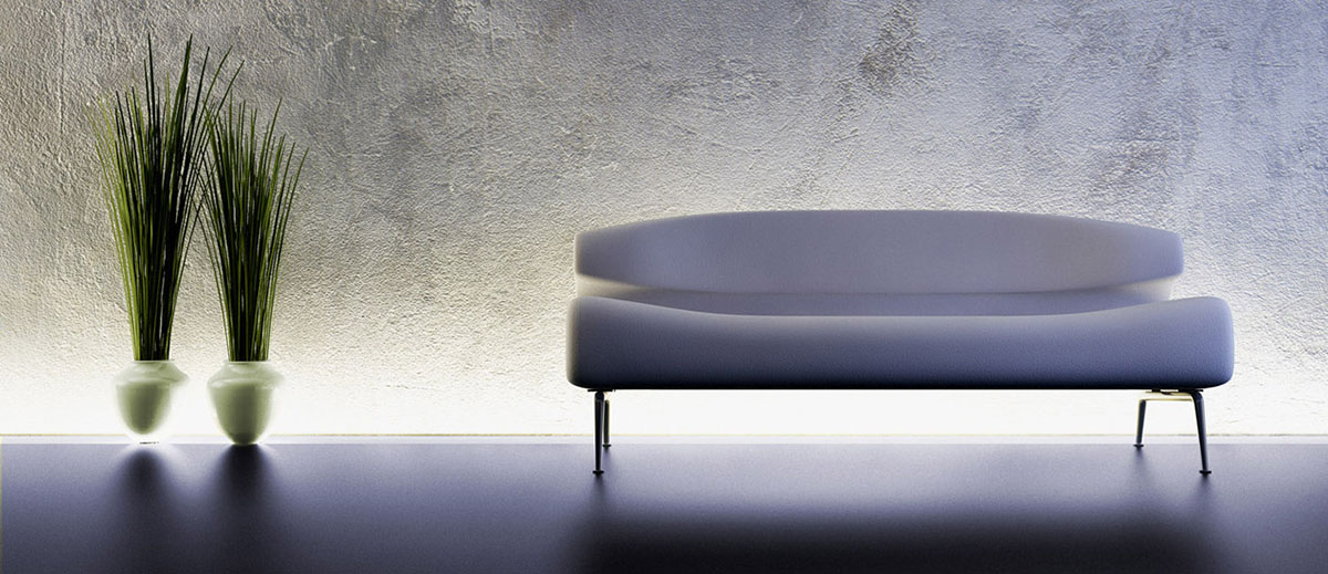
For example, blue is typically associated with sky and water, evoking a sense of calm and relaxation. However, in a cultural context, blue is also associated with sadness (“singing the blues”), stability (“blue chip stock”), and boys (“baby blue”). In addition to its psychological and cultural meanings, studies have also shown that blue can lower blood pressure, create the perception of lower temperature within a room, and enhance sign language visibility in environments that cater to the deaf.
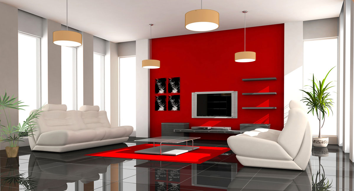
On the other end of the spectrum, an abundance of the color red has the ability to raise blood pressure, increase appetite, and create the perception of higher temperatures. Associated with fire and blood, the color is often viewed as aggressive, energetic, passionate, and bold. Culturally, red communicates danger through stop signs, red lights, and biohazard warning labels.

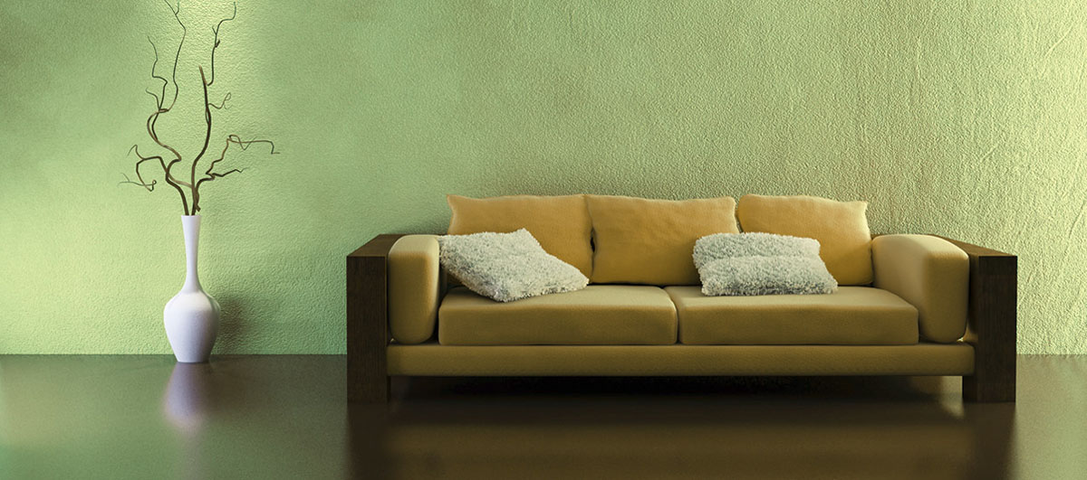
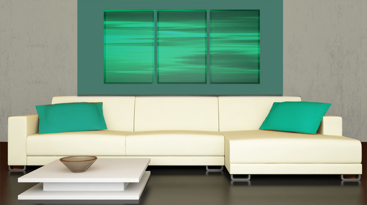
Yellow is often associated with sunshine and is said to result in feelings of happiness and optimism. Green, strongly associated with nature, represents environmentalism and envy and has been found to improve learning in classrooms. Orange, with its vibrancy, is used to promote socializing, while pink is a comforting and soothing color associated culturally with baby girls, breast cancer, and femininity.
The Impact of Individuality
Although decades of color theory exists, Morton says that much of the research is old, and current studies are often contradictory. For example, one study may scientifically conclude that the color blue evokes a relaxing, calming effect, while another may prove that it can lead to depression. Despite conflicting research results, color theorists tend to agree on one premise: color has the power to produce psychological and physiological effects; yet these effects and their duration is unique to each individual.
“We all have different reactions to color – it’s not universal or one size fits all,” says Morton. “We are completely biological organisms, which makes color psychology so complex.”
Personal experiences, memories, cultural symbolism, religious beliefs, and inherent preferences can both consciously and subconsciously impact the color and emotion equation. To complicate the psychology of color theory even further, the impact of a color on an individual can change over time, possibly as a result of pyschological homeostasis or because preferences tend to evolve as one ages.
Choosing Color for the Home
According to Morton, personal preference is the most important concept to consider when sorting through the psychology of color. “It all comes down to personal reactions to color – your preferences, your color phobias, and your interpretations,” she says. “Although this may sound simple, it’s backed by decades of scientific research.”
Morton explains that one’s personal relationship to color need not be justified. “No matter what a study may say, the final verdict is that if a color makes you happy, that’s the effect you’ll experience when you use the right shade of that color in your home,” she says. “Using colors that you are drawn to creates living environments that nurture you.”
When selecting color for residential interiors, Morton advises homeowners to begin by gathering facts about the room, such as the size and shape, available lighting, and who will be using it. Next, she asks them to do a color inventory, taking into consideration existing furniture and accessories. The third phase of the process involves exploring color preferences, interpretations, and emotional reactions. Morton’s clients complete worksheets with information about their favorite colors, least favorite colors, favorite color memories, favorite items, and potential new color directions. Next, she asks them to experience color in nature, noting personal impressions about specific shades of color. Finally, she helps them to summarize the outcome of the various exercises in order to define the mood and style of the room and select the color palette.
“In trying to simplify the complex psychology of color, it all comes down to personal preference,” says Morton. “The only time personal preference shouldn’t be the most important component of the color decision is when one is designing for commercial environments.”
In the commercial realm, Morton takes her clients through a similar process, using the personality of the company and the functionality of the space as the basis for color decisions.


Lisa Taylor Minor
Lisa Taylor is a freelance writer and marketing consultant. She has more than 16 years of experience as a communications professional and has worked with a variety of companies in the home products and building materials industry. Originally from Memphis, TN, Lisa earned a BA in Journalism from the University of Memphis in 1995 and a MA in Journalism from the University of Memphis in 1997. She spent the first 11 years of her career working in account service for Memphis advertising agencies Thompson & Company, Oden Marketing & Design, and Carpenter/Sullivan. Lisa then spent five years in Nashville, TN, with The Buntin Group, an Adweek Top 100 U.S. advertising agency, and Louisiana-Pacific Corporation, a leading manufacturer of building materials. Lisa currently lives in Denver, CO, and is Principal/Owner of Wazee Marketing.
Website: www.wazeemarketing.com