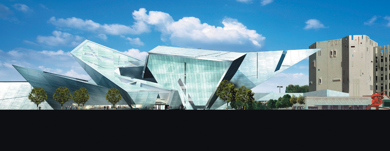
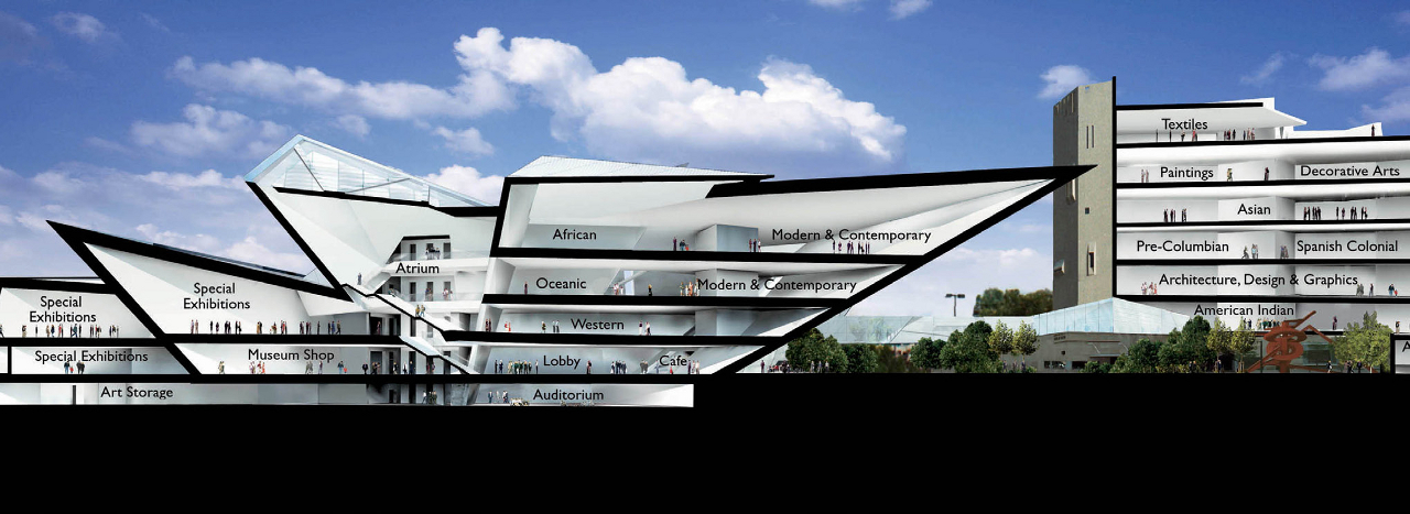
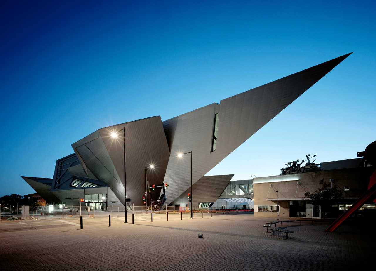
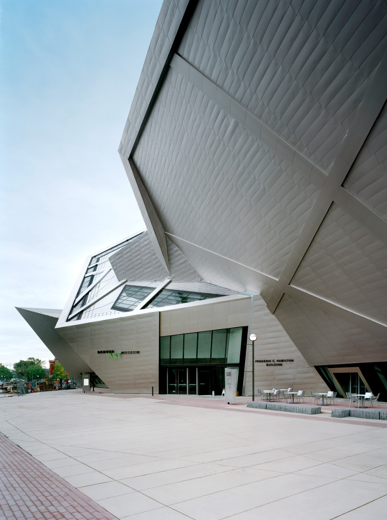
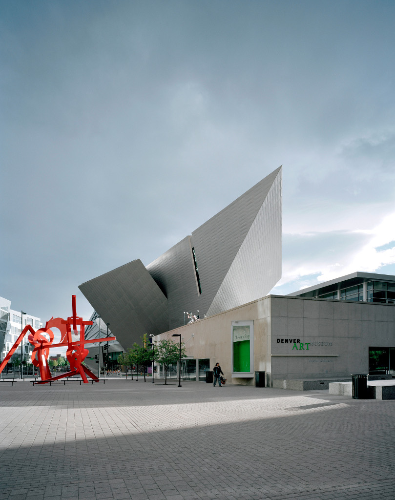
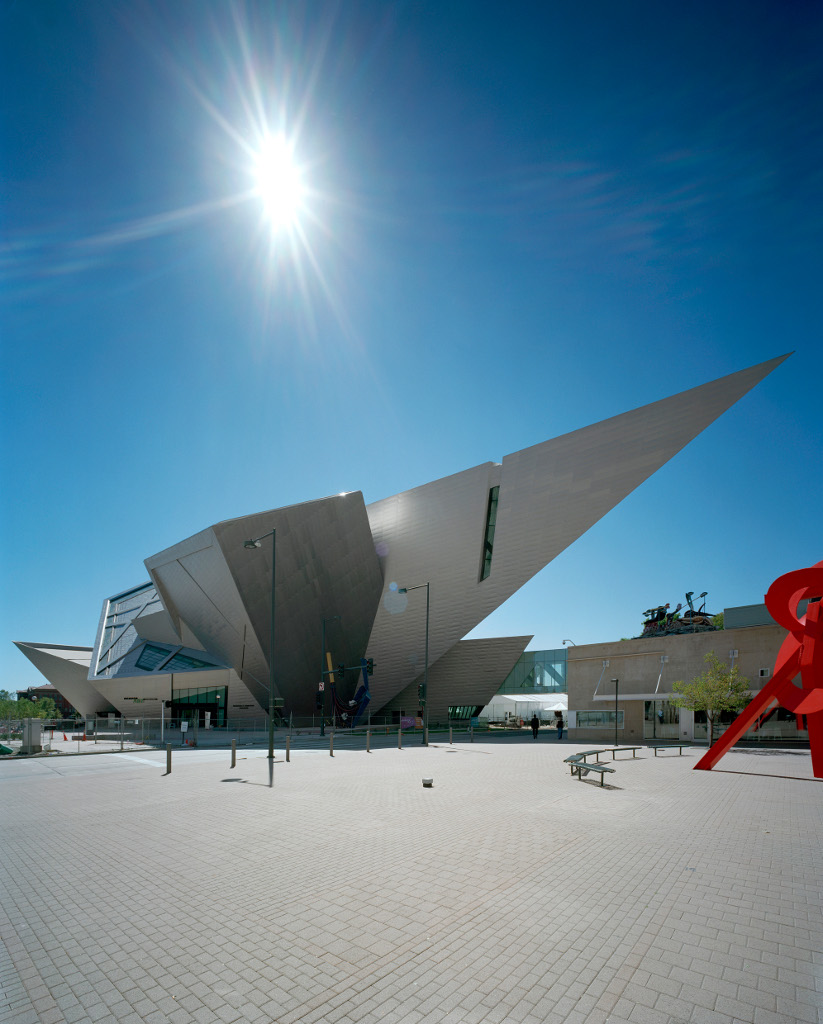
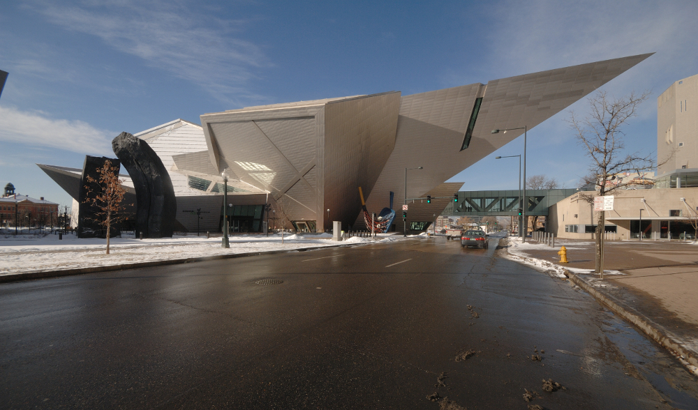
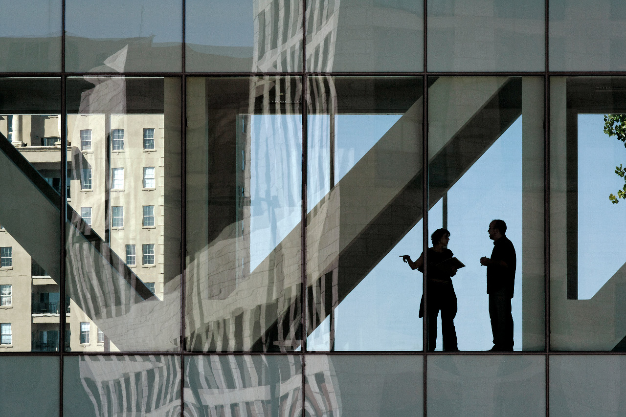
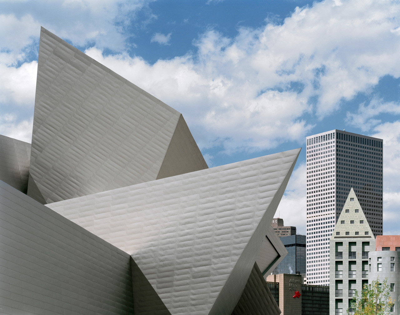
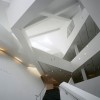
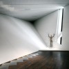
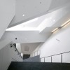
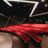
The Denver Art Museum may well be the most prominent expression of Denver’s cultural heart. Daniel Libeskind’s 146,000 sq. ft. extension to the museum, The Frederic C. Hamilton Building, was a joint venture with the Davis Partnership and houses Modern, Contemporary, Oceanic, and African Art collections. The original museum, which opened in 1971, was Italian architect Gio Ponti’s first American commission and boasted an exterior of Italian tile and the innovation of stacking its galleries vertically, which sought to combat the “museum fatigue” that resulted from traversing the long horizontal layout typical of museums at the time.
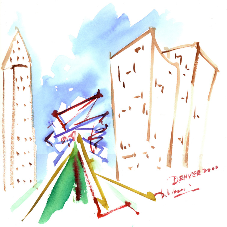
 Credit: Studio Daniel Libeskind
Project Overview
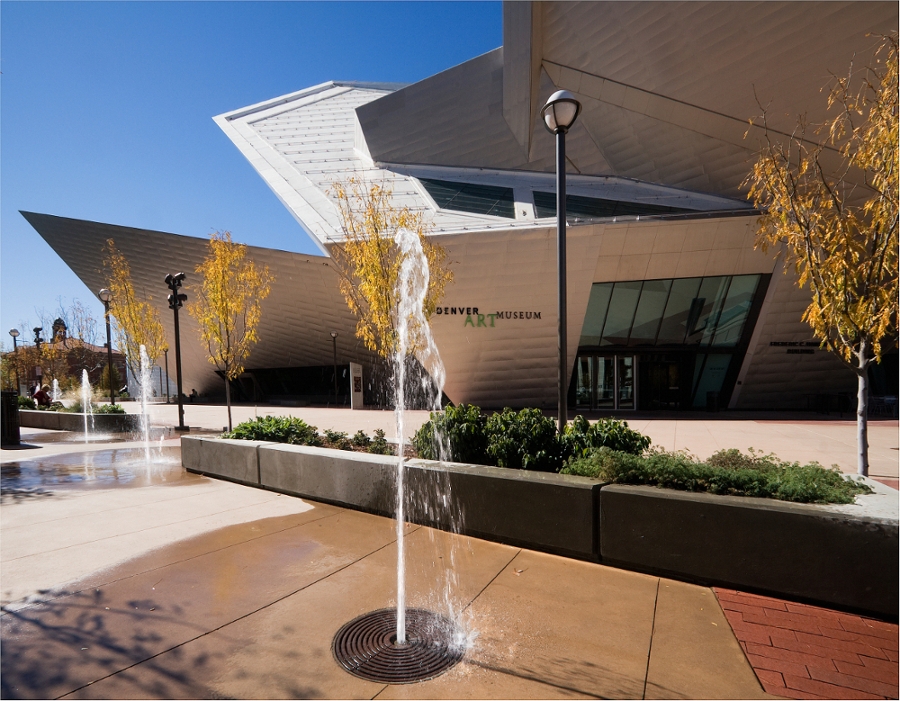
Libeskind's Extension to the Denver Art Museum
- Completion Date: 2006
- Building Area: 146,000 sq. ft.
- Construction Cost: $46 Million
- Client: City of Denver and the Denver Art Museum
- Joint Venture Partner: Davis Partnership
In 2005, with the selection of Studio Daniel Libeskind as the architect of the Denver Art Museum’s new Hamilton Building, Denver once more chose an architectural firm whose importance was untested in the U.S. Continuation of this trend may enable the architectural expression of Denver’s skyline to continue gaining international prominence.
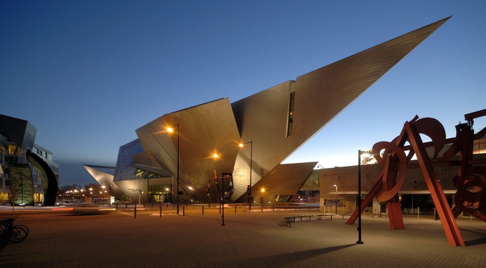
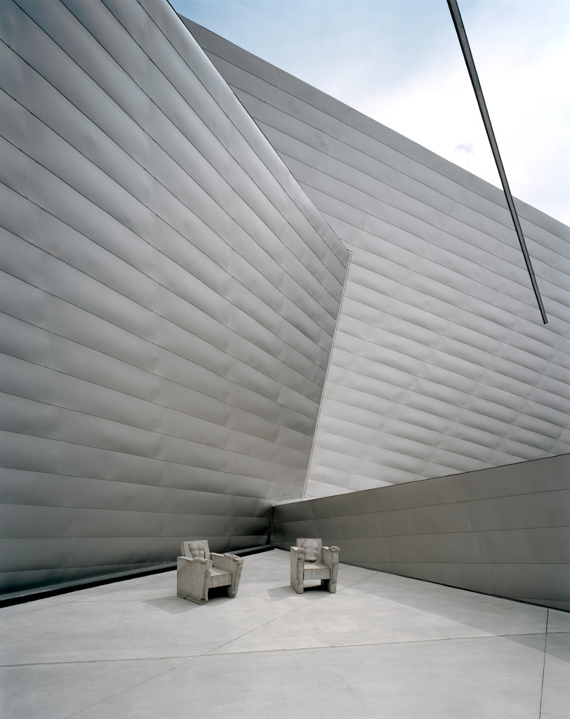
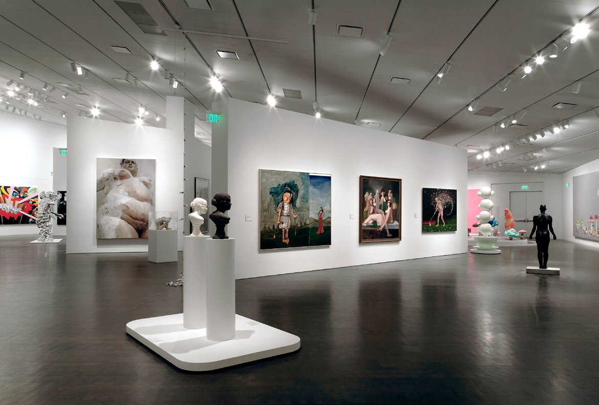
Although Libeskind’s first American building highlights the city of Denver, the Hamilton Building (like all new buildings) has met with some criticism. One point of contention is that the Museum’s gallery design, which has walls that slant in response to the shape of the building, makes the mounting and display of traditional paintings difficult. The Museum has dealt with the challenges of this space by using it to display contemporary sculpture; additionally, the Museum has used it to exhibit site-specific paintings by artists who enjoy creating work accommodated by these unorthodox volumes.
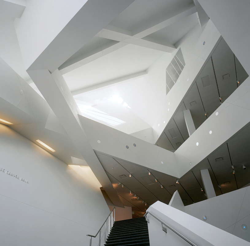
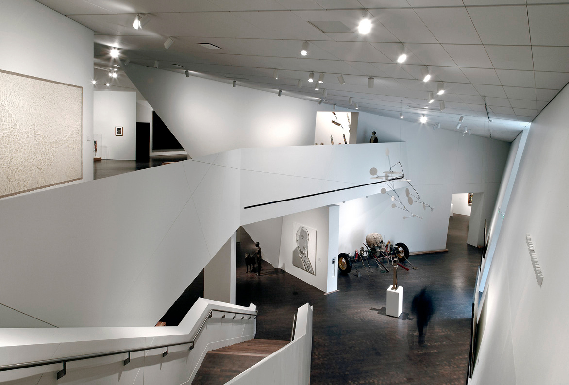
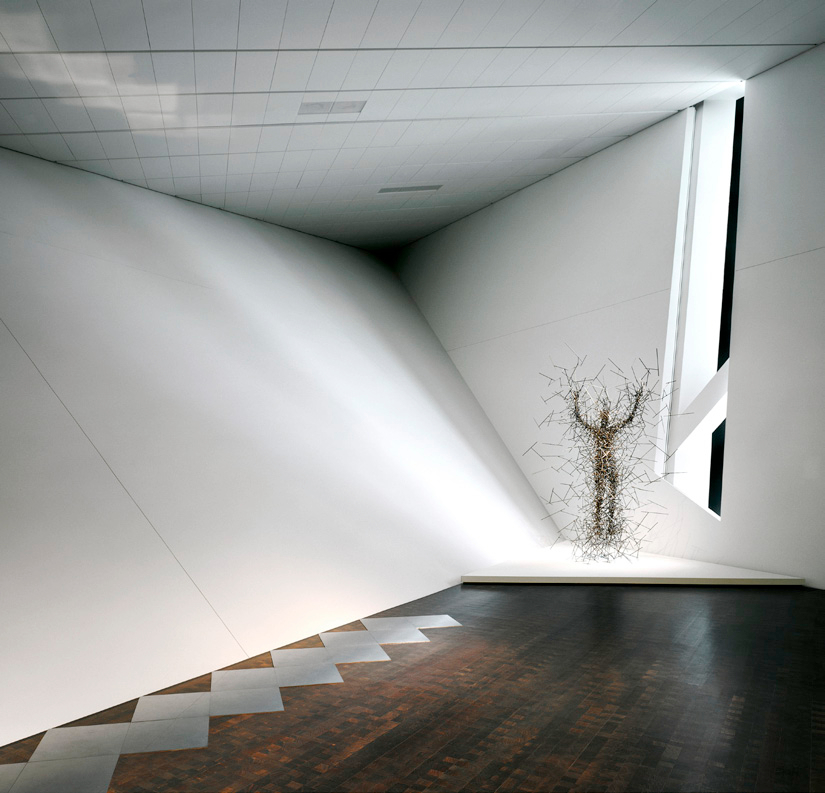
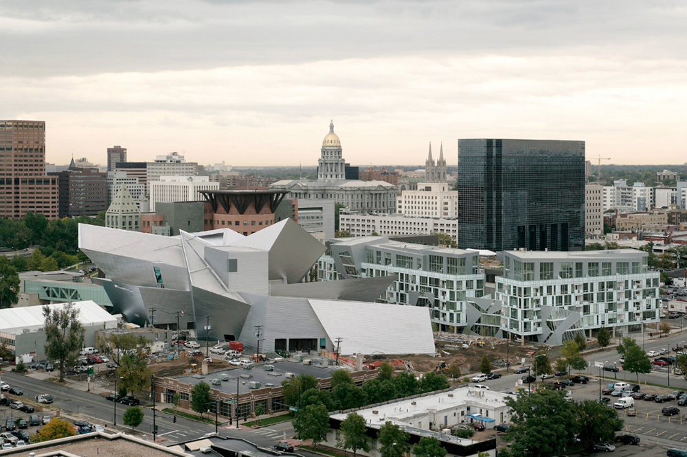
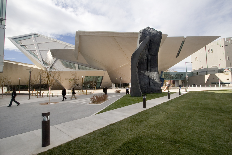
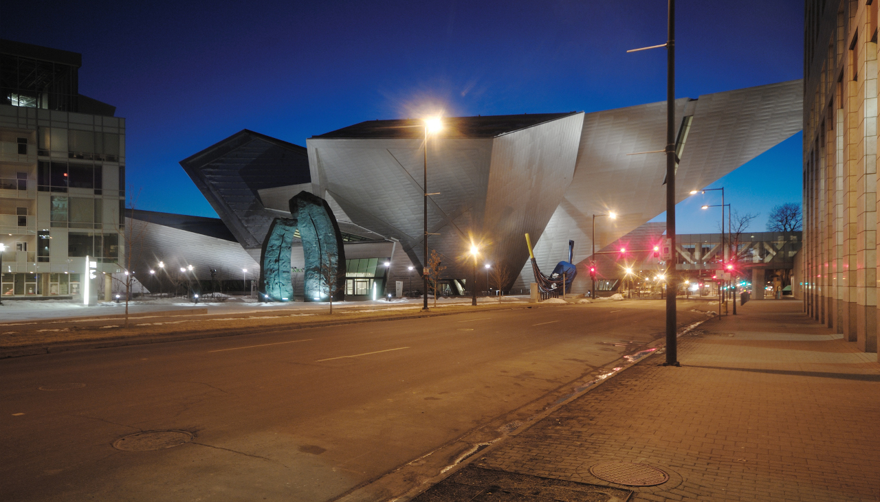
The use of dynamically connected glass and titanium-clad triangular shapes is consistent with Libeskind’s vocabulary. These shapes not only create an urban geometry that reaches into and reflects Colorado’s blue sky, they mimic the surrounding Rocky Mountains and help to unify the downtown area by complementing the surrounding architecture: the adjacent Michael Graves Denver Public Library and Libeskind’s own Museum Residences, which are across the plaza from the museum extension.
For his part, Libeskind seems as pleased with Denver as Denver has been with his work. In a webcast outlining the expansion to the museum, Daniel Libeskind described the inspiration for his design: “It’s so closely rooted in the history of the topography, the light, and the spirit of the city of Denver. Denver is a new city, Denver is an open city that gives you kind of a breathlessness when you come here. You see the world in a beautiful way, and that’s what the building mirrors: it mirrors that spirit. It comes from the excitement and the beauty of this place.”

Morey Bean, AIA, LEED AP
Colorado's 1999 Architect of the Year and Vice Chair of the Boulder Chapter of the Urban Land Institute, Morey’s experience includes the successful development of the Colorado Architecture Partnership, an architecture firm dedicated to sustainability and green building. Morey was appointed by the Chief Architect of the GSA to the National Register of Peer Professionals. He serves as a ULI Service Advisory Panelist and was a charter member of the Colorado Chapter of the USGBC and past president of the Colorado South Chapter of the AIA. He is a construction litigation services expert witness, land development analyst and sustainability strategies consultant.
The author was honored by the Colorado Component of the American Institute of Architects as their Architect of the Year in 1999 and is on the Roster of Neutrals for the American Arbitration Association (AAA), providing dispute settlement for the design and construction industry.
Website: www.cyberarchitects.com
