Video
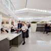
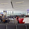
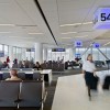
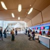
In 2008, San Francisco International Airport (SFO) began renovation of its Terminal 2M (SFO T2). While airport expansions and renovation have become commonplace, global design and planning firm Gensler aspired to nothing less than a paradigm shift with this 640,000 sq. ft. project.

Accommodating New Needs
In the 1950s, air travel was glamorous. It represented a new era of speed and accessibility. In later decades, the perception of glamour declined as more and more people took to the skies. Air travel became, at best, mundane. On the ground, renovations were performed to accommodate this new form of mass transit; airport square footage multiplied and multiplied again, but without significantly improving the experience of air travel.
In contrast, Gensler strove to create “a terminal that elevates the traveler experience by highlighting the Bay Area’s distinct culture, art, and epicurean delights,” according to a company statement. In addition to incorporating creature comforts and cultural amenities, SFO T2 is expected to become the first LEED Gold-certified terminal in the United States.
“The graphics are placed at key passenger catch points and they are focused on how the passenger, not the airport, is contributing to sustainability… a ‘we’re all in this together’ message." Melissa Mizell, Gensler
“We tried to look for where traveler experience and sustainability merged together – where sustainability overlapped with passenger delight – then went through design strategies from there,” says Melissa Mizell, Senior Associate with Gensler.
Hospitality
One way in which the designers expect to recapture some of airlines’ lost elegance is by providing a new level of hospitality services. Contemporary airports need to function as more than simple transition points. With the number of travelers being accommodated, and complicating factors such as Homeland Security, more people are spending more hours, and engaging in more activities, in airport terminals. Furthermore, new technologies, from scanners to e-ticket kiosks, have changed the usual procedures.
Since friends and family members are no longer permitted in the gate area, an Arrivals Lounge – complete with a café – is located near the front of the terminal. More lounge areas placed near baggage claims and curbside extend the options for a comfortable place to wait.
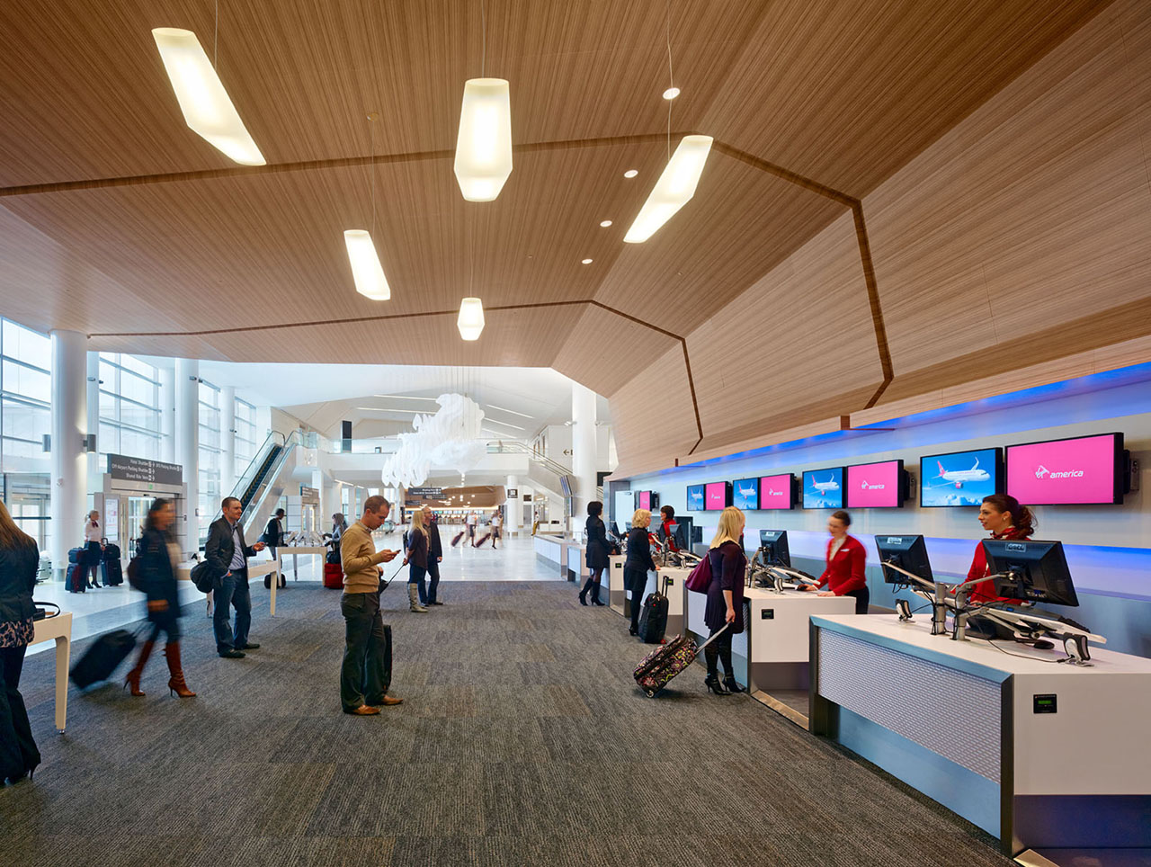
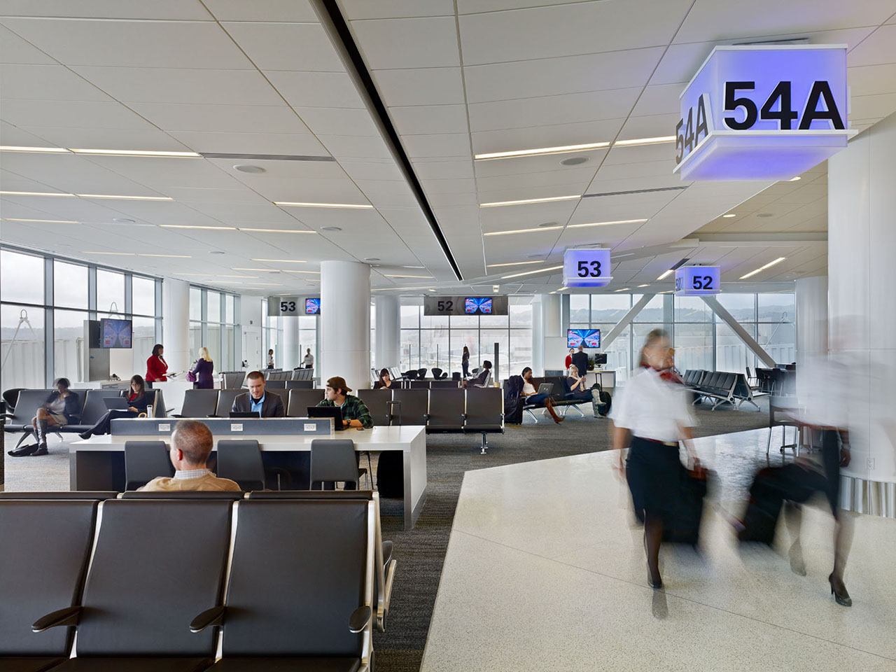
Local mass transit is easily accessible from the arrivals and ticketing hall as well, streamlining pedestrian traffic. The transparent entry wall and open sightlines in the ticketing lobby help travelers to quickly navigate the system; those with extra time at the end of the line can take advantage of amenities in the gateway area. There task stations provide places to plug in devices and get some work done; freestanding armchairs, seating clusters, and low tables offer places to relax. Gateway lounges and restaurants play up local foods and flavors. Two separate children’s play areas are within direct view of the food and beverage areas.
Several of the SFO T2 design features simplify steps at the security checkpoint. Sorting receptacles provide a place for the composting and recycling of prohibited items. An area called “Recompose” is provided at the end of the checkpoint; instead of having to struggle into shoes and reassemble belongings while still jostling along with the crowd, one can spread out and de-stress in this generously proportioned space. It has ample seating and is bathed in daylight. Views into this restful area provide some comfort to passengers who are still in the midst of the checkpoint.
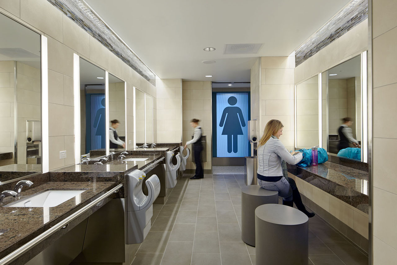
Color, natural light, and warm finishes soften the environment throughout the terminal. Even the restrooms are made inviting, with live plants and lighting that replicates daylight. Vanities and elevated counter sections (which provide dry spots to set baggage) make the restrooms comfortable and easy to use.
Culture
This airport was the nation’s first to be accredited as a museum, and Gensler strove to keep art prominently featured in the redesigned terminal. San Francisco also has an Art Enrichment Ordinance, which requires 2% of the total eligible construction costs of civic public works projects to be allocated for public art.
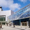
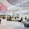
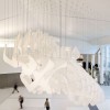
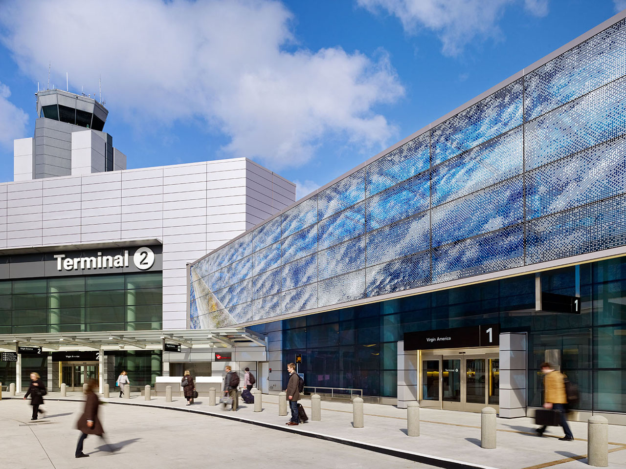
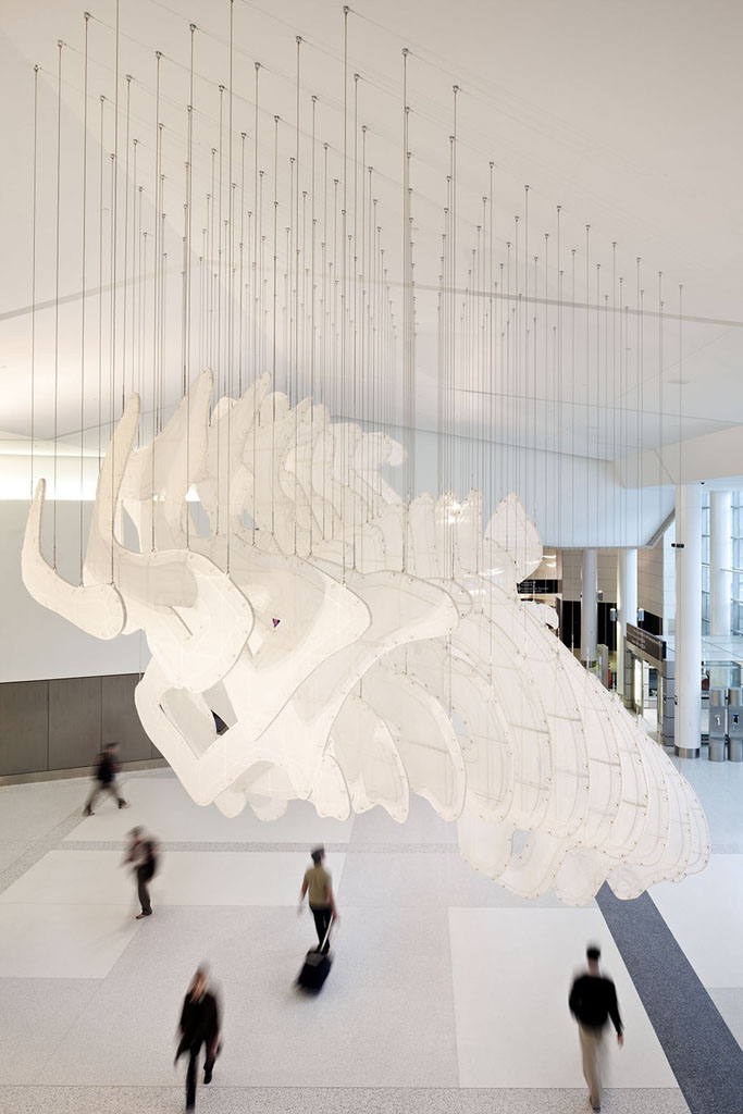
Art greets travelers at the arrivals curb – spanning the façade of the building are panels of laminated glass with artist Norie Sato’s “Air Over Under,” a piece that captures the changing transparency and density of clouds that is associated with air travel. Inside, suspended from the ticketing lobby ceiling, is Kendall Buster’s “Topography.” Made of powder-coated steel tubing and greenhouse shade cloth, the piece uses flat planes hung parallel to one another to evoke topographic lines.
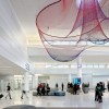
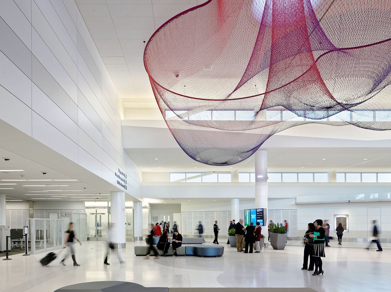
“Every Beating Second,” by Janet Echelman, enriches the Recompose space. This animated sculpture, composed of three woven fiber "nets," uses colored lighting and moves in cadence with a computer-driven airflow to cast cloud-like shadows onto the floor.
One of the children’s areas includes an interactive sculpture called “Butterfly Wall,” by Charles Sowers. Kids can use hand cranks to raise butterflies toward the ceiling, from where they flutter back down. Walter Kitundu also designed interactive art for the play areas. His installation, “San Francisco Bay Area Bird Encounters,” features two benches, made of high-veneer plywood, that are shaped like bird wings and can be played like marimbas. A bird-themed mural echoes the theme of the benches and incorporates another wooden marimba in a bird's wing.
Environmentalism
In addition to green features such as the use of reclaimed water for toilets and the selection of low-flow fixtures, the San Francisco International Airport has the ambitious goal of having zero waste. It has also implemented a sustainability education program, achieved through creative graphics and signage. “The graphics are placed at key passenger catch points, and they are focused on how the passenger, not the airport, is contributing to sustainability ... A ‘we’re all in this together’ message,” explains Mizell. Functions and processes that are usually kept hidden are, at SFO T2, brought into the open. “For example, through one of the windows people can see a very large trash compactor. There is an accompanying explanation of how airport waste is handled,” says Mizell.
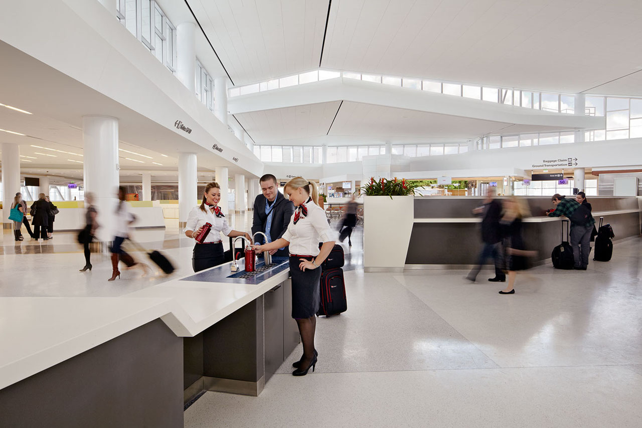
“Hydration Stations” eliminate the need for a last-minute purchase of disposable plastic water bottles. Travelers who bring a reusable bottle can fill it with spring water at the station. Local merchants and fresh, local products are featured in the terminal’s Marketplace, as well as in gateway lounges.
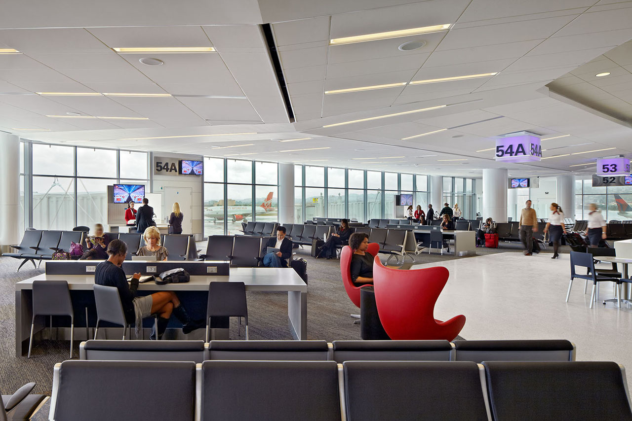
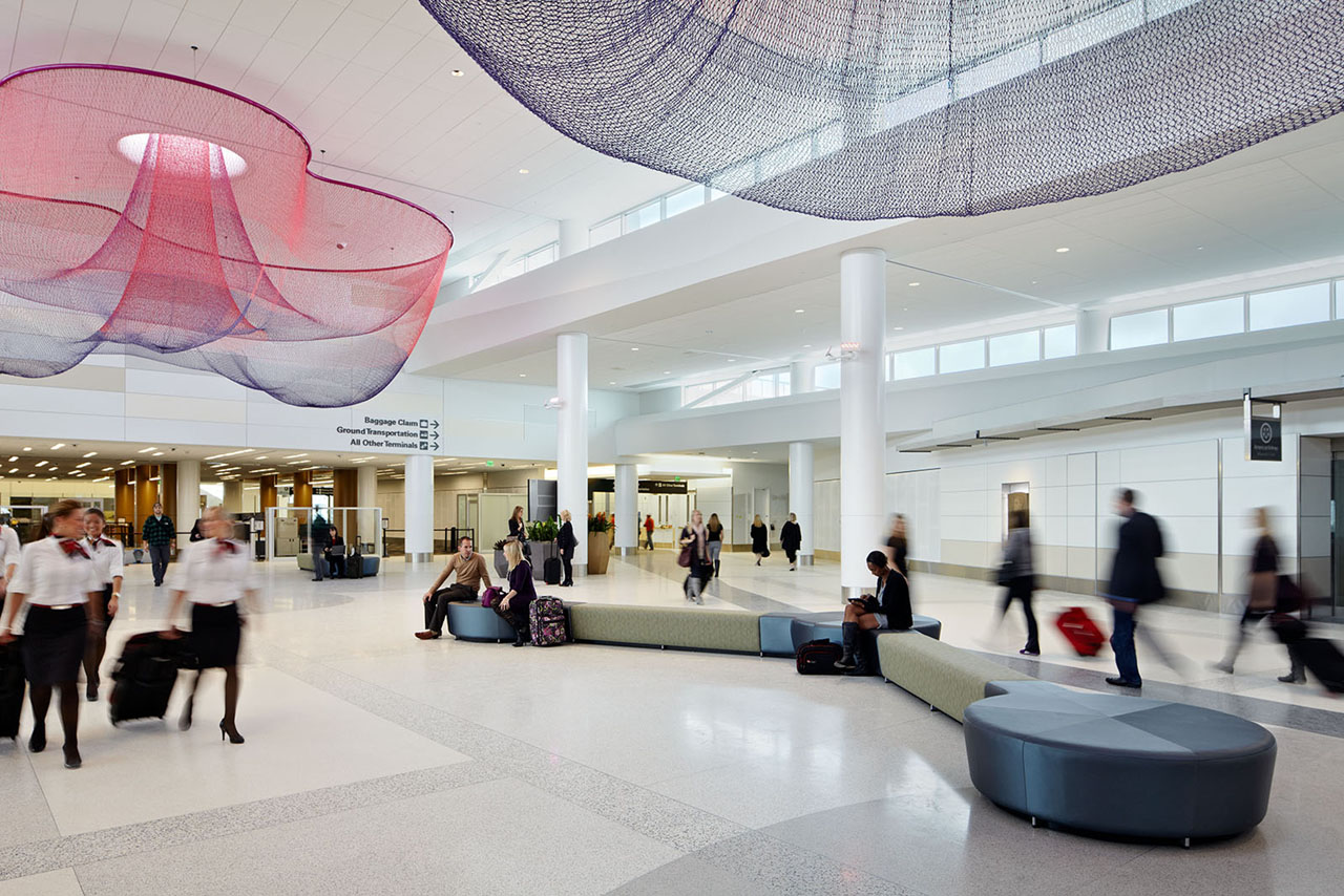
Glass canopies, clerestory windows, and curtain walls allow daylight into the terminal. The need for electric light has been reduced by over 20%. A displacement ventilation system brings cool air into the building at waist level; this allows warm air to rise and be vented from the space. The system keeps the temperature at a constant 70° and infuses the space with fresh air, all while reducing power usage by 20%. “Even though the temperature inside is slightly warmer than it would be with conditioned air,” says Mizell, “it’s more comfortable. This air distribution system doesn’t force particulate matter down on people.” Mizell adds that due to the placement of the diffusers, they are visible to travelers, and so grilles had to become a design feature. “In the retail area, they are set into what we call neutral piers, so they provide a break between storefronts.” Because of their high visibility, it is hoped that the diffusers become one of the educational elements which will, in Mizell’s words, “spark curiosity” about sustainability. For anyone who wants to learn more, a complete phone tour of sustainable features is available at the terminal.
By re-examining a set of needs that has evolved greatly over the last 50 years, Gensler has, paradoxically, instigated a return to the days of more glamorous air travel. Comfort, culture, and long-term usability are all highlighted in San Francisco International Airport’s Terminal 2.

Kristin Dispenza
Kristin graduated from The Ohio State University in 1988 with a B.S. in architecture and a minor in English literature. Afterward, she moved to Seattle, Washington, and began to work as a freelance design journalist, having regular assignments with Seattle’s Daily Journal of Commerce.
After returning to Ohio in 1995, her freelance activities expanded to include writing for trade publications and websites, as well as other forms of electronic media. In 2011, Kristin became the managing editor for Buildipedia.com.
Kristin has been a features writer for Buildipedia.com since January 2010. Some of her articles include:

