Milstein Hall: How Old Meets New
A new academic facility by OMA supports Cornell University's College of Architecture, Art, and Planning (AAP) while bridging several historic campus buildings.
As if designing space for an architecture school weren�t a complicated enough feat, try maneuvering around four historic buildings. OMA�s New York office designed an extension to Cornell University�s College of Architecture, Art, and Planning in Ithaca, New York, which officially opened last October. The modern yet reverent structure consolidates these previously separated programs and promotes interdisciplinary interaction within its open and flexible studios, critique spaces, plaza, and auditorium.
 Image courtesy of OMA
Adaptive Reuse
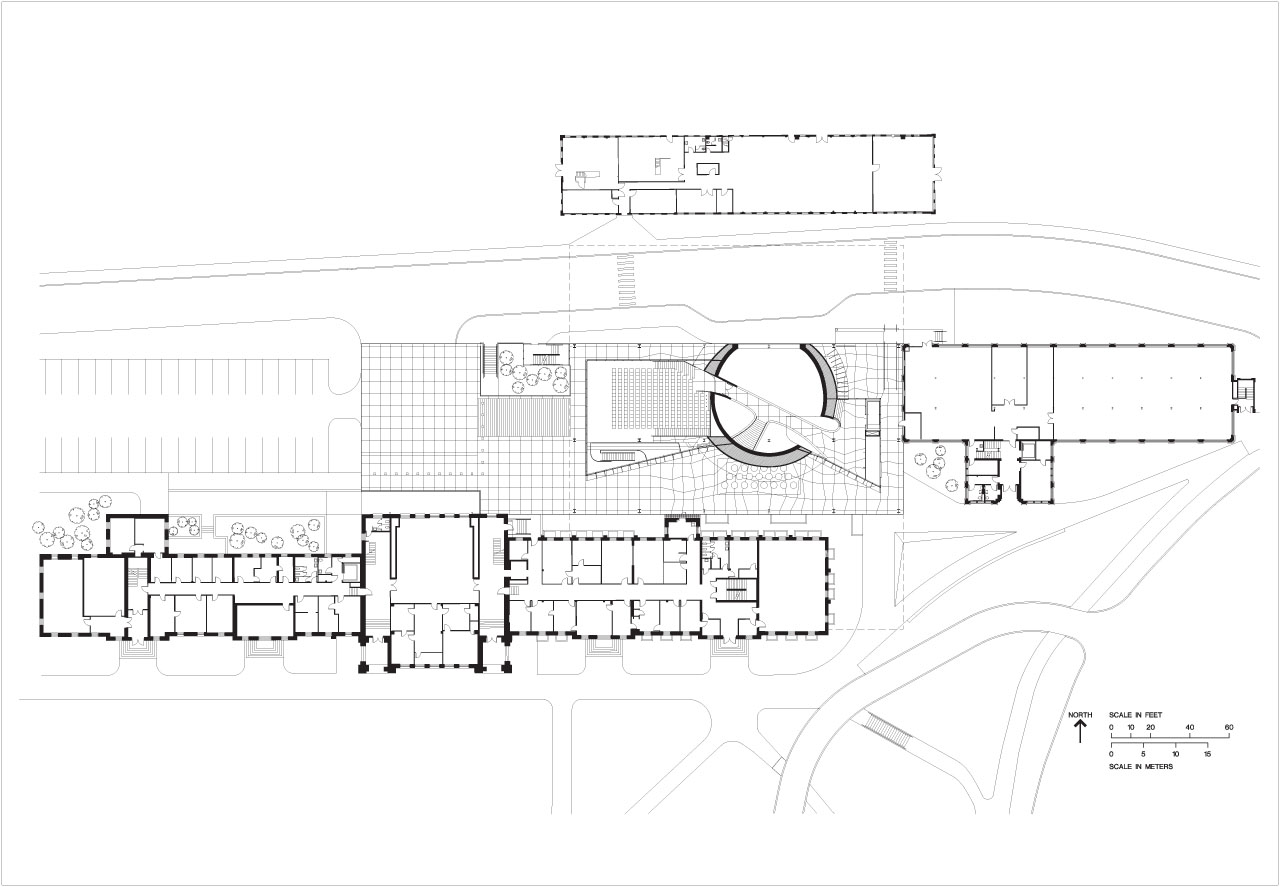
A theme characterizing the work of OMA is the adaptive reuse of existing buildings in fresh ways. For this project, the architects were provided a program but not limited to a particular site, recalls Shohei Shigematsu, Partner and Director of OMA�s New York office. They chose to site the new building along the northern edge of campus between the Arts Quad and the Fall Creek Gorge. This edge was loosely defined by four buildings�Rand Hall, Sibley Hall, Tjaden Hall, and the Foundry�each built in different eras with similarly linear forms. Both Sibley Hall and the Foundry are landmarked, so OMA could not alter their main facades. However, their rear facades and interiors were fair game. OMA completed a master plan to reconfigure the programs and make upgrades to comply with Americans with Disabilities Act (ADA) guidelines.

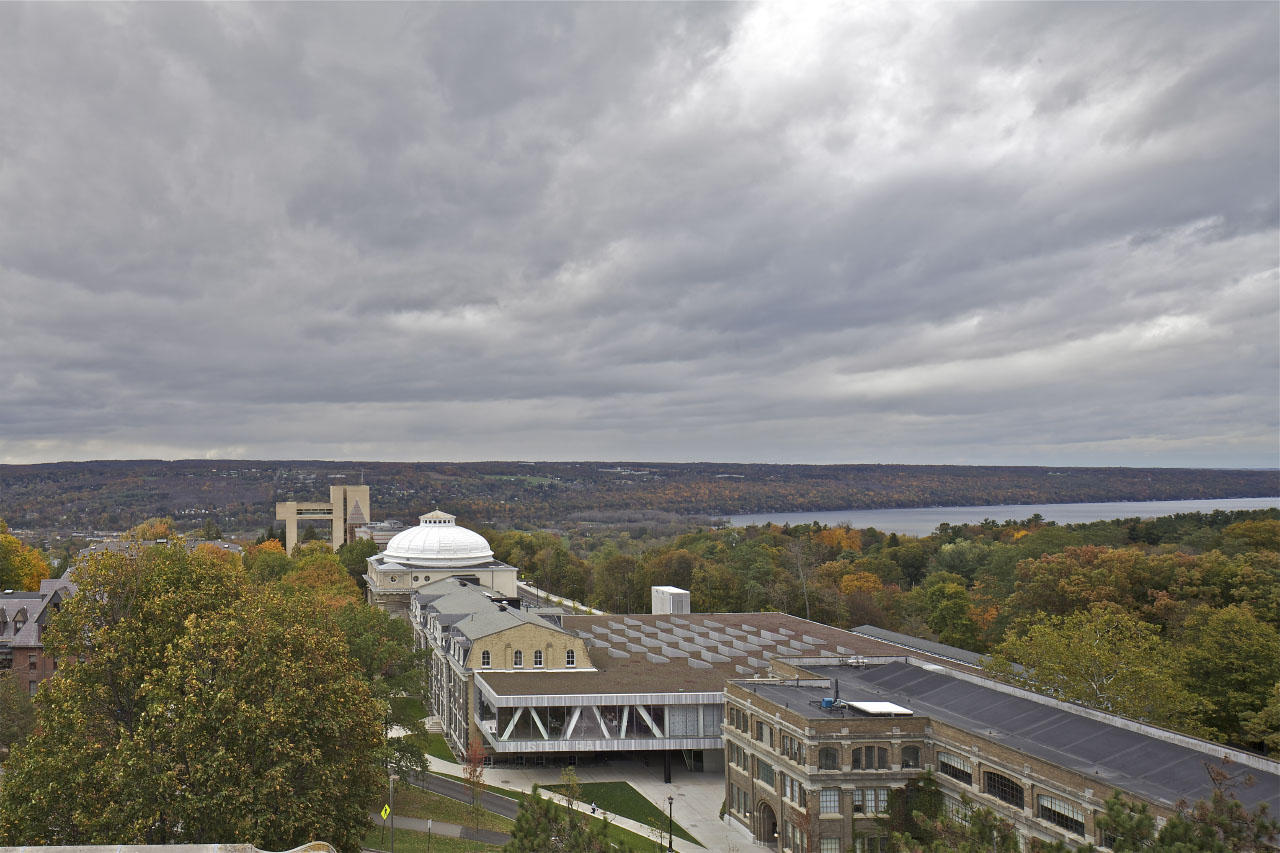
The new Milstein Hall provides additional program space and connects these formerly disparate buildings as a single complex. Although it serves as infill and touches Rand and Sibley Halls, seeming to disappear from certain angles, Milstein Hall doesn�t hide; its dramatic cantilevers prove eye-catching. �Our ambition was to create a bridge between the different facilities of the AAP, so we connected the second levels of Sibley and Rand Hall with a large horizontal plate. We also chose to leave the ground condition of the AAP campus uninterrupted and elaborated on the building�s materiality with a continuous concrete plaza that is lifted to form the dome,� explains Shigematsu. Milstein Hall�s architectural vocabulary is simultaneously subdued but distinguished from the historic buildings. A series of horizontal plates is supported by hybrid trusses, and this structure is clad with naturally striated marble and lots of glazing. �We wanted to respect, rather than overwhelm, the adjacent historical buildings, so the end effect is very stealthy and very clean,� explains Shigematsu.
Flexible Interior Spaces
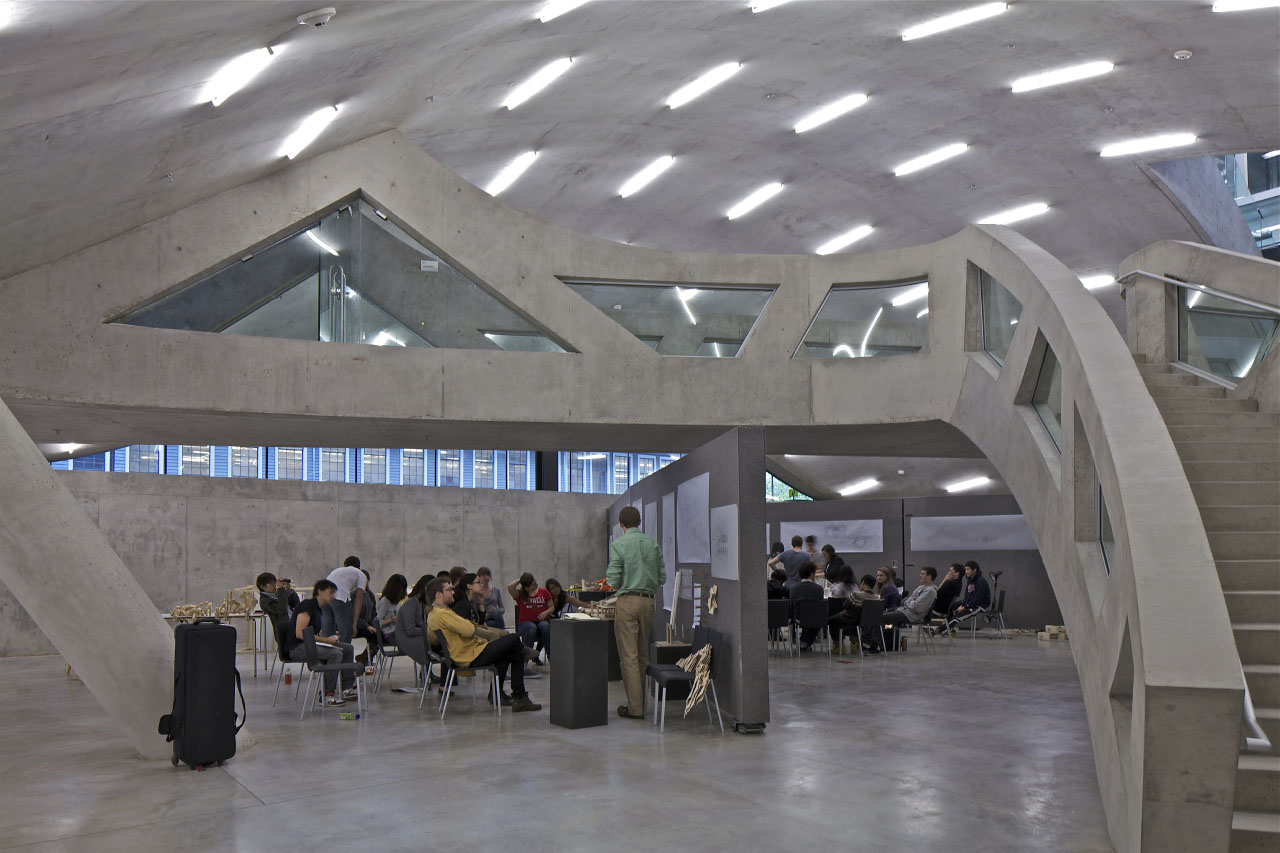
The exposed hybrid trusses, which combinine the angled members of a typical truss with some vertical columns similar to a Vierendeel truss, were designed to balance structural efficiency at the cantilevers and maintain open circulation within the large open plan of the upper level studios. In large, open spaces such as Milstein Hall�s, maintaining comfort can be a challenge, which OMA architects answered by specifying innovative and efficient systems. The ceiling serves as a �chilled beam,� a convection-based HVAC system supplied by water from nearby Cayuga Lake. During the winter months, radiant heat rises from the floors.

In architecture school studios, the lack of pin-up space is often the biggest complaint among students and faculty. To avoid this conundrum, OMA designed desks with attached pin-up boards. The boards are situated at just the right height to avoid partitioning the space but still allow students to customize their work areas. Another defining feature of the building�s interior, in both plan and section, is the dome-like precast concrete volume that bubbles from the basement to the lower level. It contains a 250-plus seat auditorium that doubles as a venue for University trustee meetings. Its concrete shell was impressively cast in a single pour.
The Other Facades
Since much of Milstein Hall is obscured by its older neighbors, the outdoor spaces defined by its form become the primary facades. The north and south cantilevers create a bus stop, drop-off zone, and pedestrian plaza beneath. Shigematsu explains that this potentially dark and unpleasant area met with some opposition initially, but a few key design details resulted in an active space that is popular with students. Four-by-four-foot pressed stainless steel coffers line the ceiling, adding both human scale and a subtle historical reference to New York stamped metal ceilings. The surface of the auditorium penetrates the plaza, inviting students to lean against its smooth concrete surface or gather on a cluster of seating pods illuminated from within.

The roof garden features a gradient pattern that serves as a continuation of the landscape, reinforcing the connection between the campus and the adjacent gorge. Dots planted with different species of sedum shift in density from one side of the building to the other, while three sizes of skylights form a radial pattern to provide an even amount of natural light to the studios beneath.
Shigematsu shares that when architects are the clients, �it can be difficult to achieve consensus,� but Milstein Hall�s design proves diplomatic on a variety of levels: it defines the edge of campus while tying into the natural environment, all while connecting previously isolated departments. The new structure�s wide-open spaces will surely inspire some fruitful interdepartmental collaborations.

Murrye Bernard
Murrye is a freelance writer based in New York City. She holds a Bachelor's degree in Architecture from the University of Arkansas and is a LEED-accredited professional. Her work has been published in Architectural Record, Eco-Structure, and Architectural Lighting, among others. She also serves as a contributing editor for the American Institute of Architects' New York Chapter publication, eOculus.
Website: www.murrye.com


