Urban Living: Designing Small Spaces
Urban living has many advantages � increased walkability, access to public transportation, and a wealth of things to do in the area, among a host of others. One disadvantage of an urban location, however, is living in the smaller space that generally accompanies city life. Size limitations can make designing a home �� whether a house, duplex, or apartment �� quite problematic. Renting, rather than owning, puts further constraints on what improvements can be made. To tackle these challenges, we spoke with Cleveland-based architect Robert Donaldson of MOD{all}Studio and Los Angeles celebrity interior designer Michelle Workman to share some ideas for designing small spaces.


How to Maximize Your Apartment Space created by ForRent.com
Keeping It Simple
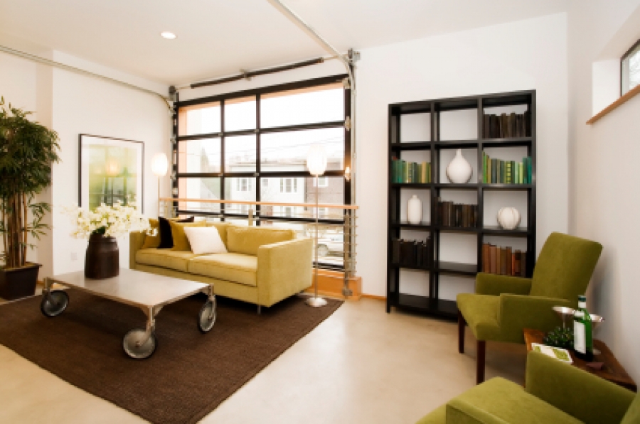
Unsurprisingly, the biggest difficulty in designing small spaces is managing the amount of stuff that is in the space. Workman urges you to scale down if you have an abundance of things to fit in the space. �Using just a couple pieces of furnishing, rather than trying to incorporate a bunch of stuff in there, is preferable. Any accessories that you do have, or even collections � dolls, figurines, shells, things that you collect from trips, any sentimental pieces � can look very cluttered," she says. "Grouping them together in one area using shadow boxes or frames makes it seem like one small statement rather than spreading them throughout the house.� She also mentions the importance of consistency. �Having one element that kind of carries through and marries all the spaces is really important in small spaces, because the more variation you have in style or color, the more hectic it becomes to the eye," Workman says. "You can do any style, but you have to sync in terms of streamlining the looks, so that you�re not trying to do too many things in one space.�
�The lighter the color, the more open the space will be. The darker the color, the more cave-like and enclosed the room will be.� Robert Donaldson, MOD{all}Studio
Maximizing Storage Space
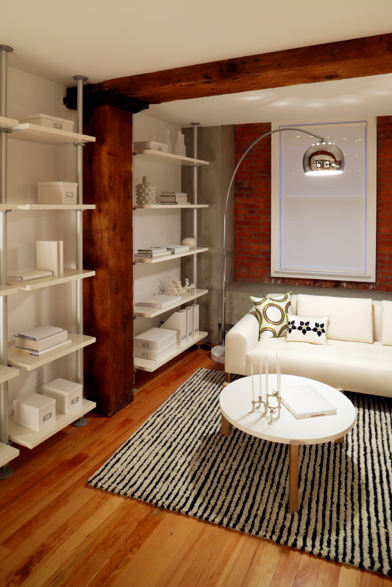
You can reduce the amount of clutter in a space in many different ways, and paring down what you bring into a space will take you only so far. Donaldson says, �It really comes down to using efficient storage as much as possible. This could include using dual-purpose furnishings that have storage. One great place to go, of course, is Ikea. Being based in the European countries that generally have smaller living spaces, they are really conscious of their market base and the fact that they need to provide solutions that not only are aesthetically pleasing but provide storage solutions.� With the vast number of pieces available (from Ikea and a variety of other companies), you can find plenty of versatile storage options. Ottomans, benches for seating, and even sofas can be used to hide the clutter.


Playing with Color
It is common knowledge that painting is a great way to dramatically change the look and feel of a room, and it becomes even more important in urban spaces where renovations may not be a possibility. Donaldson describes designing his own home, a smaller house in Lakewood, Ohio. �We�re not afraid of colors. It�s very lively, and as a result the house has more or less a life of its own with a vibrant feel to it,� he says. He reminds us, �The lighter the color, the more open the space will be. The darker the color, the more cave-like and enclosed the room will be.� Workman, too, suggests that color is essential. �There are people who believe that everything has to be white to appear bigger. I�m more of a fan of doing a color on the wall that is carried throughout the home in gradations of darker and lighter, because for me that draws your eye onward while white bounces your eye back. Yes, it does bring in more light because of that same bounce -- but you want to feel like there�s more depth.� She adds that utilizing one color throughout the space creates consistency and a flow throughout the home because the eye doesn't have to stop with a change of color.
Working within Limitations
�Having one element that kind of carries through and marries all the spaces is really important in small spaces, because the more variation you have in style or color, the more hectic it becomes to the eye. You can do any style, but you have to sync in terms of streamlining the looks, so that you�re not trying to do too many things in one space.� Michelle Workman
Because rental properties are a large portion of urban housing, it is important to understand how to improve the aesthetic quality of your space without making any changes that would be met by unhappy landlords. Donaldson suggests, �You can do very simple things. The easiest thing to do with most rental properties is wall hangings. A good-sized painting can tie a room together really well. If you have something that either punches, providing contrast, or serves as a conversation piece, you can really turn a room around. Another way is to use room dividers, which don�t necessarily need to partition a room. For example, they can be a great way to soften corners. Just having more diversity in surface creates additional depth in the space.� As mentioned, painting (if permitted) is a great way to alter the look and feel of a room, but putting focus on a few great pieces will give the space a complete look that is clean and complete.
Making Lighting Work for You
Ensuring that your space has sufficient lighting will keep your small space from appearing cramped or closed off. Using lighter and brighter colors will maximize the amount of light that bounces within a space, but Workman also mentions that mirrors are a fantastic inclusion for working with light in a space -- opening it up and making it appear larger. Donaldson suggests that creating a skylight in a space, if possible, is a great way to make a smaller space feel larger. He also mentions the importance of window treatments. �In an urban space there is generally very limited space between the houses. Sometimes you don�t always want to see your neighbors, however. If you use something as simple as white drapes you can get a nice amount of luminance without having to resort to heavy blinds or darkening curtains. Whether it is daytime or nighttime, doing simple light or white-colored drapes can dramatically impact a room,� Donaldson says.
Working with small spaces can often require a bit of creativity, but, with the right guidance, the perfect balance of form and function can be attained. I will be taking up the challenge in the next month by using these tips and other advice from these great designers in the transformation of my own urban living space � so check back in the coming weeks for the process to unfold!


