Designing the Small House
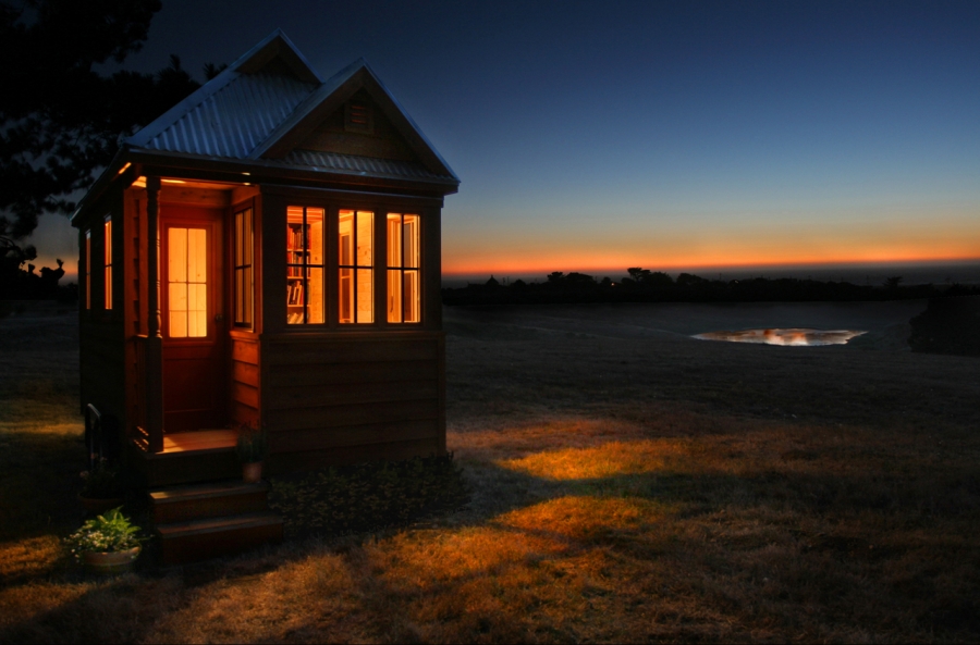
Create a livable small home by using these basic design techniques.
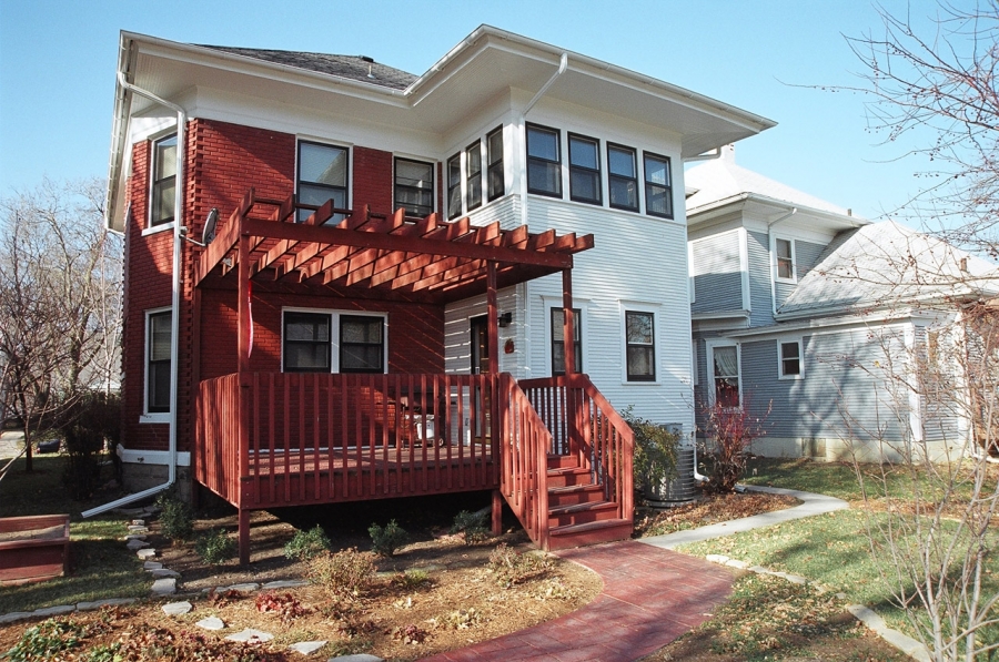 Image courtesy of Fernando Pag�s Ruiz
I was tempted to subtitle this article �A Practical Primer� because I have spent a good part of my 30-year career guiding and sometimes even prodding architects on the basic design techniques required to create livable and attractive small homes. Many architects are reluctant to design small, despite the success of Sarah Susanka�s �The Not So Big House� books, which promote the idea of trading square footage for higher-quality finishes. Even Susanka�s designs, at least as evidenced in her Not So Big Showhouse, start at about 2,450 square feet � this is smaller than large houses, but not really small by traditional standards.
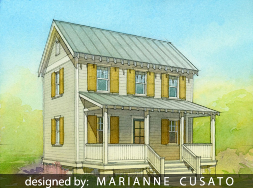
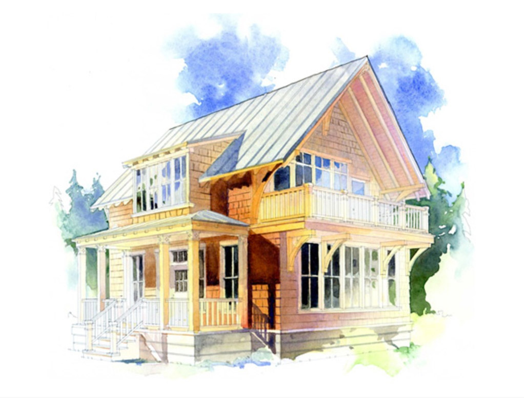
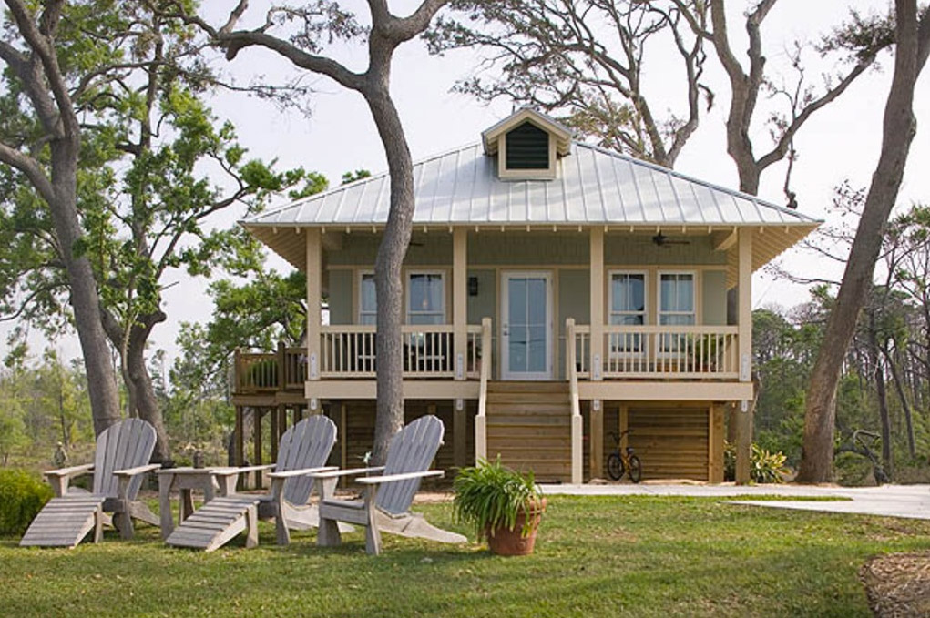
Many good examples of small homes populate our traditional neighborhoods; these traditional small home designs include Cape Cod, Italianate, and Craftsman houses, which typically range from 900 to 1,500 square feet. Drive through any established neighborhood in your area and you�ll observe that most of those enchanting little homes consist of a basic cube just about the size of a large cottage with an ample front porch and a few clever facade details.
I turned to these older homes as a template when trying to create contemporary small homes under 1,600 square feet. I will show you some traditional examples and how they work, but first I want to tell you the principles I learned from these examples and how I applied them to creating marketable floor plans today.
Design from the outside in
To start, I�ve learned you have to design backward, starting with the exterior perimeter of the home, rather than developing a design from the inside out. This is where most homeowners and designers err when planning a small house, ending up with something much larger than they set out to accomplish, yet feeling they could design nothing smaller. When you begin your design with the floor plan, envisioning how you want the kitchen, living areas, and bedrooms, the size of the structure balloons. I read recently a New York Times article about the biggest single family home in the United States: the homeowner said he had not set out to build the biggest house ever, but when he included everything he wanted, it just turned out that way. It always does. To limit the size of a house you must start with an exterior footprint, thereby limiting the square feet to your target range, and then design the floor plan within this frame as if remodeling within an existing exterior envelope.
Inside the box
Even at equal size, some footprints are more efficient than others. When I described the traditional neighborhood homes as little cubes, I was referring the basic structure. The cube works best when designing small homes because it yields the highest floor-to-shell ratio. In other words, it provides the smallest area of exterior surface to cover the largest proportion of living space.
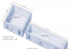
To understand this concept, look at the image below (originally published by Taunton Press in my book on affordable home design). Picture an imaginary square house of only 625 square feet enclosed by four 25'-long, 8'-tall exterior walls. This structure has 800 square feet of exterior wall (4 x 25 x 8) enclosing 625 square feet of floor. In other words, this simple structure has a floor-to-wall ratio of 1.28 (the number of square feet of exterior wall that it takes to enclose each square foot of interior floor area). Now picture the same 625 square feet of living space enclosed within a rectangular footprint of 12.5 x 50 lineal feet. Do the math and you�ll find that this structure has a floor-to-wall ratio of 1.60 � a whopping 25% drop in efficiency. The more efficient the relationship between the envelope and the area enclosed, the more flexibility you will have in designing the floor plan, and the less money you spend on building the house, which is often the driving consideration when designing a small home. That�s why I always begin planning my homes by designing their exterior shells and not their floor plans.
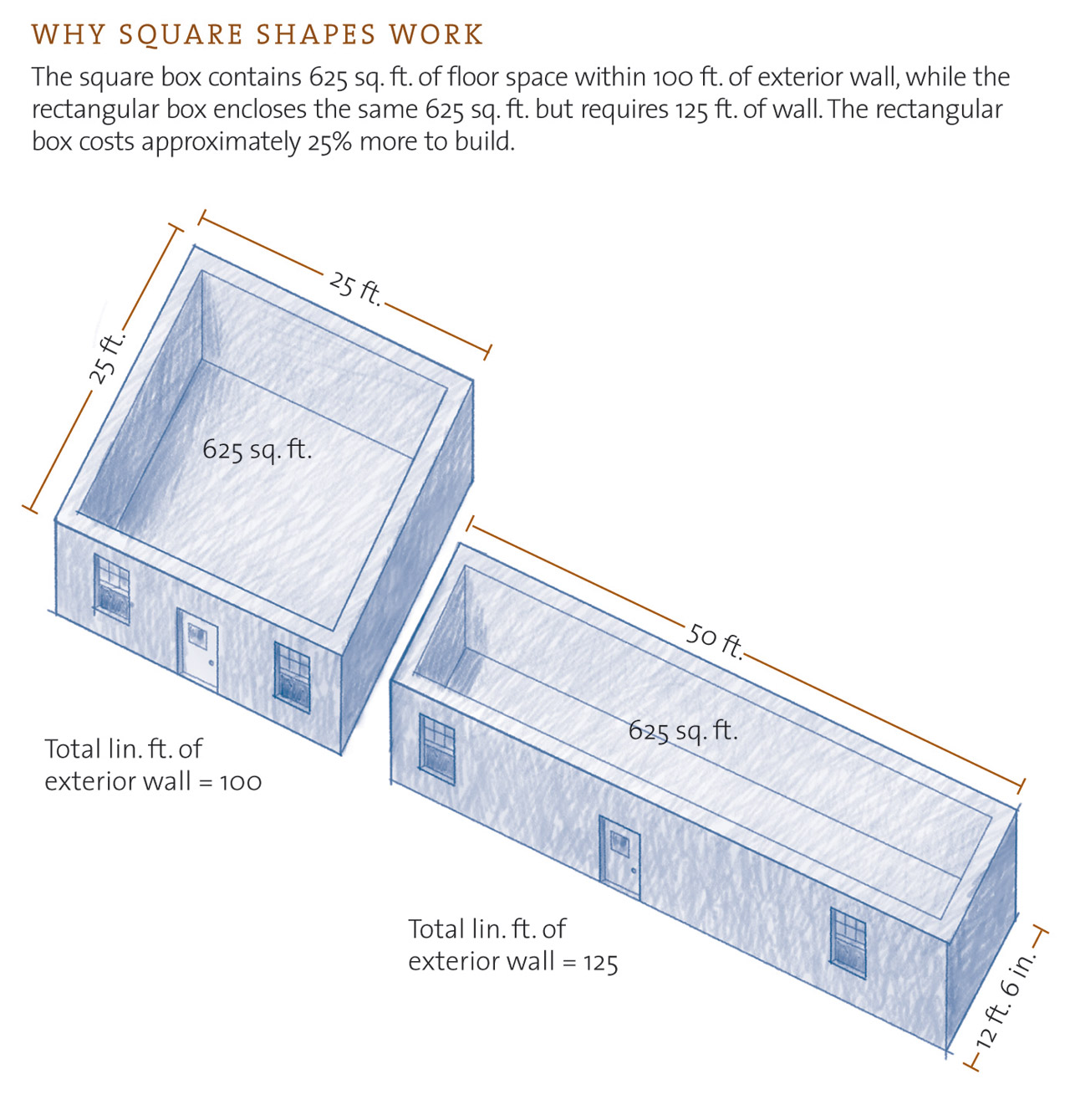
(1) Total lineal feet of exterior wall = 100 lineal feet. (2) Total lineal feet of exterior wall = 125 lineal feet. The square box contains 625 square feet of floor space contained within 100 lineal feet of exterior wall. The rectangular box encloses the same 625 square feet but requires 125 lineal feet for the job. The rectangular box is approximately 25% less efficient and therefore less flexible in accommodating your living area.
Next, I lay out the mechanical core. This second step postpones the fun part, designing the room distribution, but laying out the mechanical core at this point saves heartache later, when you have to compromise that cherished floor plan to accommodate a furnace, water heater, and air distribution ducts. I generally place the mechanical core (a consolidation of a house's "life-support" systems, including the electrical panel, furnace, and water heater) near the center of the house to facilitate the distribution of ducts and piping. When possible, I site this in the laundry room, or even under a stairway.
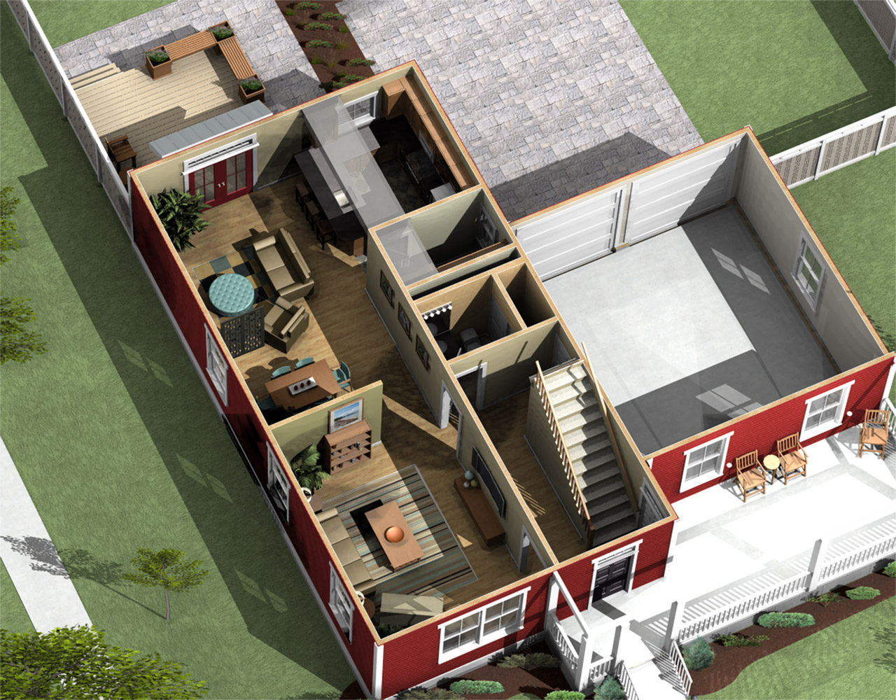
In this home designed by Torti Gallas and Partners, the mechanical core was sited next to the kitchen, within the laundry room, adjacent to the lower level bath and below the upstairs bathrooms to save space running ducts in bulkheads and squirreling them through closet chases. Cleaning up the design by considering the mechanical layout at the outset yields a more efficient plan, which is the goal of a small home design.
With the shell of the house and mechanical core sketched, you can begin to create the interior floor plan knowing you have already established the two most important parameters of small home design, the target size and economy of construction.
Small home interiors
Just as homeowners want curb appeal, they also want a house that feels spacious and comfortable. In a small house, this usually means combining rooms into larger environments. You can sometimes find excellent examples of this in the best apartment architecture. I recommend touring high-end apartment complexes when designing a small home, as you will often see clever strategies that make very small residences, sometimes 750 square feet or less, feel large and luxurious. Some of thse strategies are the creation of long, diagonal views that target a window; taller ceilings in certain areas; and multipurpose areas that can accommodate cooking, dining, children's activities, and entertaining in one room.
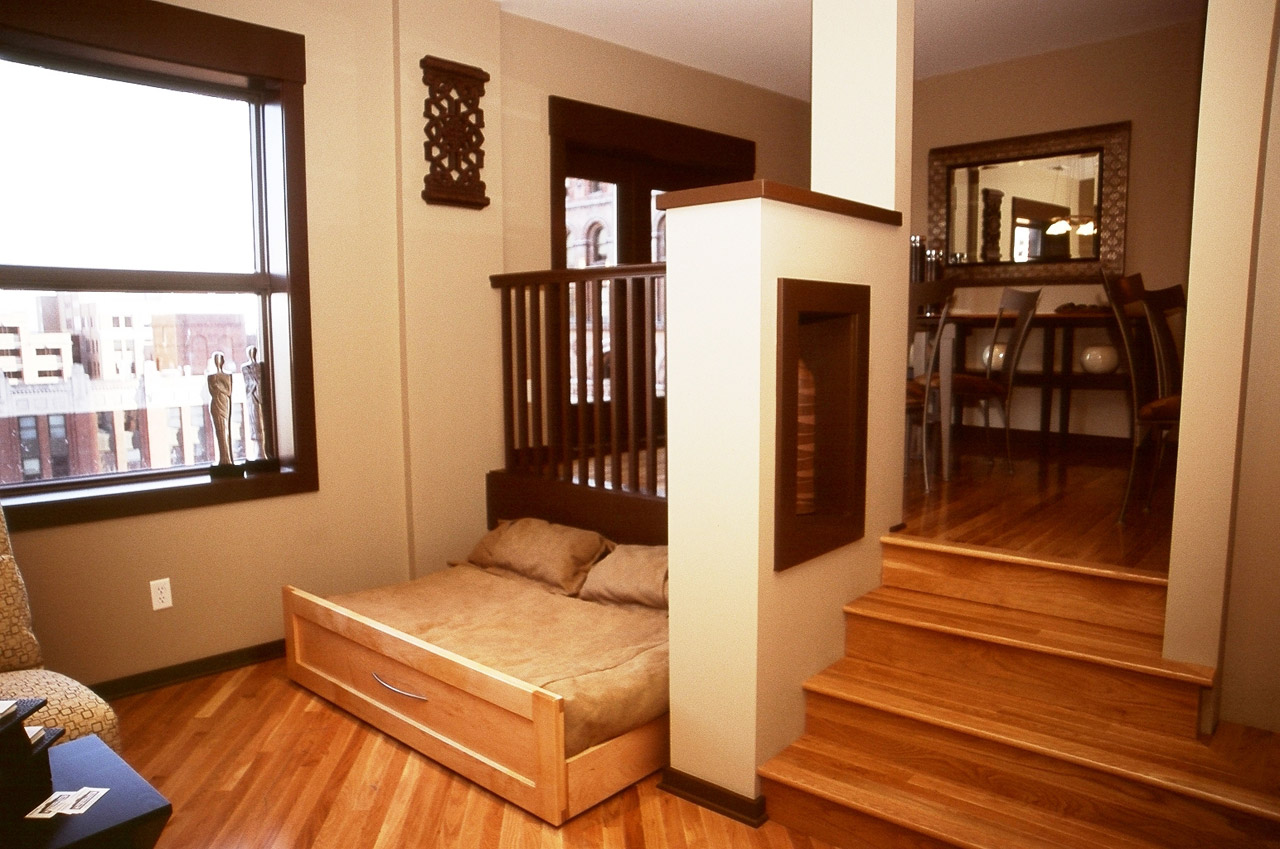
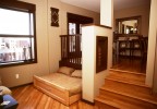
Small inspiration from apartment designers: within a very small space, this condominium layout takes advantage of low walls and a raised floor to differentiate the dining area from the living room. An added bonus is the pullout futon bed that slips under the floor, doubling as a love seat when retracted.
As you do with the exterior shell, checking the relationship between floor area and the total square feet of interior walls tells you a lot about a home�s design efficiency. A higher ratio of floor-to-interior-wall represents a more efficient design. As you reduce the overall size of a house, you have to provide utility within each square foot. This challenges you to design your interiors like a naval architect would design a yacht, making every square inch count.
Living areas
Currently a large room that functions as a conglomerate of kitchen, dining, and family rooms serves as a common area for family recreation and entertaining. This living area has replaced the traditional living room and therefore needs a touch of architectural drama to justify it as a showplace for social gatherings. It should always be a room of which the homeowner can feel proud.
Use vaulted ceilings, large windows, and broad diagonal views across this multipurpose room to make your small, economical house feel large and luxurious. Try not to block sightlines with walls, and place a window or glazed patio door right across from the entry so you can see through it as you walk into the room. When occupants can look through wide-open interior spaces to the great outdoors they feel unrestricted. It really does not matter if your house contains 750 or 3,000 square feet � an occupant�s perception of size ends at the wall. Create large sight distances and you create the illusion of space.
Bedrooms
Builders often err by creating large living areas and master bedrooms and then shaft the rest of the family by stuffing them into tiny, office-sized cubicles. I have found that families prefer an adequate master bedroom that�s big enough for a queen-sized bed, along with ample secondary bedrooms for the kids. Despite our tendency to showcase master bedrooms, it�s the children who need more space to play. On the other hand, there�s no better way to save space in a small house than eliminating the obligatory third bedroom when prospective residents don�t need it.
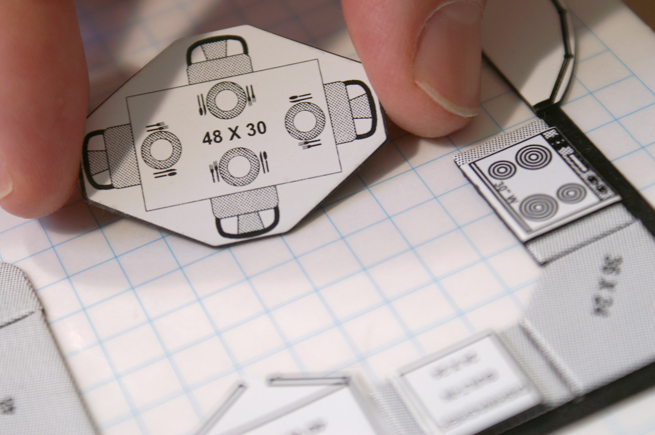
Since efficiency is a core value in small home design, it�s important to create a furnishability plan from the outset to make sure the small areas work with your belongings and lifestyle. I recommend laying a quarter-inch scale floor plan on a metal surface and then using an interior designer�s kit of magnetic, scale furniture to test the layout before settling on a design.
We used to believe that a home for even a single person needed three bedrooms to assure its eventual resale, but this perception has changed with evolving demographics. In 2010, married couples dropped below half of total households, and in 2011 just 1/5 of households represent traditional families, according to the U.S. Census Bureau.
You can maximize bedroom area by eliminating any wasted space, such as those short entry corridors commonly found between bedroom doors and an adjacent closet. Try to build closets as bump-outs, rather than insets that take up valuable living area. Cantilever the closet if necessary. Take advantage of found spaces, under stairs or into attics, to create additional storage. Make sure to leave space for furniture by offsetting windows and doors to maximize running wall lengths. Whenever possible, locate your windows facing an unobstructed view and near corners, not at the center of a wall.
Hallways
Although you need to move from room to room, hallways and circulation areas should be considered expensive, wasted space. A 2,000 square foot house with 400 square feet of hallway is actually smaller than an 1,800 square foot house with 100 square feet of hallway. To make sure your floor plan minimizes wasted space, highlight hallways, stairwells, and circulation areas and then calculate the percentage of your house devoted to passageways. The lower the percentage, the more efficient your plan. Architect Steven Winter of Steven Winter and Associates recommends that your circulation areas not exceed 6% of the finished square footage in your home. Anything above 9% represents careless waste.
If you take a calculator to your hallways and multiply the square feet of circulation area by the square foot cost of your house, you�ll also see how expensive these areas become. For example, if your house costs $50.00 per square foot, a 1% reduction in circulation area within a 2,000 square foot home represents a savings of $1,000.00
Bathrooms
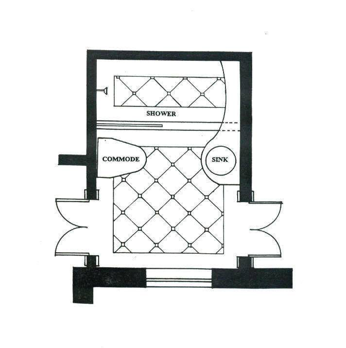
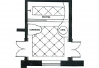
In this plan the illusion of size in small bathroom is created by blurring the line between the vanity and shower and using large floor tiles. Eliminating borders visually signals big space to the brain.
Even kings used to have to put up with simple, utilitarian bathrooms, usually the size of a small closet at best. But during the 1980s and after, the bathroom, especially the master bathroom, became sumptuous. A small home often can�t accommodate this modern fantasy, but sharing a small, impractical bathroom is one of the factors that drive people out of their apartments and into their first houses. Especially in small one- or two-bathroom homes, it is important to make the bathrooms appear large and to make them comfortable for two people to use simultaneously.
You can make a bathroom feel bigger by providing a full-sized mirror over the cabinet. Install a good ventilation fan and whenever possible a window, which adds much needed air and light. A skylight can also make a small, ordinary bathroom feel spacious. Factory-made skylights have become inexpensive enough to consider for even economy houses.
Kitchen
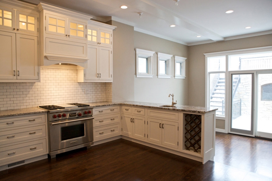
Gourmet kitchens have come into vogue even for families that rarely cook; yours doesn�t need to appear glamorous, just practical and bright. Here a kitchen designer specializing in remodels can help. You will find many clever and practical storage and countertop solutions available for small spaces. If you build your kitchen into the open family space it will appear large and airy even when it�s actually small. Careful lighting and window placement can add to the feeling of breathing space and comfort in a kitchen. When your design doesn�t call for many cabinets, consider a built-in pantry.
Laundry
In a small house, the laundry room can provide an unfinished space for the mechanical equipment and long-term storage. It should be located in the plumbing cluster, near the kitchen and baths. In a slab-on-grade design, place the laundry in a closet off the kitchen or next to a hall bath. A stacked washer and dryer save space, but remember that the stacked version of these appliances can cost a third more than the standard setup and do not vent and plumb as easily.
Storage
Nowadays, extra storage is critical. Take advantage of leftover nooks. I like to explore my new floor plans just after they have been framed looking for areas under stairs, next to garage walls, and between trusses to create �found� storage areas. These claimed spaces add substantial comfort to small homes at negligible cost. Sometimes I leave these spaces insulated but unfinished so that buyers can use them as attic space for long-term storage. Occasionally these spaces can actually add viable square footage, hence value, without incurring the expense of building a bigger home.
Garage
Despite the opinions of city planners enamored with New Urbanism (a neo-village concept favoring pedestrianism, with a strong bias against the automobile), most homebuyers still prefer an attached two-car garage � especially where there�s winter.
Garages are rarely beautiful structures, but you can use your garage as an important element for design variation. This 20 x 20 module provides an opportunity to present elevation changes and a new roofline that can break up an otherwise flat, boring front without incurring the expense of a fully finished living area.
Flex space
Even those committed to downsizing find it difficult to let go of some positions and lifestyle options when actually faced with the compromises that smaller homes require. People feel much more willing to sacrifice certain features if they see the potential to add them later, if needed. Make it easy by designing future expansion right into your plans.
Options for future additions may include commonplace provisions, like blanking off a future bathrooms in a bedroom closet or in the basement.
In warmer climates, design the garage for conversion to a bedroom or rec room by providing an exterior area for a carport in front of or beside the existing garage. Install an unfinished multi-purpose loft that the homeowners can eventually use for an office, bedroom, or rec room. Design a home office that can be converted to a bedroom by adding a closet.
Other options for future space include designing an extra first-floor room addition right into your original plans, even if you�re not going to build it. Provide enough room on site to accommodate the addition and design an easy-conversion passageway to access it with minimum demolition and remodeling. Don�t forget to supply future HVAC and electrical hookups nearby. This flex space allows your house to change in the future. In my PATH Concept Home, we designed the front porch and garage attic as easy conversions to future bedrooms. The small house of today may limit the family later, and having thought through ways to grow the house if necessary can provide the present owner some insurance for change.
Al fresco
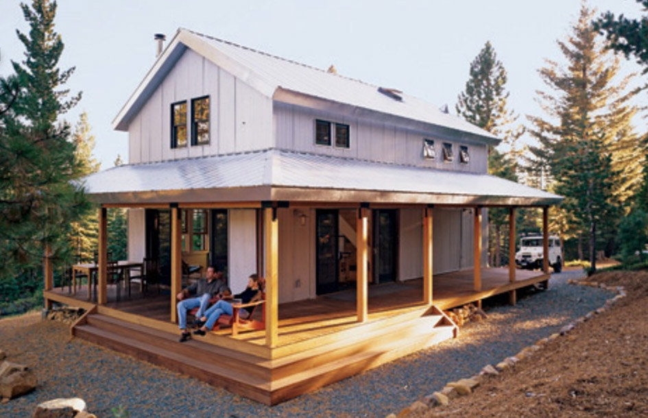
Even those homeowners devoted to small home living still need elbow room. Look for opportunities to offer air space. Inside your house, volume works to make small areas feel big. Scissor trusses accomplish this cheaply, turning small family rooms, dining areas, and kitchens into an expansive multipurpose rooms. You can also make a house feel bigger by adding outdoor �rooms.� A buyer perceives a covered front porch or enclosed atrium as part of the living area of the home � and it�s certainly cheaper to build a nice deck than to construct more interior square footage. Tricking the eye into perceiving an outdoor room on an interior scale works especially well: a 6 x 8 patio seems small from an outdoor perspective, but when you use it to expand the �feel� of an interior room, the 48 square foot addition feels huge.
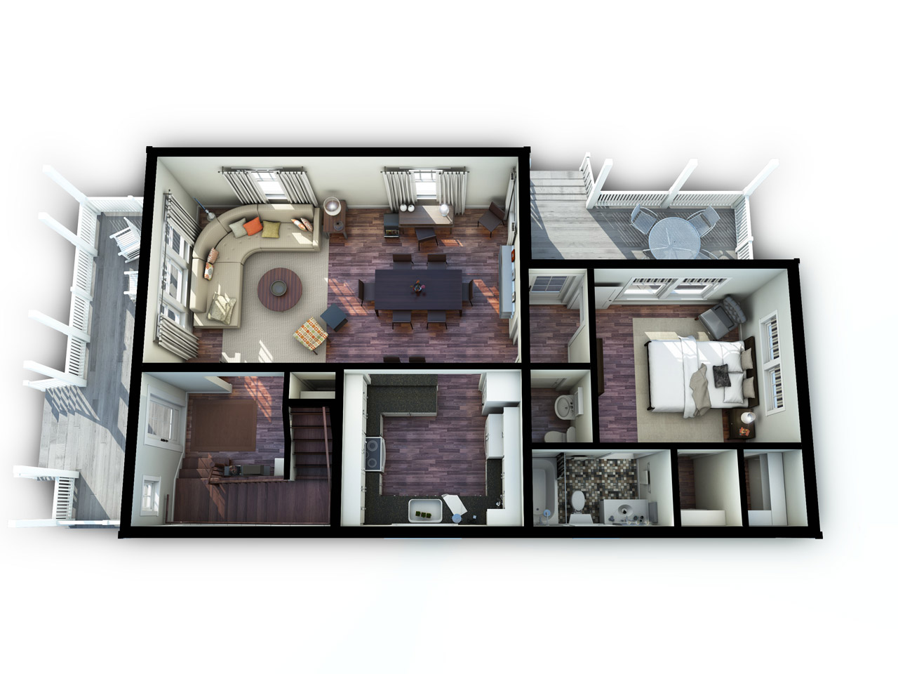
For a tour-de-force of small, efficient design, visit Marianne Cusato�s New Economy Home, which provides an excellent example of a tight but beautifully livable floor plan.

Fernando Pages Ruiz
Homebuilder, developer and author Fernando Pag�s Ruiz builds in the Midwest and Mountain States and consults internationally on how to build high-quality, affordable and energy-efficient homes. As a builder, his projects have numerous awards including the 2008 �Green Building Single Family House of the Year� and the 2007 �Workforce Housing Award� from the National Association of Home Builders. In 2006, the Department of Housing and Urban Development's PATH project chose him to build America's first PATH Concept Home, a home that is affordable to purchase and to maintain while meeting the criteria of LEED for Homes, ENERGY STAR, MASCO Environments for Living, and the NAHB's Green Building standards. A frequent contributor to Fine Homebuilding and EcoHome magazines, Pag�s is also the author of two books published by the Taunton Press: Building an Affordable House: A high-value, low-cost approach to building (2005) and Affordable Remodel: How to get custom results on any budget (2007).
Contact Fernando on facebook or by way of his website buildingaffordable.com.


