In September 2011, publisher Rizzoli New York released The Glass House, a photo tour of Philip Johnson’s famous estate. The book includes text by Philip Johnson himself and by architecture critic Paul Goldberger and is the official Glass House book of The National Trust for Historic Preservation. Robin Hill’s photo “Glass House Dawn” was selected to appear on the book’s cover.
Below is the second of a three-part installment wherein Robin Hill shares his experience of photographing the Glass House estate. Read part one here.
Now I am making my way the few steps toward the lakeside pavilion. Here Johnson is up to new tricks. As I approach the lakeside, I am reminded of the London Underground loudspeaker system, which brusquely ejaculates "MIND THE GAP" every time you board or deboard a train. Instead of designing the pavilion to gently nudge the shoreline, there's this intentional but irritating gap that Johnson has deliberately placed in one's way. Why? My first thought is "to mess with your head" or perhaps it is to make you pay attention. OK, so now I'm paying attention, and the impression is that ordinary scale has been obliterated by the architect's hands. This is a perfect modern folly. It is barely functional, save to sit underneath and have an uncomfortable picnic. Through these photographer's eyes excellent framing opportunities are created by the multiple archways. The visual pun is too obvious for my taste, however, and the pavilion does nothing for me in an architectural sense. I begin to feel that this is a dud, a Johnson experiment that doesn't really work very well in either form or function. Perhaps, this is indicative of Johnson's uneven career as an architect, brilliant one minute and mediocre the next. In the space of a few steps I have gone from momentous elevation to ungarnished mediocrity, from design excellence to controlled vacuousness. Still, the adventure of being here leaves my intellect alone for a while and I am left in solitude in the middle of a 46-acre design campus. Heaven! There is a serenity here that is both palpable and meaningful.
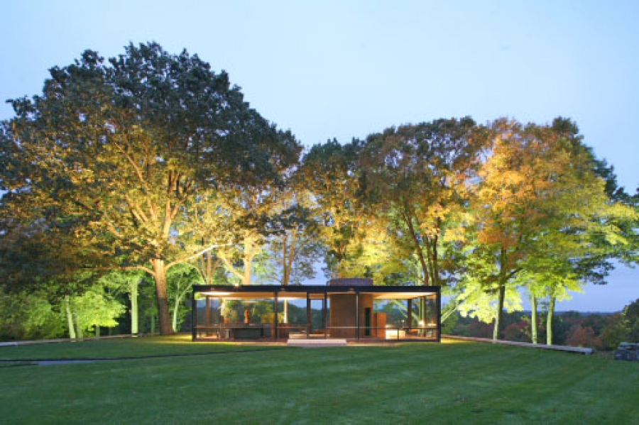 Image copyright Robin Hill ©
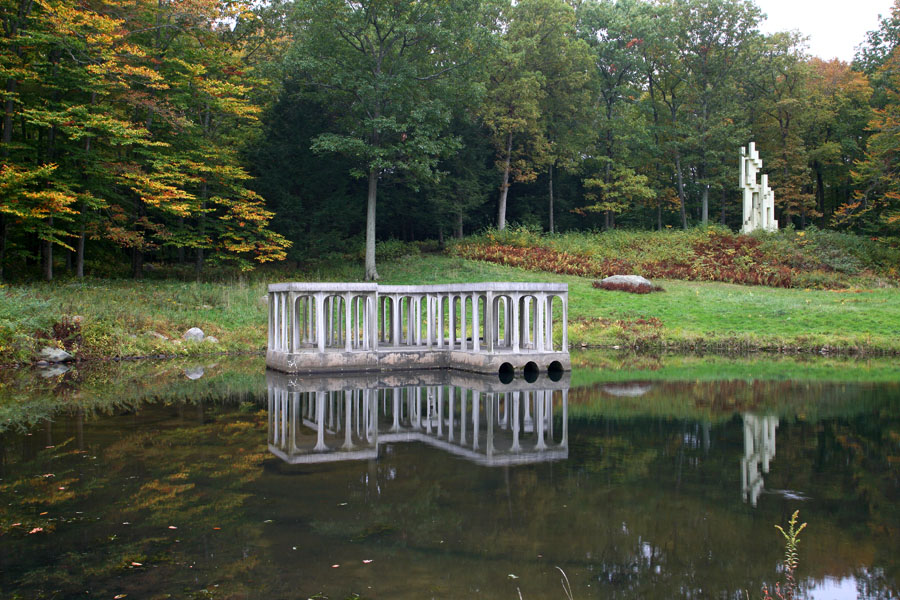
That meaning will have to wait for further exploration, until this experience has subsumed itself into my fibers, because I am now off on a different tangent, intent on navigating myself to the next location, which is the Ghost House. In this rarefied atmosphere I am half expecting an encounter with a spectral Johnson. Now if I could only photograph that! My thoughts return to more earthly matters and the living architect that the Ghost House celebrates, Frank Owen Gehry. Johnson and Gehry were friends, and Johnson famously championed Gehry's architecture. In 1998 I saw both of them on Charlie Rose entering Gehry's Guggenheim in Bilbao, Spain. Johnson entered the lobby and tears were clearly streaming down his cheeks. It was not an affected moment. He was clearly moved by the architecture. The void of space had entered his pores and the awesome power of Gehry's paradigm-shifting architecture had rattled him. That, however, is another story, and this story brings me back to a small shed made of ordinary chain link fencing designed in homage to Gehry's own house in Santa Monica. The Ghost House is open to the elements and now covered with vines and beckons exploration. There are no ghosts here, but there is evidence of great intellect and learned design, of pure geometry and deconstructivist ideas, of open minds and deliberate poise. The Ghost House breathes more than any other structure in the Glass House complex. It changes with the seasons and interacts with nature. It is, in its own way, an organic piece of architecture. It does not surrender itself to the usual laws of shelter; it is existent in its own paradigm, a reflection of the man to whom it pays homage.
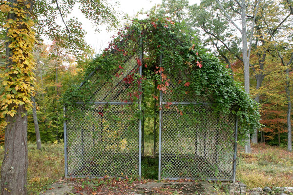
Johnson's simple design reminds me of Robert Venturi's Vanna Venturi House (or Mother's House), but it is really Gehry's baby. Who else could inspire such architecture made of chain link fence? The Ghost House is at once both a bit of a prank and an architectural conundrum. It serves no real purpose, save to acknowledge the capacity of architects to play with form. And why not? Why not serve only the tenet of delight? It is with this last Vitruvian thought that I exit the Ghost House and head uphill to the library.
Poised mid-slope and currently painted a somewhat mediocre shade of brown (not always the case), the library is a simple and beautifully lit space, with a Gehry chair at Johnson's desk overlooking the Gehry-inspired Ghost House. Above the desk is a skylight, and rows and rows of tomes on architecture line the walls. I start to scan the selection and find that Johnson's range of reading in architecture is a real panorama of its many and varied practitioners. There's Urban Space by Rob Krier (an early exponent of new urbanism) as well as Koolhaas's OMA: Essays in Architecture – opposing viewpoints in the space of the same box in row 4, column 5. It is at this point that I realize that Johnson's mind was a true wide angle: not the average 28mm with a viewpoint of 80 degrees, not even the traditional 180-degree fisheye, but a full-on 360-degree panoramic that takes in everything. Of that fecund soup, he manifests new viewpoints and extends the realms of architectural thought and practice into new areas. Now if only his political thought of the 1930s could stand up to such a wide view, perhaps he would be more fondly remembered. Still, I am on the hunt for architecture, not politics, and my eyes return to the bookshelves: Zaha Hadid, Melnikov, Loos, Michael Graves, the inevitable Le Corbusier, and too many others to list. And there, of all the books that are stacked in vertical manner, sits Moby Dick, conspicuously perched on the horizontal like a lintel stone atop the massive sarsens at Stonehenge. I find this curiously invigorating. It is the only novel in the place. How novel, I thought!
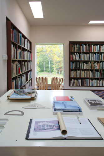
I am now sitting at Johnson's desk, alone and pondering the compelling silence and how well appointed this place is for pure thought. There are no distractions. It is a temple to knowledge. A vibrant atmosphere of intellectual curiosity fills the space. It actually FEELS intelligent.
Three shallow steps greet the entrance to the library, rather similar to the two steps that lead up to the Glass House itself. I find the spacing of the steps particularly inviting. They slow me down as I cross the threshold from one world into another. They act like a small bridge, an easily overlooked detail that might pass many by, but I am fortunate that my chosen vocation keeps me looking and searching for God in the details. My library visit has come to an end, but my journey continues.
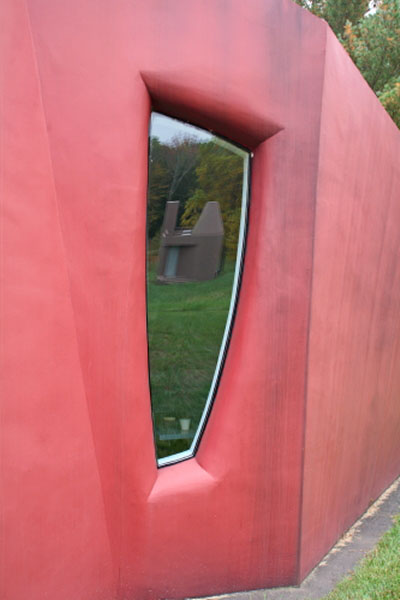
I am like a spacecraft that visits many planets and uses the gravitational pull from one planet to pull me to the next, and on this journey the next planet is unlike any other I have visited. It is the Pluto in the solar system of the Glass House complex… an outlier, living in the space between sculpture and architecture. It is "Da Monsta"! A red, angular, unshapely cocoon of a "building" and the last to be finished in 1995, it represents Johnson's climactic period of architectural exploration. Its free-form geometry on the outside is dynamic and visceral, formative and sound. Step inside, though, and the atmosphere changes dramatically. I feel like I have been thrust onto a ship that is lurching violently to one side in a storm. Normal perception of space has been thrown out the window. There is a sense of chaos herein. I am very uncomfortable in this place. It is not soothing or peaceful, but torrid and perplexing. (Its space shifts hither and thither.... arghhhhhhhhhh! I have to get out! And I do so in short order.) I recognize in this episode that for architecture to move forward, it has to experiment, and that this is a perfect place for experimentation to be undertaken. Often, as any scientist will tell you, experiments fail before they succeed (how else to get at the truth?). Da Monsta delivers as a sculpture, but as a work of architecture it needs to be appreciated after consuming certain mushrooms. And there are none on the menu today. In my mind Da Monsta is just like Pluto – beyond categorization. Perhaps that was Johnson's point. My exit from Da Monsta leads me around its base to view the window, within which is reflected the library.
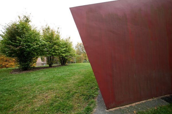
The Glass House complex is full of these visual surprises and all are by design. The window is a seriously odd shape that bends on its vertical axis as it tapers down to its conclusive horizontal plane. The resulting reflections are somewhat distorted, like looking in a house of mirrors at the local fairground. The reflected library now incorporates a skeletal tree rising above the roofline, like a trail of smoke exuded from a chimney. Da Monsta is red. Stop signs are red. Ferraris are red. There is a reason for this: red attracts our attention first and urges us to consolidate vision on the subject matter. Photographers often look to the color red to make a statement, to bring the viewer into the picture. It awakens an assertiveness inside us that screams “Stop!” In my photographer's guise it is the most obvious color, the one above all others that must be used sparingly and well. Da Monsta certainly makes one stop in one's tracks. It exudes assertion. It is not to be messed with. It says "You lookin' at me?" Through these photographer's eyes the emphatic answer is "I can't stop looking at you!” You are like the unapproachable duchess at a party. You cannot be known. You are aloof and detached. You are not quite of this world, but don't expect me not to look at you – you are red! With this notion in my head I am now determined not to let the red duchess overload my perceptions. She is monumental and fractured. So I move away and develop a new conversation where she is no longer the center of attention, but a guest star in an extra's role. However, she is arrogant and aggressive and does not want to be pushed to the sidelines. Back she comes into view, thrusting herself into the limelight. Who is she? Why does she keep intruding into my composition? At this point I have to surrender. She is powerful and I allow her half the frame.
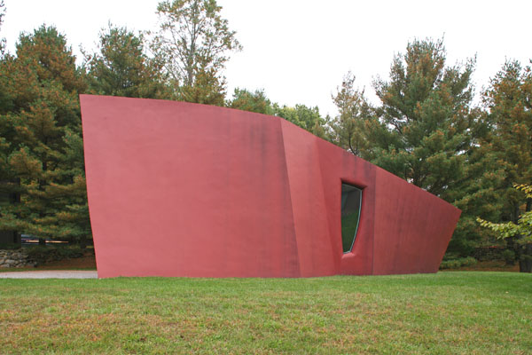
Her frozen brow stoops into the picture like the Titanic's prow, all pomposity and thrusting drive. Love her or loathe her, she cannot be ignored. I am now thinking of Alex Forrest, as portrayed by Glenn Close in Fatal Attraction, whose legendary line "I won't be ignored, Dan" comes chillingly to mind. Da Monsta is well named! I am now a few feet away from her, but it is her polite neighbor that still attracts my attention, in particular the way that she (the library) is so classically framed by the well placed trees. It’s no accident, and I love that Johnson was able to see all these wonderful visual connections between the architecture and the landscape. It’s a beautiful juxtaposition. Da Monsta has lost her menace and, despite filling half the frame with red, she cannot hamper the intricacies of interconnectedness within my composition. Da Monsta was originally intended to be the visitor's center, so therefore it sits in close proximity to the gate. It is a short walk, just a few steps along the path, and between the gap of a low-slung New England stone wall the gate becomes apparent. Before I reach the gate, I recognize the presence of long sinewy branches of cedar trees, that almost interconnect across the gap in the stone wall. Their vigorous horizontality is alluring and adds a welcoming silhouette to my composition. The library still shows its polite face even from here, and Da Monsta has been camouflaged to become another less threatening character.
This is the second of a three-part installment wherein Robin Hill shares his experience of photographing the Glass House estate. Stay tuned for part three. In the meantime please visit robinhill.net for a closer look at his photography. All content in this article is copyrighted to Robin Hill ©.

Robin Hill
Originally from Nottingham, England, Robin Hill is an architectural photographer based in Miami Beach. Over the last 25 years his photography has been published in many of the world's leading design publications including Architectural Record, Landscape Architecture Magazine, Garden Design and Vanity Fair. His photographs of Frank Lloyd Wright's Florida Southern College were included in the Guggenheim's 2009 exhibition, Frank Lloyd Wright: From within outward and his photographs appear in numerous books including MiMo: Miami Modern revealed (Chronicle 2004), Miami Architecture Guide (University Press Florida) and The Glass House (Rizzoli 2011). Much of his work is dedicated to Historic Preservation and his photographs have helped in Miami/Miami Beach to create the North Shore and Normandy Isles districts, which are in the National Register of Historic Places, and the North Beach Resort and the Morris Lapidus/Mid 20th Century districts, both designated historic on the local level.
Website: www.robinhill.net
