Urban Redevelopment: 1111 Lincoln Road
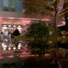
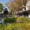
Not long ago, 1100 Lincoln Road was just another city block in Florida, with all the trappings one would expect: heavy traffic, wide medians, and lots of palm trees. Developer Robert Wennett saw that it had potential -- especially considering its history as Miami’s one-time commercial center (its revitalization occurred in the 1990s) and its link to the city’s most well-known architect, Morris Lapidus. The site is at the western end of Lincoln Road’s eight-block promenade, which runs perpendicular to the waterfront. Known as 1111 Lincoln Road, the main part of the urban redevelopment consists of a plaza flanked by three major buildings.
 Credit: Damian Wohrer
The One-Time “Fifth Avenue of the South”
The economy of Miami Beach suffered many ups and downs throughout the 20th century, but from 1920 through the mid-1950s -- with a building boom that peaked in the 1930s -- it was in its prime as a resort town. Varying, and sometimes competing, architectural styles characterized this time period.
An outgrowth of the International Style known as Tropical Modernism popped up in equatorial regions ranging from Hawaii to Brazil. This architecture represented an adaptation to local climate and usually included an open plan (sometimes consisting of merely a roof with no walls) and the clear expression of the building’s structure. In Miami Beach, however, the prevailing style was established by Lapidus, whose twist on modernism was flamboyant, sensual, and theatrical. Buildings in this style, known as Miami Modern, or MiMo, tended to favor curves over linearity and ornamentation over austerity. Needless to say, MiMo was ridiculed by proponents of the stark International Style.
In addition to numerous iconic hotels along the beachfront, Lapidus designed an outdoor shopping mall along Lincoln Road. Some of his trademark elements still survive along the route today, but in the 1100 block, Lapidus’s work was destroyed when the road was opened to vehicular traffic.
“The planter and garden shapes are based on movement. They allow pedestrians to pass from one side of the street to the other, so this part of the road doesn’t have its pathways blocked by restaurant seating and such, as some of the other parts do. Also, the benches are different heights and shapes, to help choreograph movement.” Raymond Jungles
The designers that Wennett assembled, landscape architecture firm Raymond Jungles, Inc., and the Swiss architecture firm of Herzog & de Meuron, took inspiration from both Tropical Modernism and Lapidus’s work. “Robert [Wennett] conceived reclosing the block,” says Raymond Jungles of the eponymous landscape architecture firm. “So we, along with the designers from Herzog & de Meuron, drew up a conceptual design. It had to be approved by the Historic Review Board.”
The site is at the western end of Lincoln Road’s eight-block promenade, which runs perpendicular to the waterfront. Known as 1111 Lincoln Road, the main part of the development consists of a plaza flanked by three major buildings. On its northern side is an extension of the landscaping, a new bank building with apartment units, and a 1930s-era bank building (now a Banana Republic store).
Tying It All Together
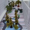
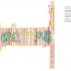
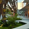
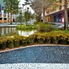
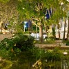
Uniting the entire site is a paved and lushly landscaped pedestrian zone. “There is a natural/urban theme,” says Jungles. Stripes of black and white pavement in varying widths create a rhythm and readability for the entire development. “They add energy to the space,” says Jungles. “I initiated the pavement scheme for the plaza, but it was our colleague at Herzog & de Meuron, Christine Binswanger, who suggested extending it to the north and south. This added a lot to the concept.” The stripes are composed of Pedra Portuguesa (Portuguese rock), which is commonly used in Brazil.
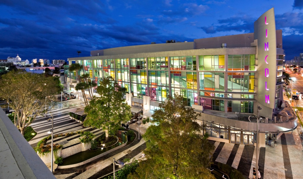
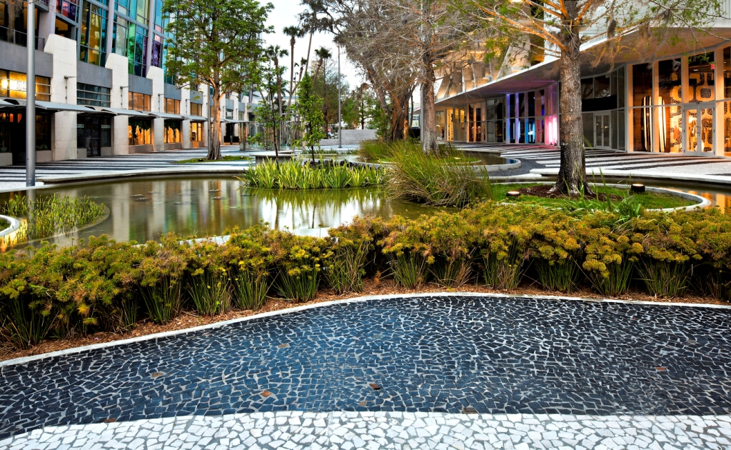
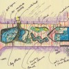
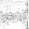
Within the plaza, Jungles placed several free-form elements that direct the flow of pedestrian traffic, establish sightlines, and provide venues for activities. Referencing the work of Brazilian landscape designer Roberto Burle Marx, Jungles designed these elements utilizing what he calls “organic geometry.” “The planter and garden shapes are based on movement,” he explains. “They allow pedestrians to pass from one side of the street to the other, so this part of the road doesn’t have its pathways blocked by restaurant seating and such, as some of the other parts do. Also, the benches are different heights and shapes, to help choreograph movement.” Jungles says that he always begins a layout with sketches, and space design is then spontaneous. “I look at where there should be open sightlines and where someone could sit in the shade. Volumes and circulation then lead to specific shapes.”
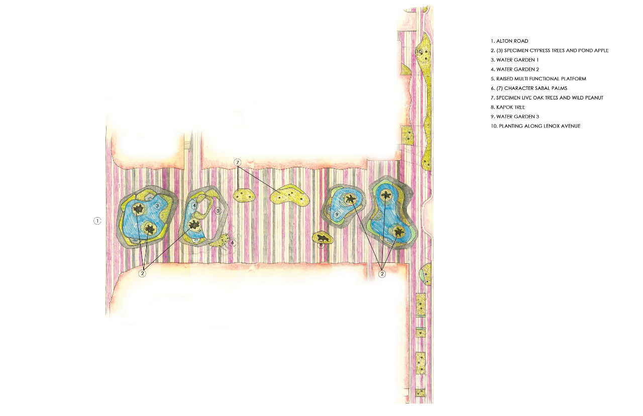
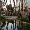
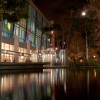
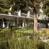
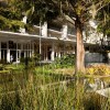
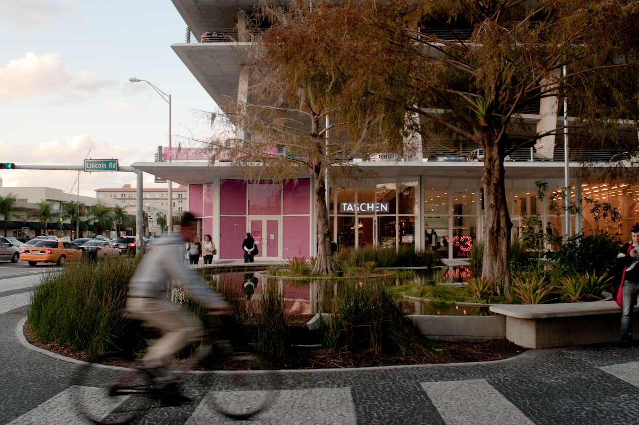
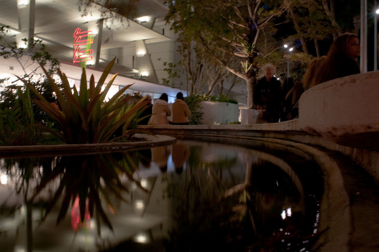
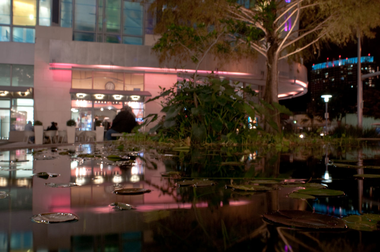
Four water gardens provide the dominant features of the landscaping scheme. Jungles replaced palm trees with plants that are native to southern Florida. “Wherever I build, I like to elaborate upon the native plant palette and link in with natural systems, attracting birds and other wildlife,” he says.
“The buildings along the plaza are taller than typical buildings in the area,” continues Jungles, explaining that this made it difficult to link the northern portion of the redevelopment. “We really needed to choose tree locations carefully, because the surrounding buildings block the sun. We did get some trees located almost in the center; we put in Sabal palms, which are tall enough to get light.” Oaks, cypresses, red mangroves, and Guyana chestnuts widen the range of species introduced to the space. Underneath the plaza are soil compartments capable of storing enough soil to support the large trees.
Working with What Was Already There
The fact that Wennett didn’t want to demolish any of the existing buildings along the block meant that, in some instances, the designers had to make their references to the road’s architectural history quite literal. In particular, a massive Brutalist bank, with its 1960s-era defensive stance, provided a challenge.
It fell to Herzog & de Meuron to rework the bank building and integrate it into the pedestrian-friendly surroundings. They left the white volume largely unchanged, except for opening the first two stories to install a more approachable, glazed retail floor. There is now also a restaurant atop the building. The banking institution itself was moved to the more modest two-story structure facing Alton Road, which the architects designed specifically for the SunTrust relocation.
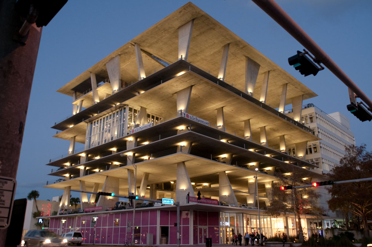
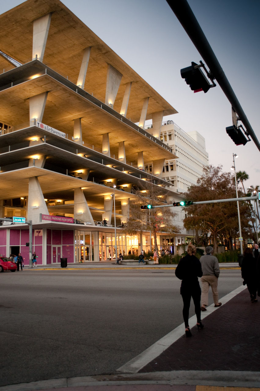
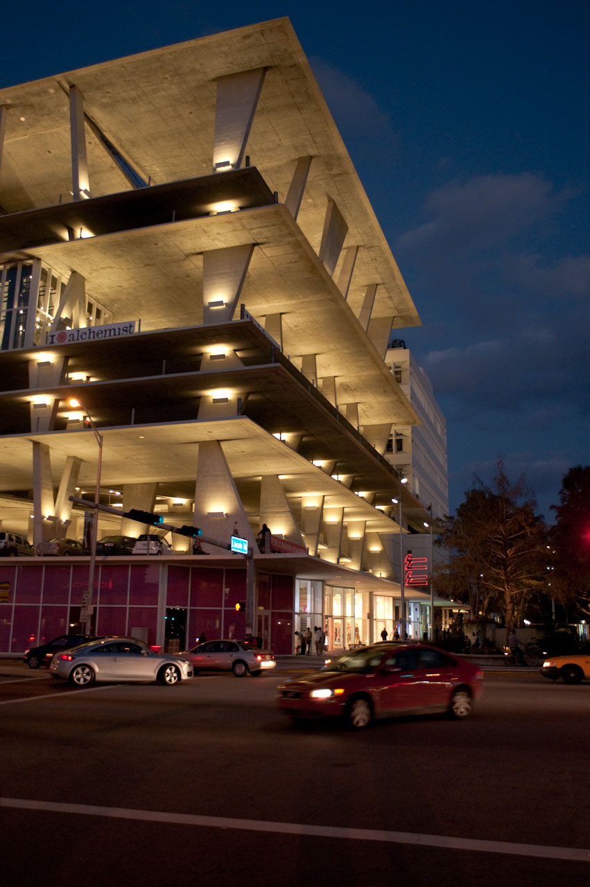
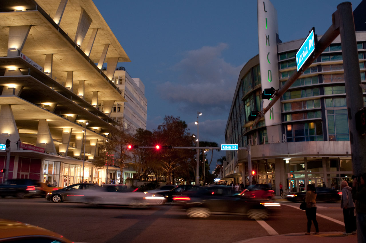
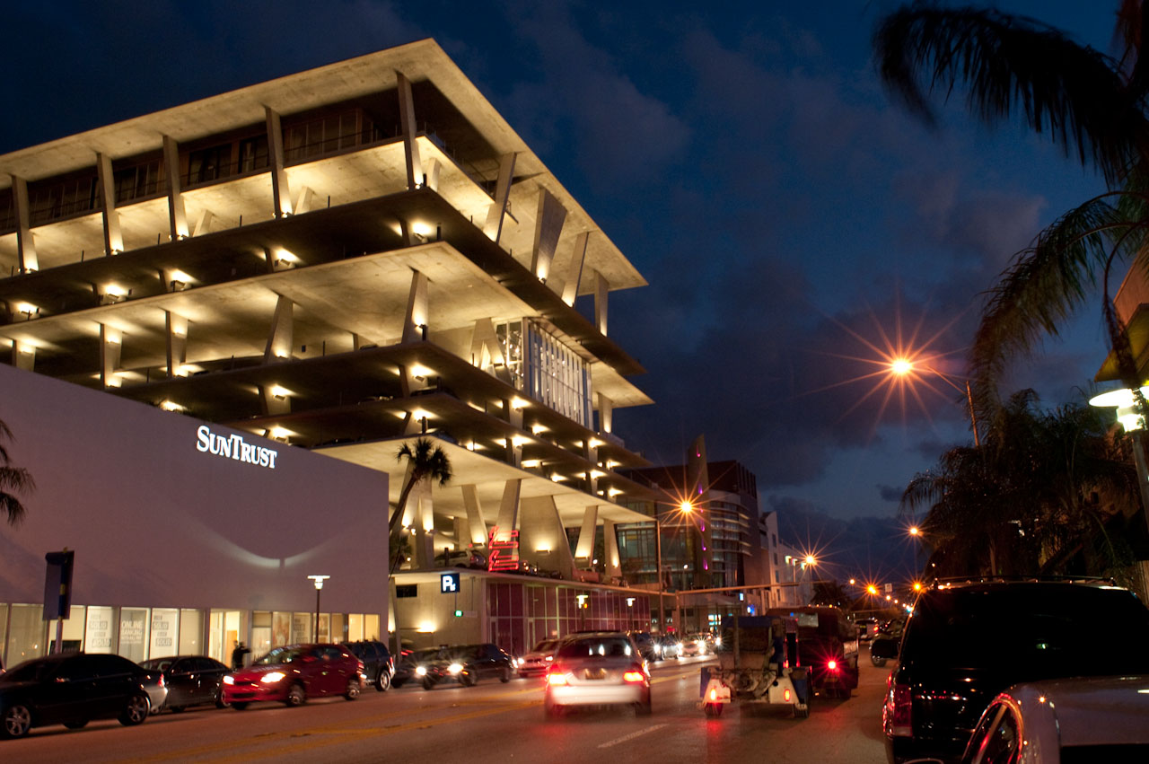
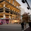
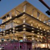
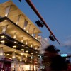
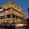
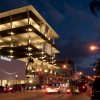
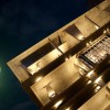
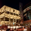
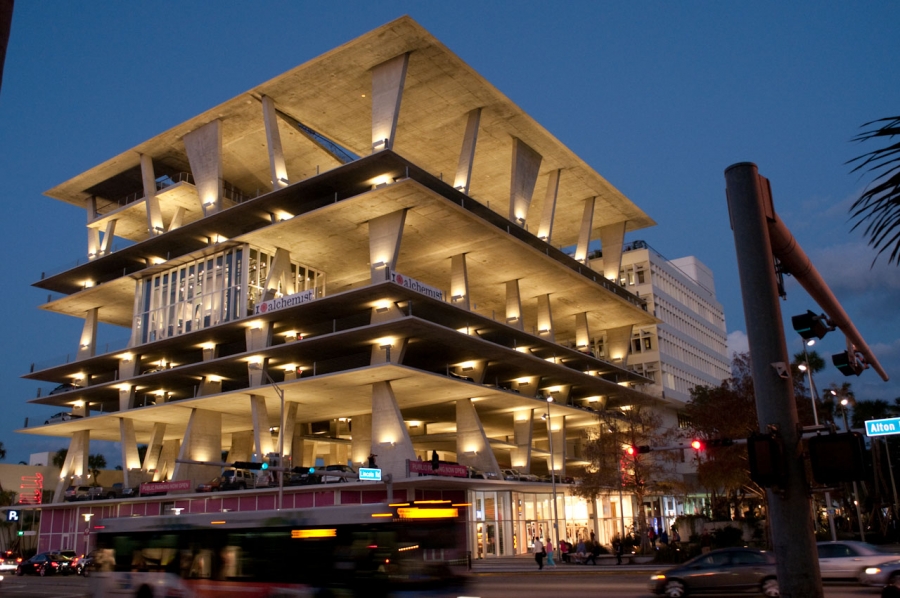
Herzog & de Meuron agreed to design a parking garage that would extend the old SunTrust bank and replace an existing surface parking lot. Because of the ambitions of the overall development, they designed a building that is much more than a typical garage. They leveraged the strengths of the building type -- its monumentality and visibility -- but avoided its usual weaknesses; the parking garage at 1111 Lincoln Road is not over-scale, under-articulated, or repetitive. In fact, it has become the defining piece of the development.
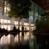
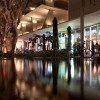
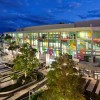
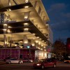
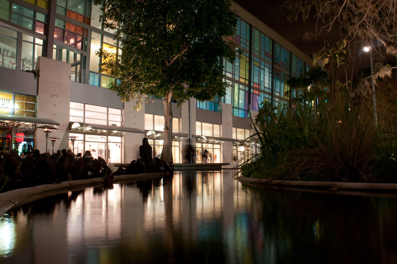
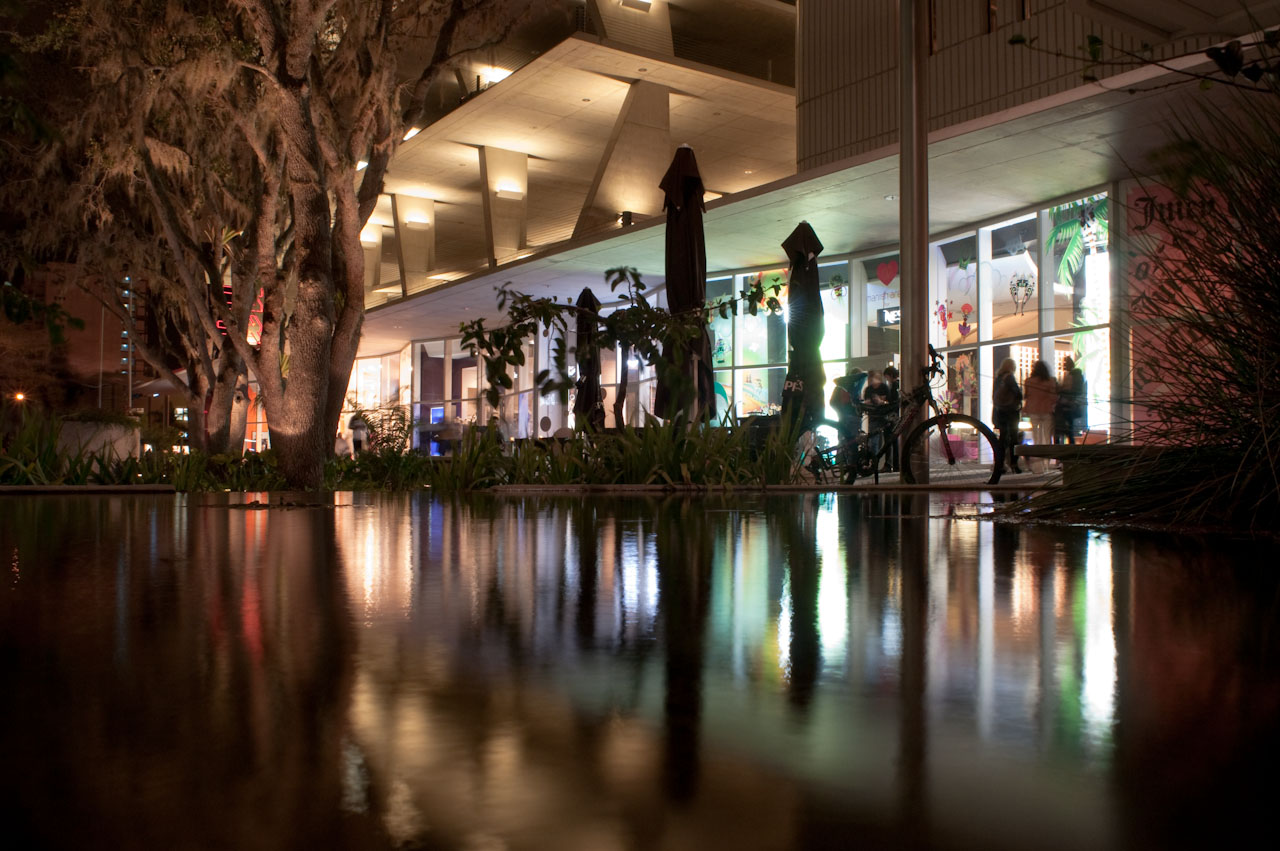
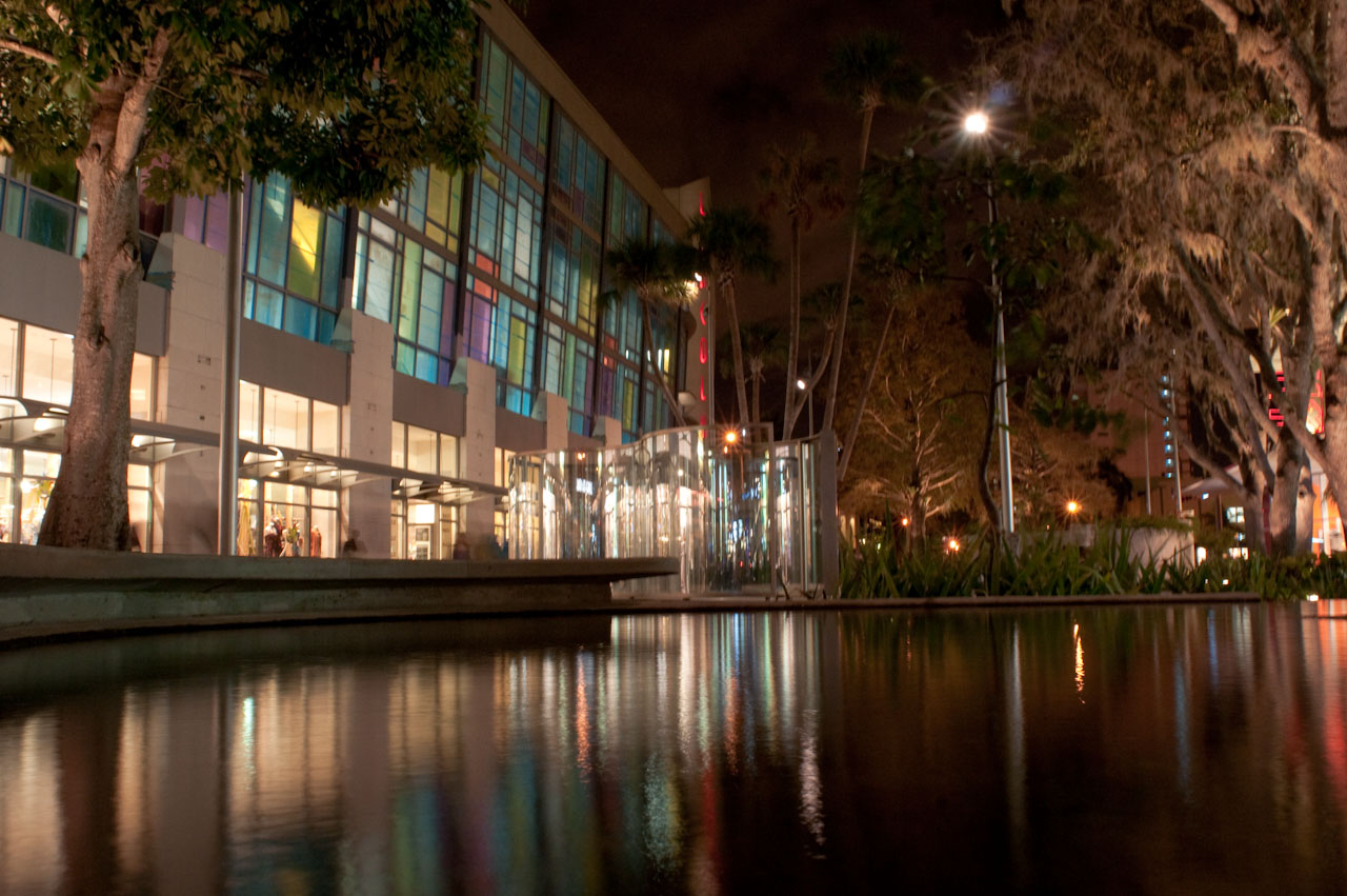
Programmatic elements are embedded in the parking structure, enhancing its functional repertoire, and some structural sleight-of-hand increases its expressiveness. A glazed ground floor houses retail and provides a street-level continuity with the retail strip of the SunTrust building. Although transparent, the veil of glass provides a visual base for the parking structure, its plinth-like aspect becoming especially apparent at night, when the shops are lit from within.
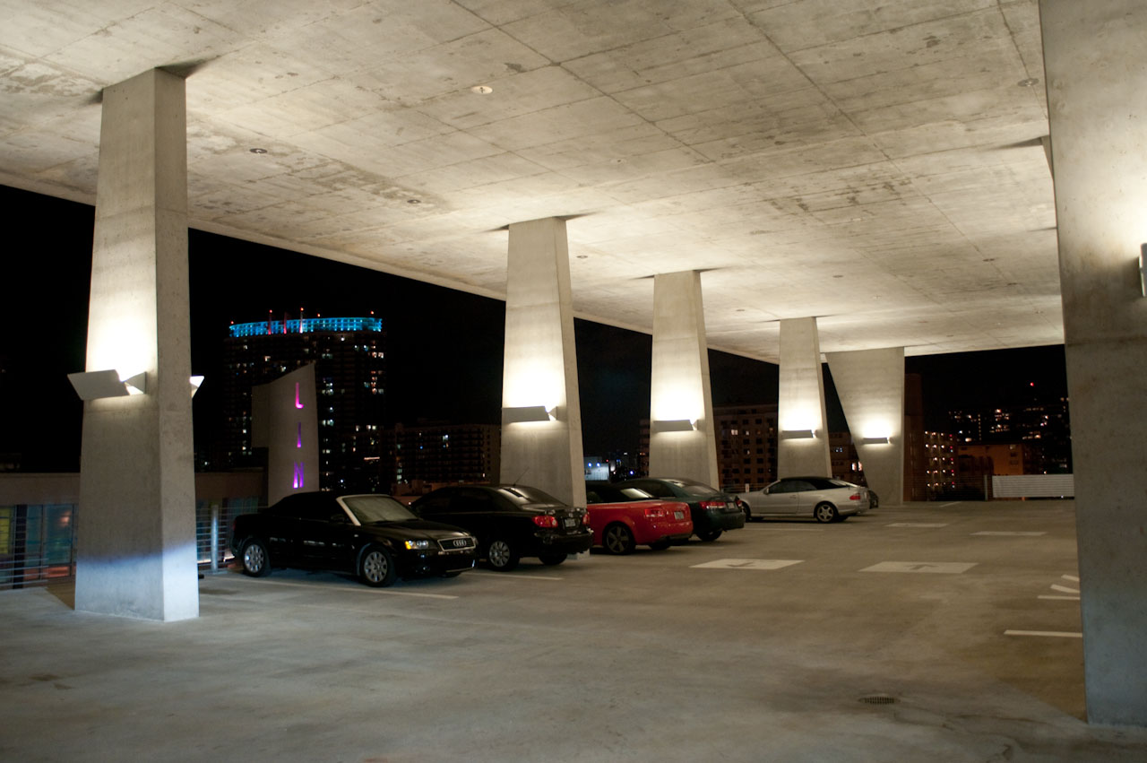
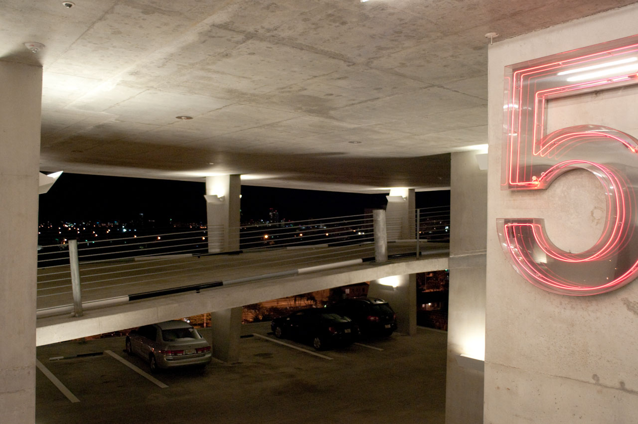
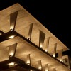
Above this base, floor slabs seem to hover, varying in their floor-to-ceiling height for a more dynamic effect. In fact, Herzog & de Meuron successfully lobbied for a zoning variance that allowed them to add overall height to the garage without increasing the number of stories. Now the “extra” height of the second, fifth, and seventh floor levels defines spaces so compelling that it is used as a selling point: it is hoped that events (even wedding receptions) will take place here.
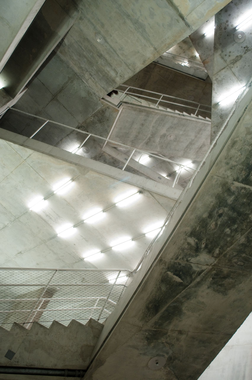
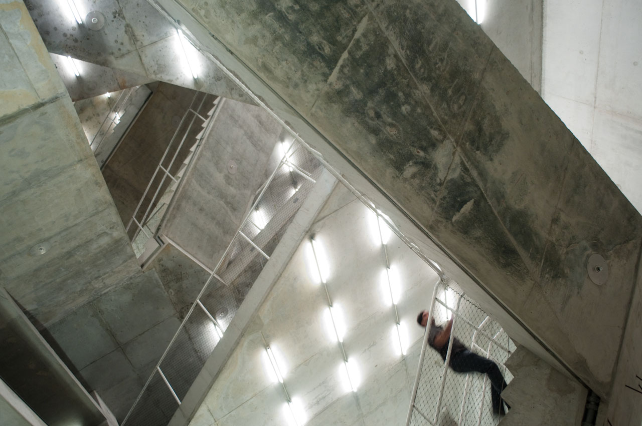
The building is constructed exclusively of concrete, staying true to the parking garage vernacular, but the broad, irregularly shaped wedges that support the floor decks break with tradition and begin to speak to the flamboyance of the Miami style. The decking itself tapers at the edges, to give a more delicate line to the strata. Moreover, the decks are offset from one another, so that they do not form a flush line in elevation. This variance in the building’s perceived edge gives it a bit of visual “shimmer.” A courtyard apartment for Wennett is tucked in at the top floor, and winking out from the fifth floor is another jewel of glazed retail space, keeping the scintillating movement of the pedestrian environment alive even at these upper levels.
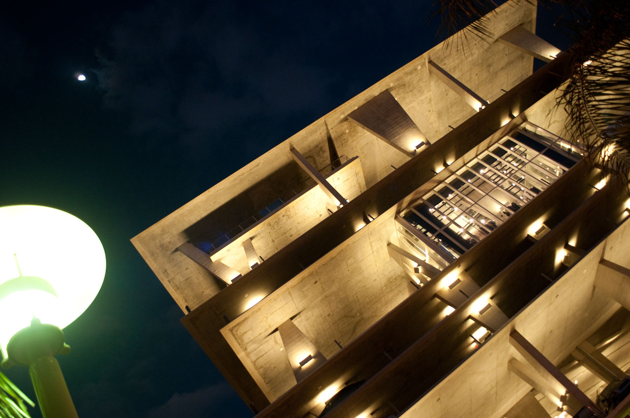
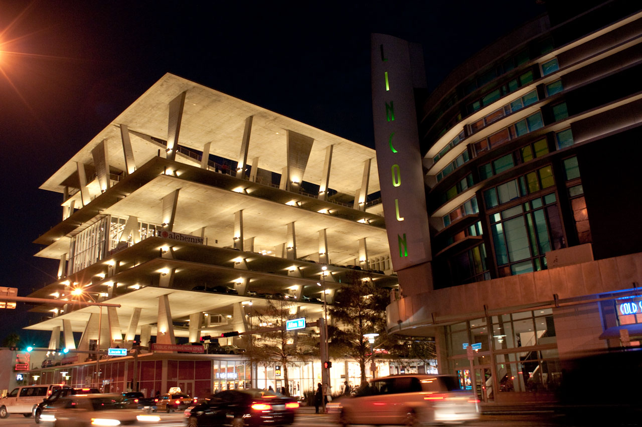
A wash of color had already been introduced to the streetscape as early as 1999, when the Lincoln Cinema opened. Zyscovich Architects won a 2001 AIA Florida Design Award for the building, which utilizes colored glass panels in a Mondrian-esque arrangement to add energy and visual excitement to Lincoln Road. Today the cinema facade provides an integral piece of the promenade experience.
For a city that built its reputation on color-glazed spaces, architectural theater, and, well, shimmer, the revamped 1100 block is a fitting effort at rebranding Miami for the next generation of tourists and residents.

Kristin Dispenza
Kristin graduated from The Ohio State University in 1988 with a B.S. in architecture and a minor in English literature. Afterward, she moved to Seattle, Washington, and began to work as a freelance design journalist, having regular assignments with Seattle’s Daily Journal of Commerce.
After returning to Ohio in 1995, her freelance activities expanded to include writing for trade publications and websites, as well as other forms of electronic media. In 2011, Kristin became the managing editor for Buildipedia.com.
Kristin has been a features writer for Buildipedia.com since January 2010. Some of her articles include:

