An Interview with Stuart Silk Architects: What Makes for Commercial Design Success?
What are some of the challenges � and pathways to success � when it comes to designing commercial architecture?
Stuart Silk Architects, based in Seattle, Washington, has more than 25 years of experience producing residential and commercial architecture. We spoke with John Adams, AIA, Principal of Stuart Silk Architects, to learn more about the latest challenges associated with commercial design. Although commercial design certainly has its nuances, his firm has successfully bridged residential and commercial design with a simple and unified insight: the client is always passionately and personally invested.
 Image courtesy of Stuart Silk Architects
What are the considerations that come into play when designing for commercial versus residential environments?
Regardless of whether we are working on a commercial or a residential project, the client relationship is at the core of what we do. We take a very personal, intimate approach and really get to know our clients, spending time after hours with them and their families. It�s important for them to know that we care deeply � that we �get� them.
We have a well-respected residential practice, and this residential custom-home mentality spills over into our commercial projects. Our commercial portfolio mostly consists of smaller, design-oriented projects in the 30,000 square foot range, so our clients tend to have a different mindset than those who build skyscrapers. Ultimately, this is their project, their baby. They are personally invested. It�s the same kind of personal investment whether we are building an office or someone�s home.
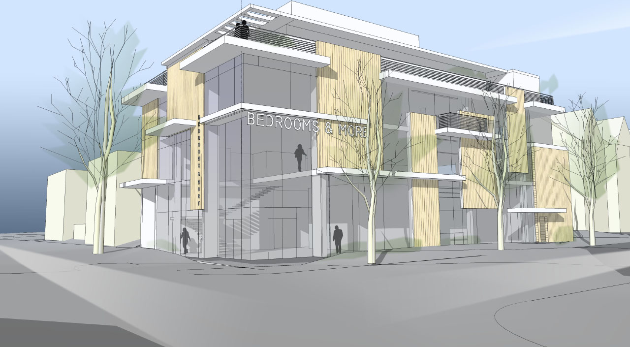
In spring 2012, Stuart Silk Architects is scheduled to begin construction on Bedrooms & More. The structure�s exterior design features abstract layers of sheets and other materials inspired by the retailer�s bedding and mattress offerings.
How has commercial design evolved in recent years?
Today, the process has slowed down and is much more complicated and considered than in years past. And our clients are much more value-conscious and risk-averse.
However, our clients still want to build and are committed to finding creative ways to make it work. For them, it�s about giving back to the community and leaving a positive mark. Ultimately, they want those who work in or visit the building to enjoy the experience.
For example, we now spend more time on naming and signage than in the past, because we realize that the structures we�re building are part of the community. Identity is more important than ever to our clients � not only for their own personal businesses, but because they are impacting the city and making it a better place.
What types of materials do you frequently specify for commercial projects?
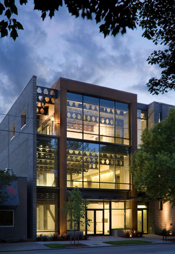
Inspired by the character and design of its surroundings, the 14,000 square foot Orion Dental Building in Seattle is distinguished by a contemporary weathering steel feature that is designed to gain a patina with age.
We like to utilize what we call �living materials� � materials that are made to last, such as glass, stone, rusted metal, and masonry. We try to avoid painted material or anything treated after the fact. And we try to choose materials that offer inherent color, [gain a] patina naturally, and don�t require much maintenance.
When it comes to interiors, this really becomes more of a personal expression of the tenants and can vary drastically from project to project. This is where commercial tends to become even more like residential � we sit and talk about colors, feeling, and texture. It�s very personalized. No one wants to see miles of painted drywall; you need elements like wood texture, slats, textiles, or pattern to add visual interest.
Also, we like to focus our energy on the 20% of the structure that will have maximum impact on tenants. For example, we typically invest the budget and our energy on common areas, such as staff kitchen and dining spaces and then carry the design throughout the remaining 80% of the structure in a simplified, straightforward manner.
Finally, we often allow the location and environment to help inspire material choices. For example, on our Salmon Bay Landing office design project, we studied the technology and metallics of various types of glass and selected the one that best reflected the water and complemented the overall design of the structure.
Do you have a list of standard green practices and features that you incorporate into each and every commercial project?
We tend to approach green building according to three different categories. First, we have the low-hanging fruit. No matter the project, we incorporate certain features because the cost is minimal and it�s just good building practice. Items that fall into this category are low-VOC paints, LED lighting, and walkoff mats in entry halls that are designed to control dirt and improve air quality.
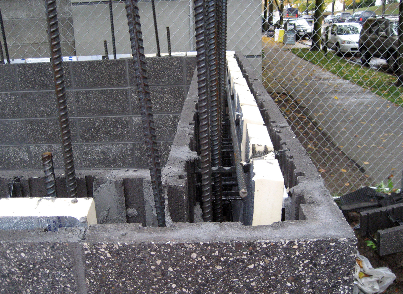
Stuart Silk Architects utilized sustainable CMFU blocks in the design of the Orian Dental Building in order to provide insulation and waterproofing, as well as to create additional interior space. This is the first time a CMFU system has been used in commercial architecture within the Pacific Northwest.
The second category includes features that may have a significant upfront cost but offer a demonstrable return on investment. One recent example is an exterior party wall that we built from CMFU (concrete block with insulation properties). Although the material required a significant financial investment, we were able to utilize it as an internal finish material and add another 400 square feet of rentable space. So this material choice made sense because it paid for itself quickly.
The third category is what we consider �pie-in-the-sky� offerings. These features don�t necessarily offer a demonstrable financial return, but they give the client a feeling of personal satisfaction and may help boost the company�s image. An example from this category would be a geothermal well. It may not pay for itself for 30 years, but the client sees it as the right thing to do.
What are some of the biggest challenges that you face on the commercial side of your business?
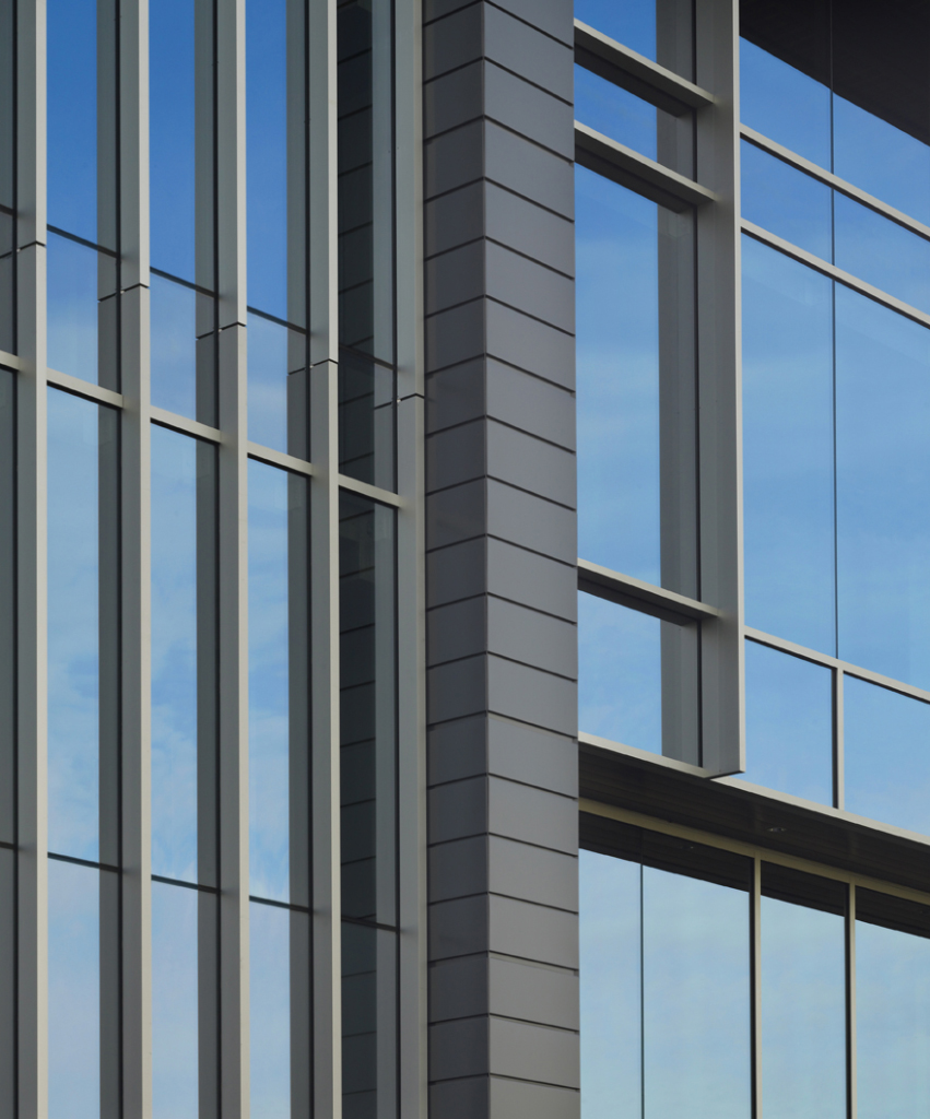
The LEED Silver certified Salmon Bay Landing building features walls of gray-toned, slightly mirrored glass, diligently selected to reflect the waters of the adjacent canal and silver-colored skyline.
Our biggest challenge has to do with timelines, as a result of working with the city. Due to the economy and understaffing issues, it�s often difficult for the city to be as responsive as we need them to be. Our clients are paying mortgages on empty, undeveloped property, paying rent for current space, carrying costs for taxes, and are paying us as a consultant. As time clicks on, these expenses can become a financial burden, especially for a smaller developer. Most developers are budget-conscious, so it can become a major challenge to their finances if the project falls behind schedule due to approval delays.
The second biggest challenge we face has to do with project financing. It can be difficult for a client to secure financing without drawings and a detailed budget, because lenders need to know the cost of developing the project early in the process. Yet, clients are hesitant to spend the upfront costs associated with preparing detailed plans unless they are certain they will achieve appropriate financing. It�s somewhat of a chicken and egg dance�you have to find that sweet spot and continue moving forward little by little, without getting ahead of the bank.
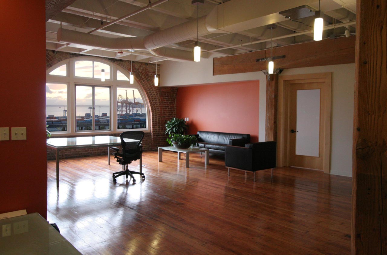
Color and light were used to efficiently transform a former furniture factory into the vibrant offices of Tiger Oak Publications in Seattle. Shared spaces, such as the meeting areas and lunch room, feature exterior views and natural light.
Many of the clients we work with are building urban infill projects within the city. So another challenge we regularly face is the ambiguity associated with code requirements and zoning regulations. Many of the codes are problematic because various codes in play don�t always align, or because the code is ambiguous and left to interpretation. On almost every project, we are forced to go to the mat due to codes that are either outdated or need to be redefined. It can take a lot of time to influence code changes and address the environmental issues that preclude development � and time means money for our clients.
Despite these challenges, in the end, we must adhere to a bottom line and a budget. So we often find ourselves having real, very direct conversations with third parties on behalf of our clients. This process can be intense, but we find a way to make it work.
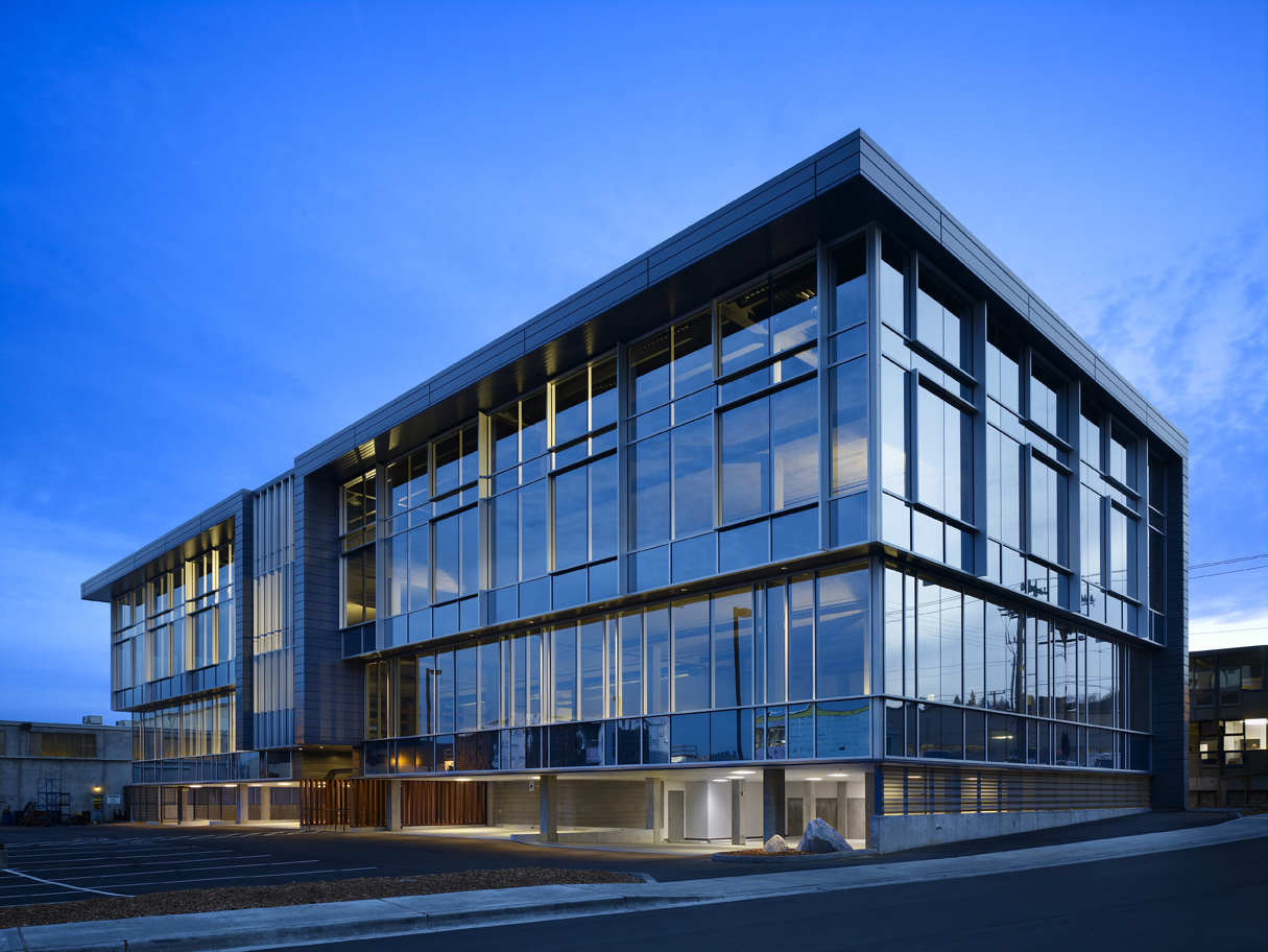
Overlooking the Magnolia Ship Canal in Seattle, the 34,000 square foot Salmon Bay Landing office building complements its environment with a floating form design inspired by the dry dock heritage of the former shipyard.
Which types of commercial projects give you the greatest sense of accomplishment?
We really enjoy working in an urban context, due to the amount of existing inspirational material. It�s fulfilling to take cues from the site and from the client and to find that inspirational starting point.
The clients we work with are passionate about the buildings they are building, because for them it�s ultimately a form of personal expression. We find fulfillment in helping them nurture and create that expression.

Lisa Taylor Minor
Lisa Taylor is a freelance writer and marketing consultant. She has more than 16 years of experience as a communications professional and has worked with a variety of companies in the home products and building materials industry. Originally from Memphis, TN, Lisa earned a BA in Journalism from the University of Memphis in 1995 and a MA in Journalism from the University of Memphis in 1997. She spent the first 11 years of her career working in account service for Memphis advertising agencies Thompson & Company, Oden Marketing & Design, and Carpenter/Sullivan. Lisa then spent five years in Nashville, TN, with The Buntin Group, an Adweek Top 100 U.S. advertising agency, and Louisiana-Pacific Corporation, a leading manufacturer of building materials. Lisa currently lives in Denver, CO, and is Principal/Owner of Wazee Marketing.
Website: www.wazeemarketing.com
