Film as Alternate Reality: Museum of the Moving Image
The New York City neighborhood of Astoria, Queens, is a long way from Hollywood and seemingly an unlikely location for a museum dedicated to the silver screen. However, the Museum of the Moving Image, which pays homage to the realms of film, television, and digital media, has occupied the area for over 30 years. A total makeover of its existing facilities and an addition, designed by Leeser Architecture, has doubled the Museum's square footage -- including a renovated lobby, exhibition space, theaters, and courtyard.
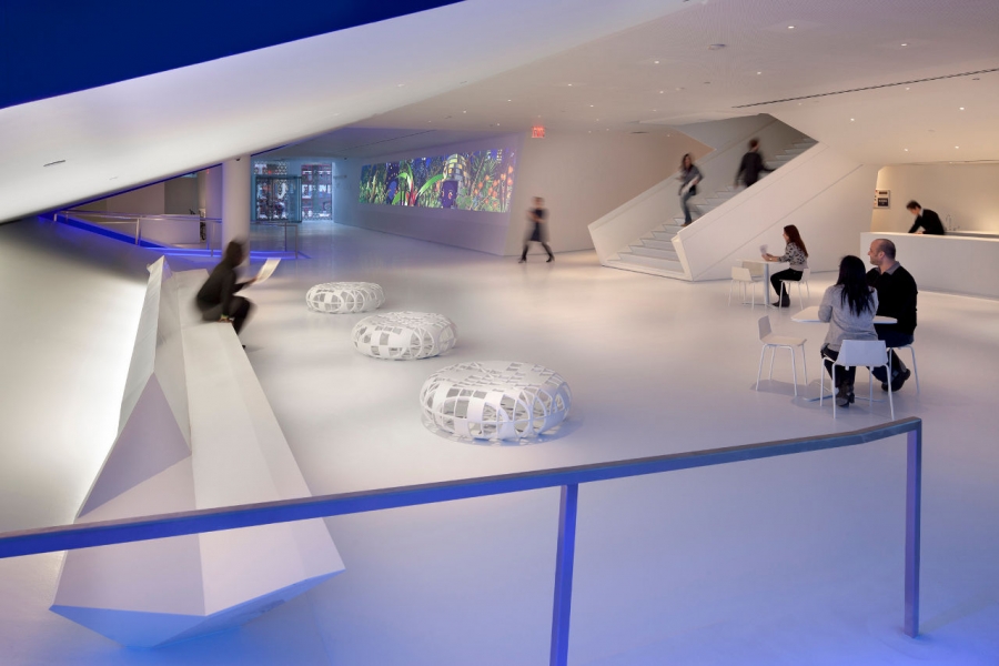 Credit: Peter Aaron/Esto. Courtesy of MMI
The Museum of the Moving Image does not collect actual films but rather screens them for the public and exhibits objects involved in their production. The collection includes relics such as Chewbacca's furry mask and more recent acquisitions like Winona Ryder's bloody artificial legs from the film Black Swan. Fitting for a repository of ephemera, the Museum occupies the historic white stucco Kaufman Astoria Studios, built by Paramount Pictures in the era of the silent film.
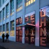
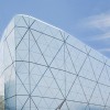
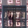
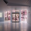
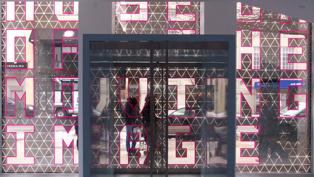
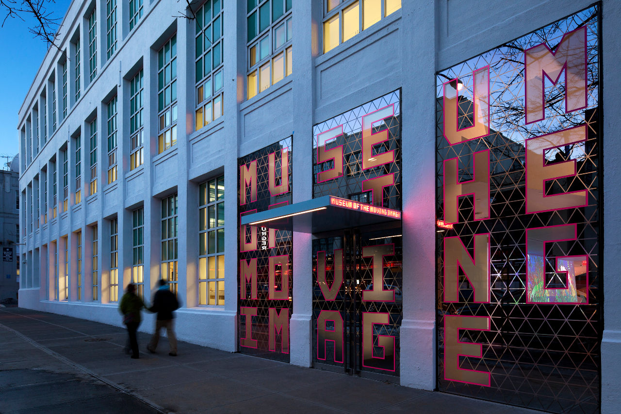
According to Thomas Leeser, principal of Leeser Architecture, "one of our main goals was to allow visitors to experience their movement through the building as a kind of participation in the imaginary movement of images on the screen." This reality-bending experience begins at the main entrance. Since the complex is listed on the National Register of Historic Places, the main facade could not be drastically altered. Leeser Architecture still managed to design an attention-grabbing entrance: 3.5' tall hot pink letters mounted against a grid of triangular mirrored and translucent pieces of glass announce the Museum's name. The triangle pattern echoes throughout the Museum, calling to mind a digital wireframe or a flattened version of Buckminster Fuller's geodesic pattern.
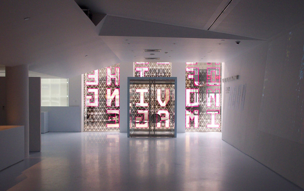
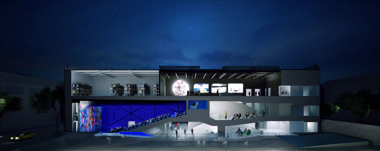
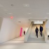
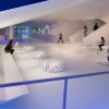
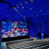
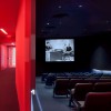
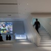
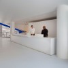
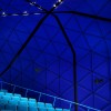
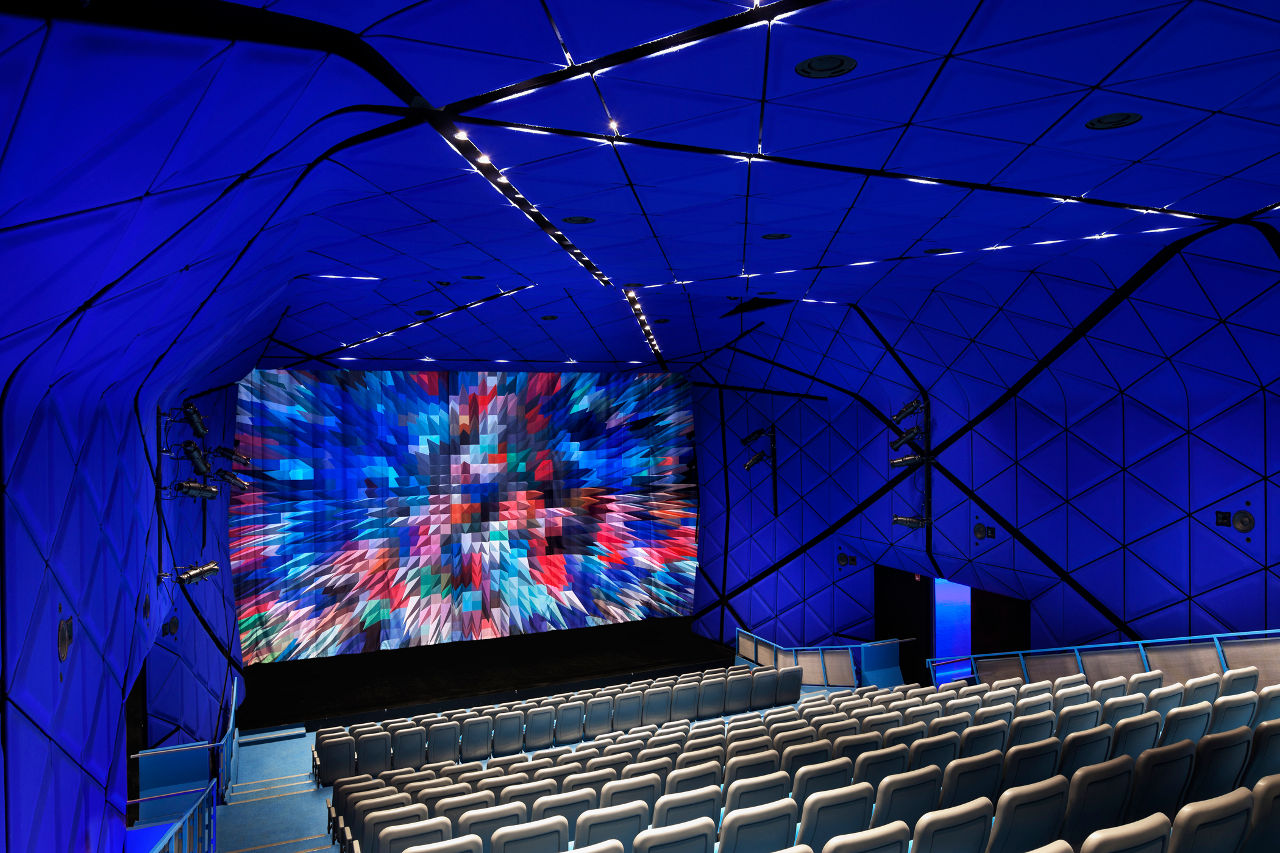
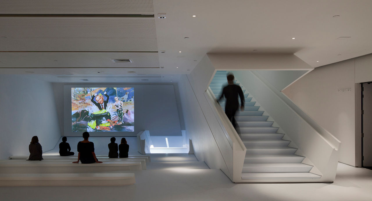
Beyond the marquee-like entry, the lobby of the Museum of the Moving Image features a blue polyester floor, milky-blue surfaces, and Corian benches, opposite a 50' long canted wall finished with screen paint, providing a backdrop for rotating films that coordinate with Museum exhibits. Visitors ascend a ramp lit with blue LEDs to enter the new focal point of the Museum, a 267-seat theater lined with electric Yves Klein blue felt panels in the form of interlocking triangles. Stadium-like seating makes viewers feel as if they are floating, and the pixelated wall surface further emphasizes the feeling of occupying an alternate reality. In fact, the design of the space was inspired by the spaceship in the Stanley Kubrick film 2001: A Space Odyssey.
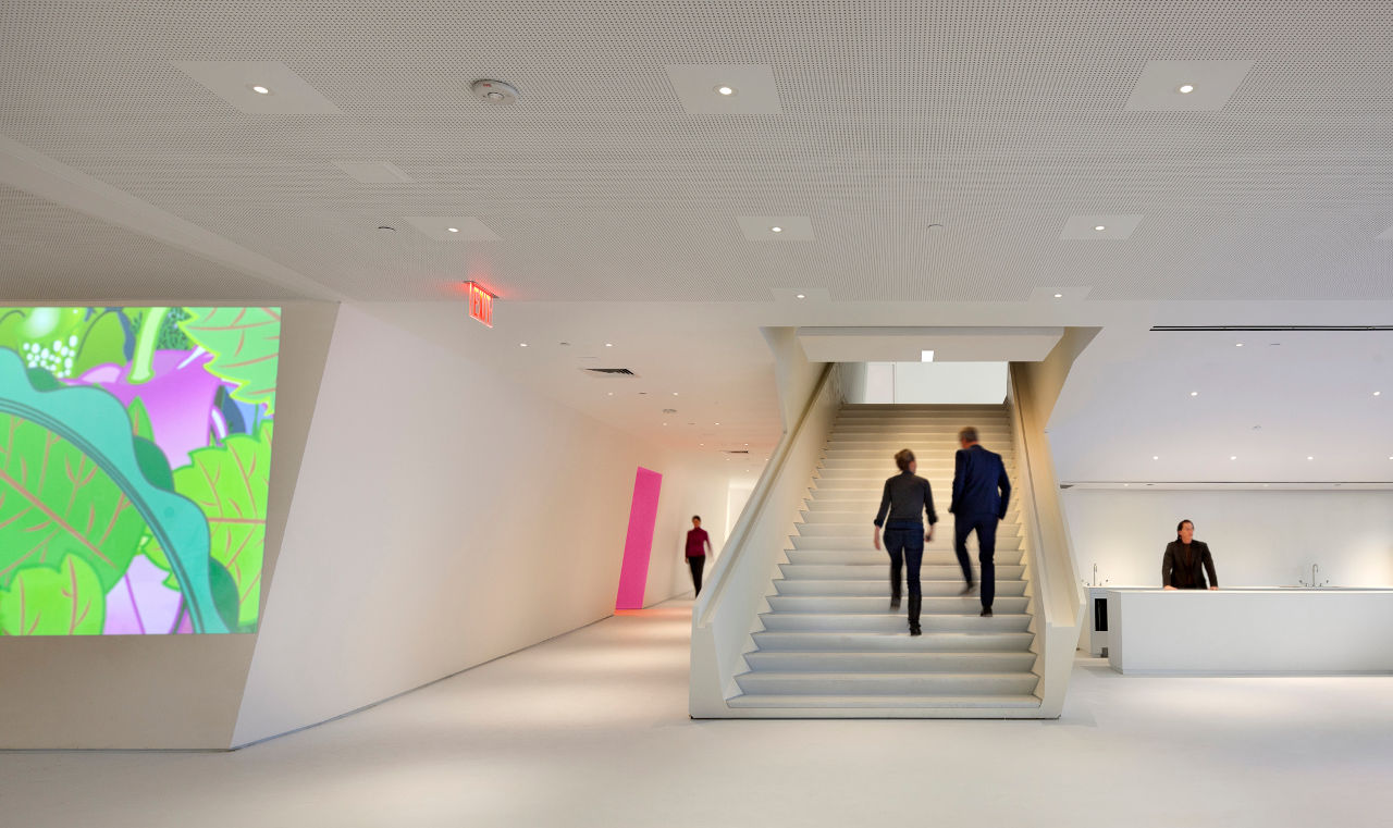
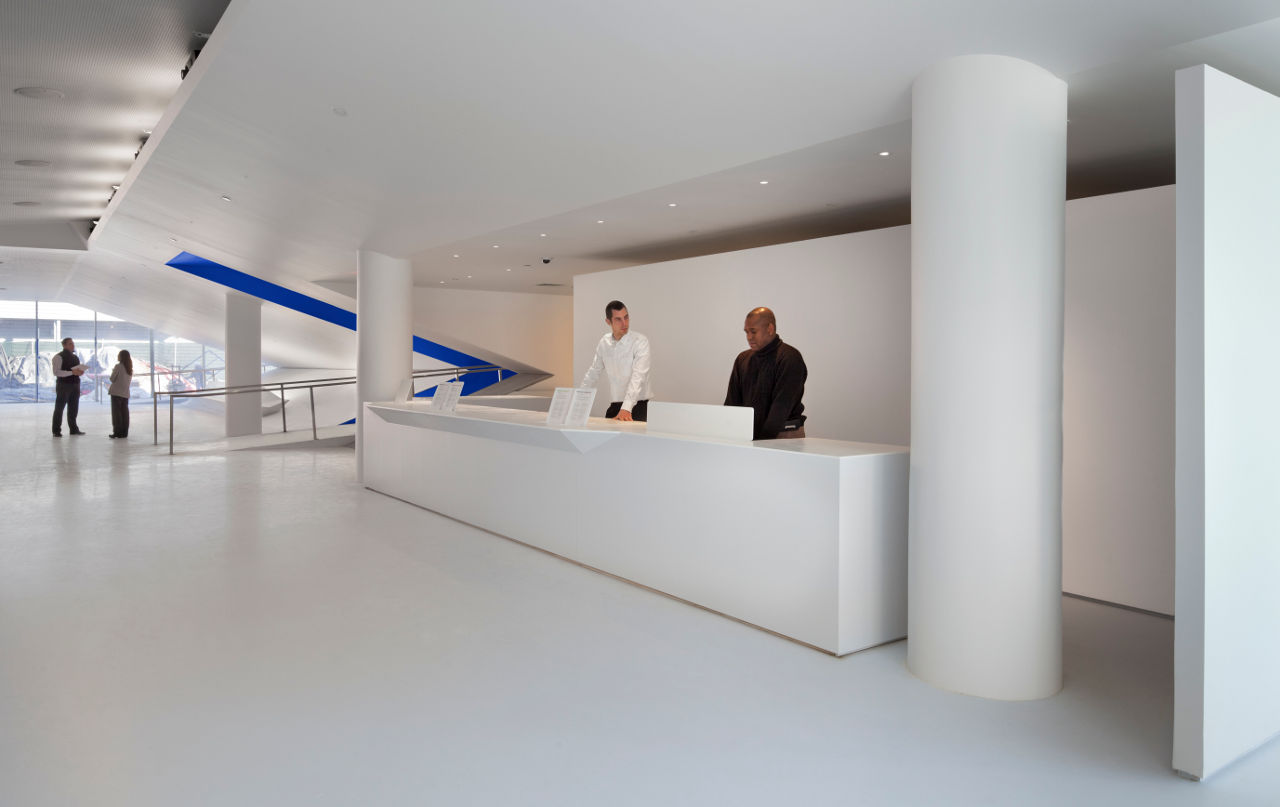
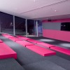
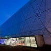
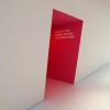
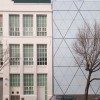
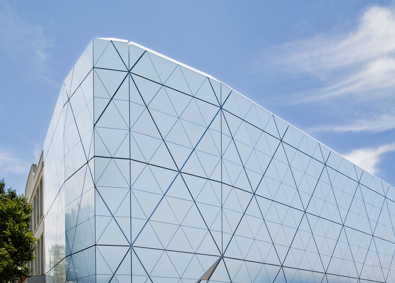
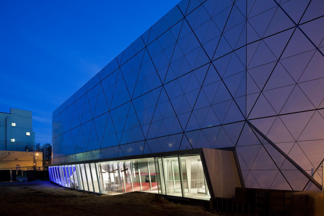
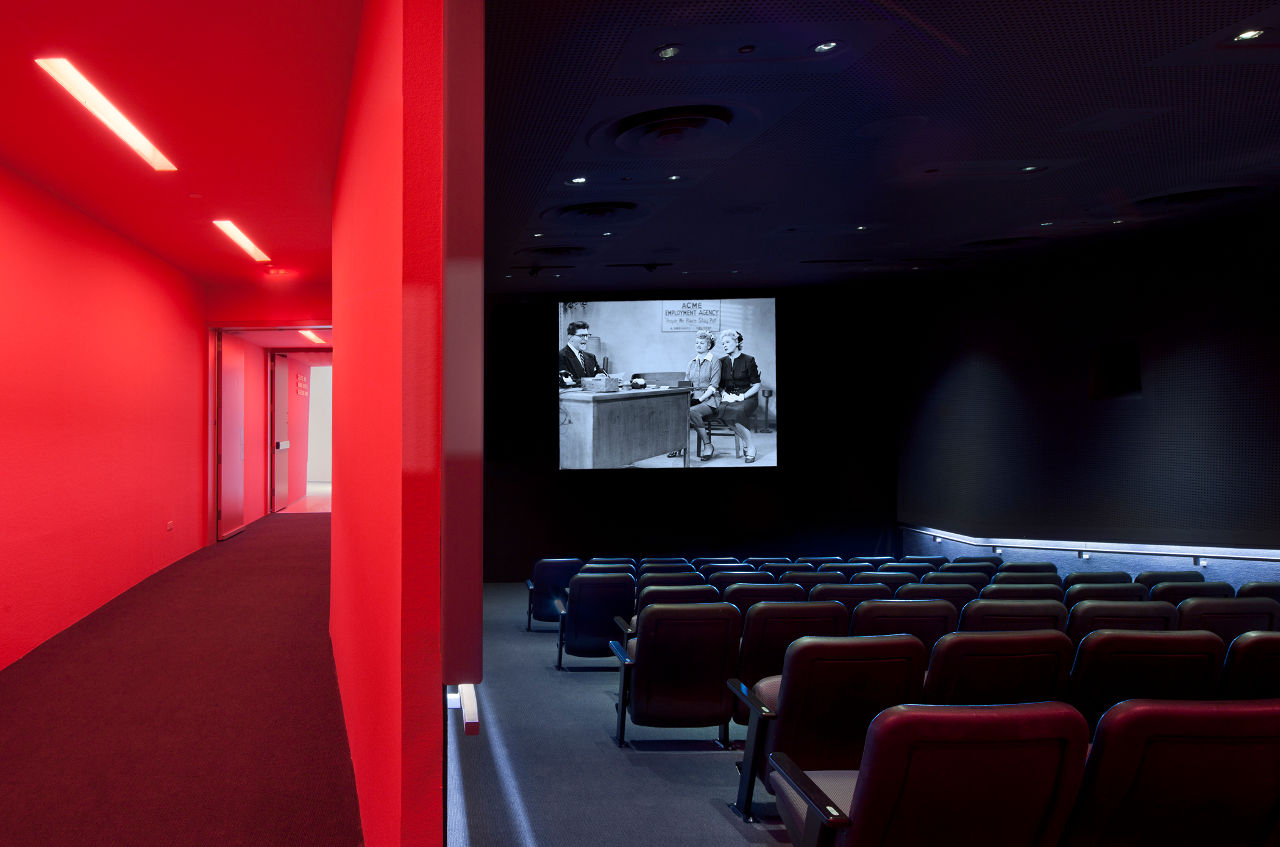
A new 68-seat screen room offers a contrast to the theater. Though its entrance is lit hot pink, the interior is decidedly more sedate, with perforated gray acoustical wall tiles and exposed speakers. At the rear of the building, the 200' long, three-story addition is clad in light blue triangular aluminum panels that seem to shatter into the sky. A new courtyard will be completed in spring 2011, providing a separate student entrance that leads directly into the Ann R. and Andrew H. Tisch Education Center.
Throughout the Museum of the Moving Image, visitors are confronted with images in every direction, and it is often a challenge to separate reality from imagination. The angled surfaces, both in plan and sloping sectionally, further skew one's perception of what is real. The contrast of smooth white planes with shocking colors, as well as the repetition of the interlocking triangular pattern, ultimately reflects our new digital reality over the subdued glamour of Old Hollywood.

Murrye Bernard
Murrye is a freelance writer based in New York City. She holds a Bachelor's degree in Architecture from the University of Arkansas and is a LEED-accredited professional. Her work has been published in Architectural Record, Eco-Structure, and Architectural Lighting, among others. She also serves as a contributing editor for the American Institute of Architects' New York Chapter publication, eOculus.
Website: www.murrye.com
