Los Angeles Museum of the Holocaust by Belzberg Architects
It seems paradoxical to integrate a structure intended to immortalize the horrific Holocaust within a public park, a setting for recreation and relaxation. The deliberate juxtaposition of these conflicting elements sets the stage for Santa Monica-based Belzberg Architects to curate a meaningful experience for visitors to the recently opened Los Angeles Museum of the Holocaust (LAMOTH).
 Credit: Belzberg Architects
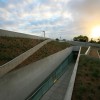
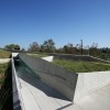
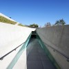
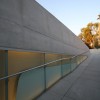
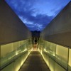
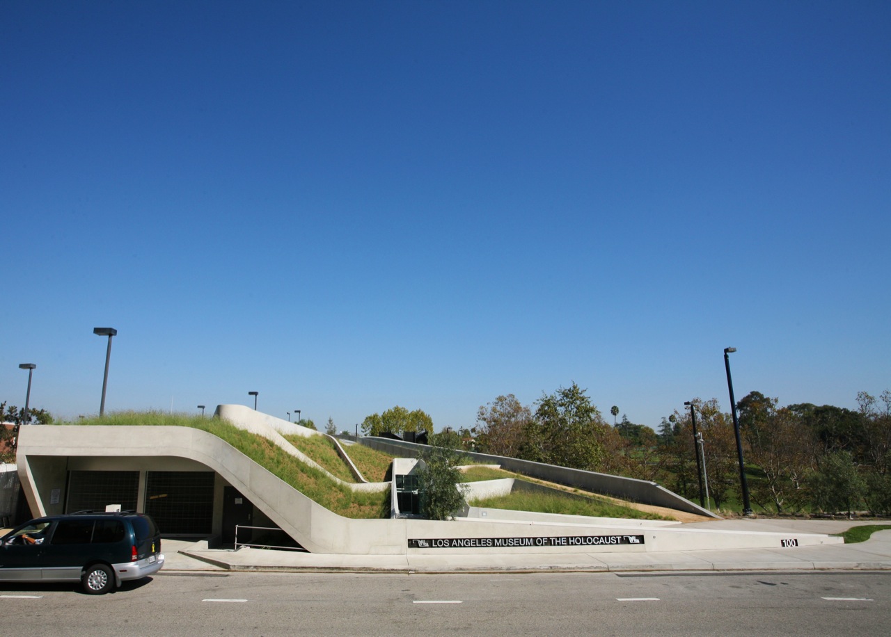
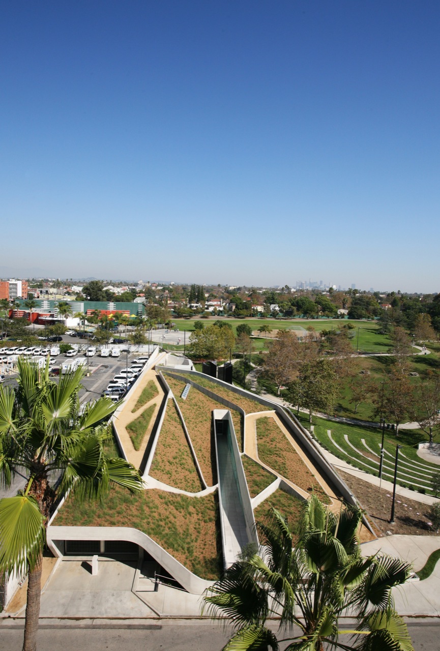
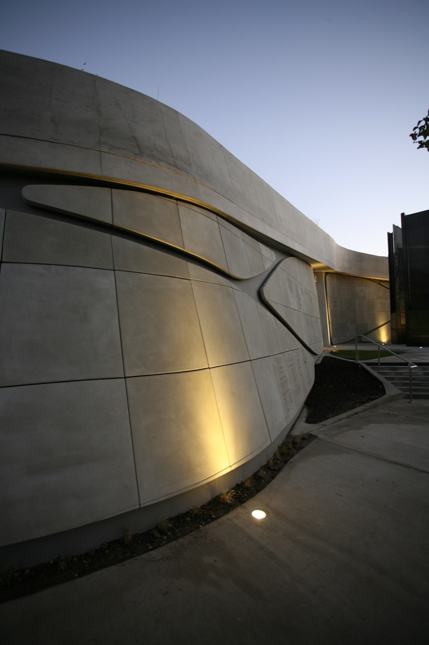
Founded in 1961, LAMOTH occupied several spaces prior to settling into its Belzberg-designed building, located on the northwest corner of the Pan Pacific Park, appropriately adjacent to the existing LA Holocaust Monument and, less so, The Grove shopping center. With an area of only 32,000 sq.ft., the new LAMOTH is not a large museum, and it appears even smaller because the architects chose to partially bury it beneath the landscape. The decision was metaphoric -- allowing for a dramatic entry ramp that looks like a gash through the earth -- but it also proved practical in relation to the context. The architects created a large green roof populated with native vegetation, contributing to the building's projected LEED Gold certification and status as one of the largest intensive green roofs in Southern California. The roof's landscape design and the building's interior circulation tie into existing pathways, successfully knitting together museum and park.
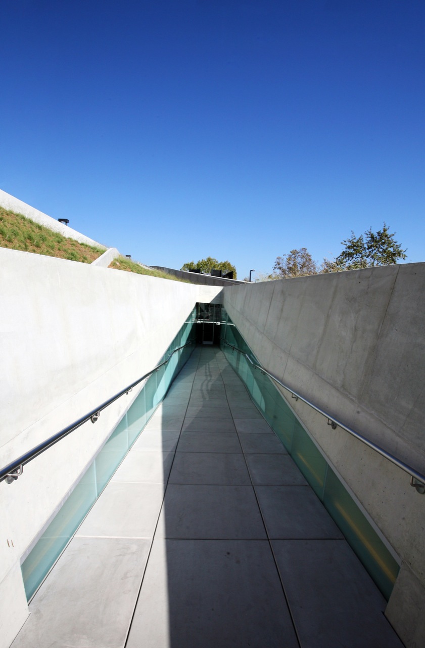
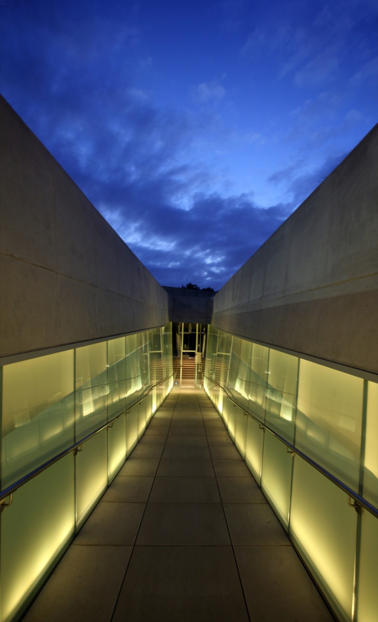
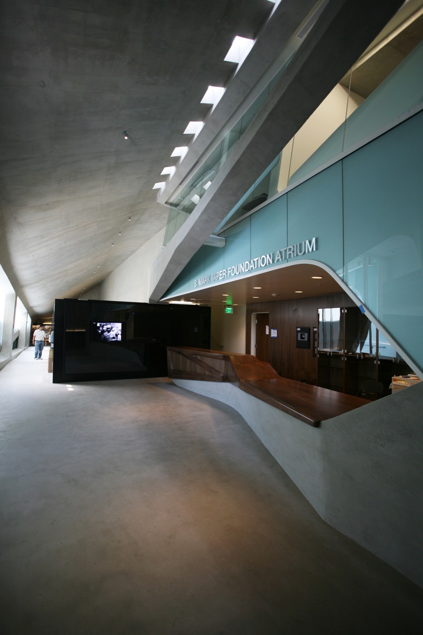
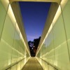
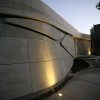
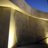
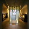
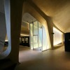
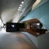
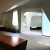
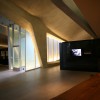
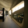
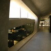
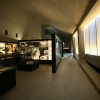
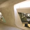
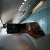
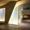
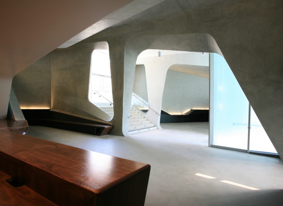
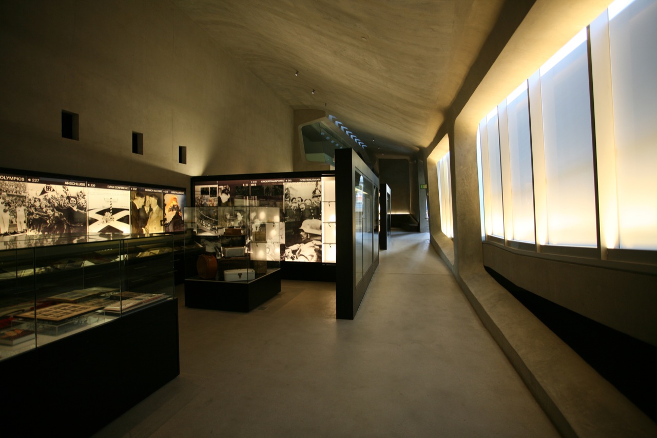
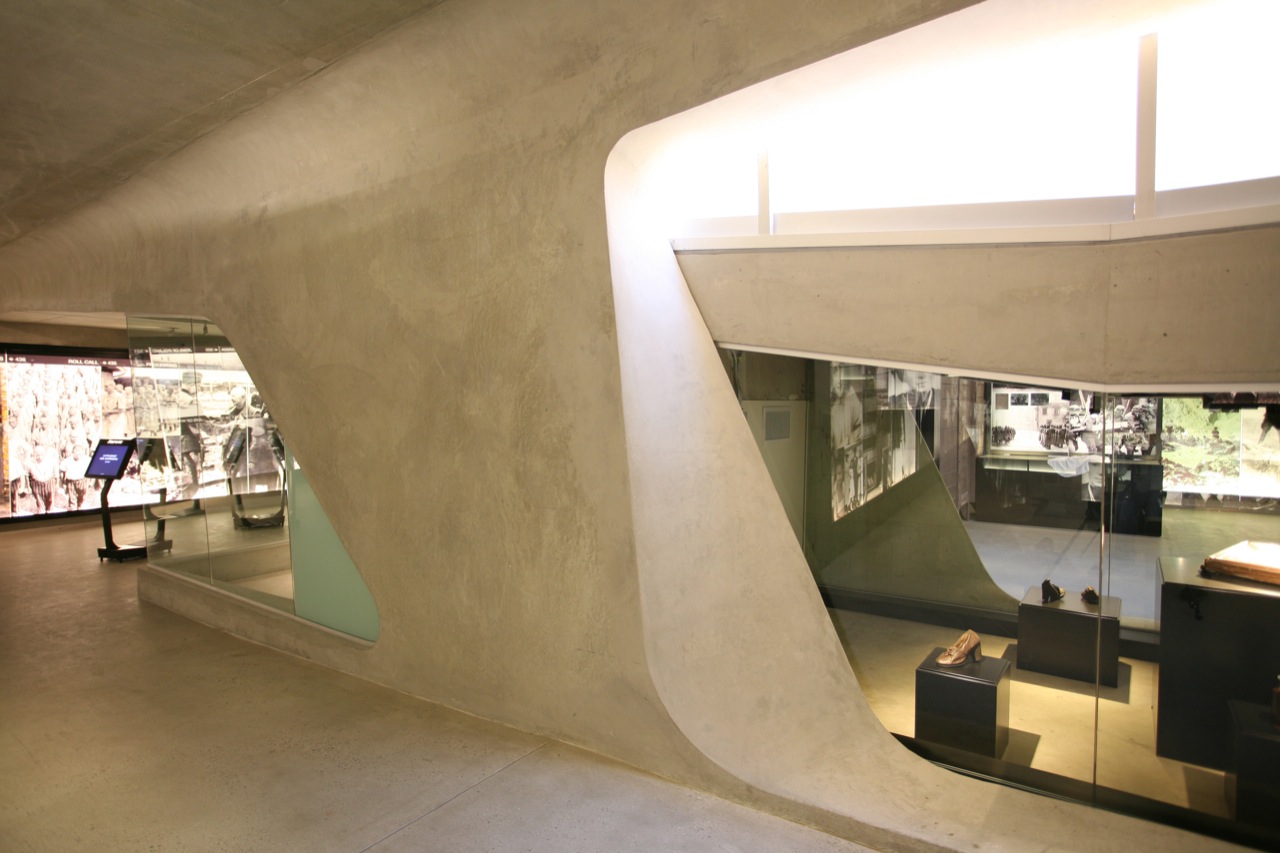
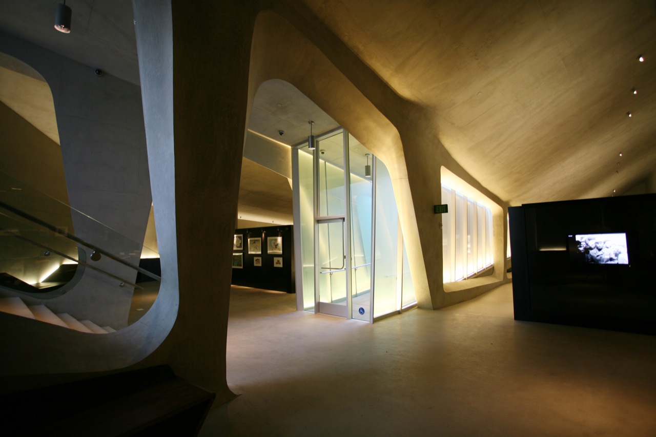
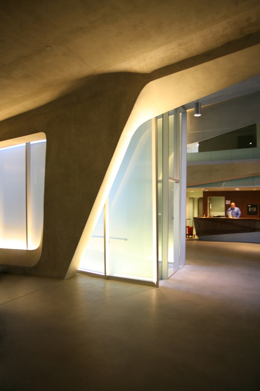
In contrast to the lush landscape, the smooth interior surfaces of LAMOTH are constructed with shotcrete -- a sprayed concrete product typically used for swimming pools -- and infilled with translucent and opaque glass. Peculiar, three-sided columns create a warped sense of perspective as visitors descend down another long ramp to view the exhibitions. Ceilings begin to drop, compressing the space, and natural light fades. Visitors lose connection with nature as the story of the Holocaust grows progressively grimmer. But there is a proverbial light at the end of the tunnel; as visitors move chronologically toward the present time, the ceiling height expands and light penetrates once again, providing a glimmer of hope.
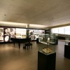
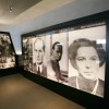
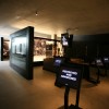
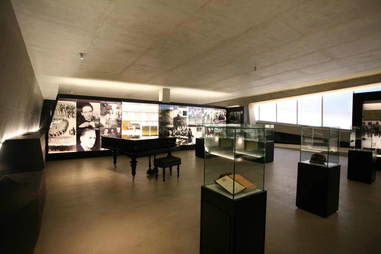
The Museum, which offers free admission, is fitted with advanced technologies in order to connect with younger visitors. Belzberg Architects collaborated with Los Angeles-based company Variate Labs to design the content and interaction strategy and New York City-based exhibition designer Potion to build the interactive exhibits. Upon entering, each visitor is handed an iTouch, which syncs with interactive displays that play audio accounts of the Holocaust from Los Angeles residents. Throughout the exhibits, Los Angeles Times covers recount the Holocaust's effects on the city. Also on view are photographs, models, and other artifacts.
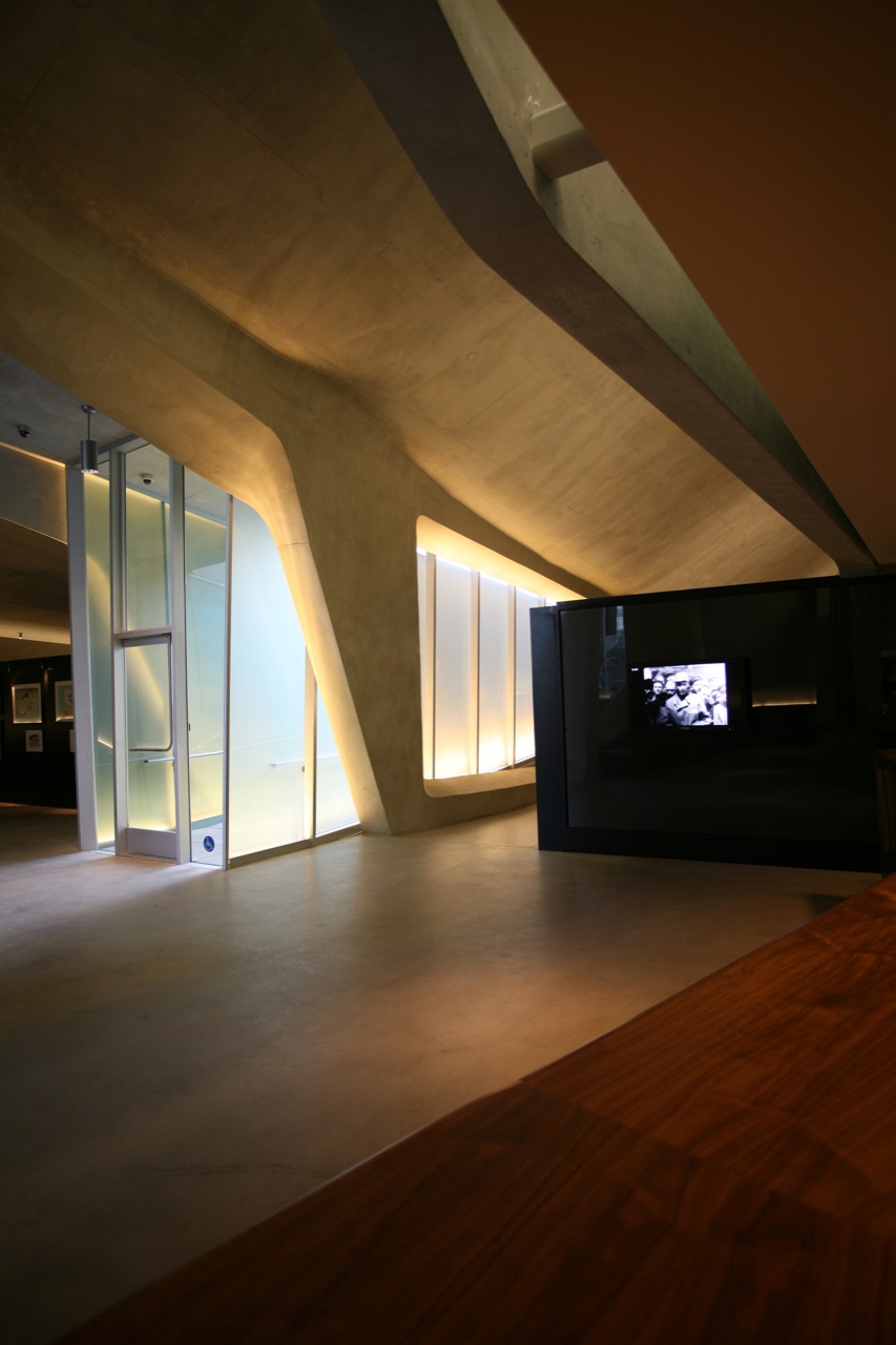
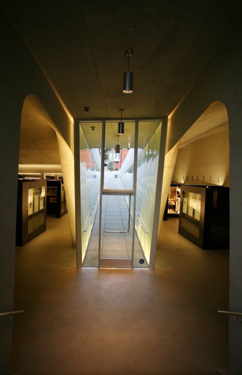
As a Holocaust museum, LAMOTH naturally draws comparisons with others among the building typology, such as Studio Daniel Libeskind's Jewish Museum in Berlin. Libeskind's raw, angular concrete surfaces create uneasiness and disorientation for visitors, evocative of the horror of the Holocaust. Though Belzberg's design uses spatial distortion to influence visitors, it is ultimately sleek and inviting -- fitting for a city that is known to value surface impressions. Stereotypes aside -- as they should remain, if we've learned anything from the Holocaust -- LAMOTH creates an experience that is uniquely Los Angeles, acknowledging both its historical and modern physical contexts.
Los Angels Museum of the Holocaust Photo Gallery

Murrye Bernard
Murrye is a freelance writer based in New York City. She holds a Bachelor's degree in Architecture from the University of Arkansas and is a LEED-accredited professional. Her work has been published in Architectural Record, Eco-Structure, and Architectural Lighting, among others. She also serves as a contributing editor for the American Institute of Architects' New York Chapter publication, eOculus.
Website: www.murrye.com
