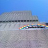
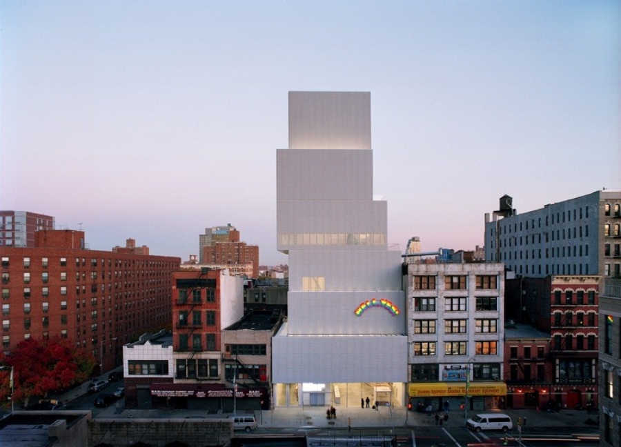
The New Museum is not exactly new anymore. Upon its completion in 2007, the blocky, mesh-clad structure generated some controversy: a rainbow-hued "Hell Yes!" affixed to its facade rebelliously declared its arrival on the Bowery, the main street of the eponymous neighborhood in lower Manhattan. SANAA's eye-catching design for the the 33-year old New Museum oscillates between the Bowery's infamous past and its inevitably gentrified future.
 Credit: New Museum
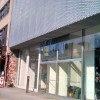
An anomalously angled street slicing Manhattan's regular grid, the Bowery once epitomized all that is edgy and gritty in New York City. Then its famous punk rock music venue CBGB closed and was replaced by a fashionable John Varvatos store along with new neighbors like Ralph Lauren and Whole Foods. Still, plenty of restaurant supply stores line the Bowery as they have for decades, filled with ice cream machines, stainless steel stoves, and the like.
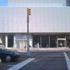
Among these storefronts, the New Museum greets the eye as a shocking expanse: 15'-tall plate glass stretches the entire width of a lot, allowing for a view clear through a bright, modern lobby. Designed by the Tokyo-based architectural team SANAA, the New Museum is considerably more accessible and inviting than most of its neighbors, Bowery fixtures and newcomers alike. Except for the glazed entry, the New Museum is uniformly clad in an anodized aluminum mesh, a standard industrial material fitting for the context. The building appears gauzy and translucent and then solid and monolithic, depending on perspective and weather conditions.
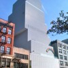
Though museums are often sprawling facilities, the New Museum's ambitious program coupled with its tight urban site -- only 71' wide and 112' deep -- forced the architects to build up. Since several modern condo developments have materialized among the Bowery's squat brick buildings in recent years, the seven-story museum seems part of a new rule rather than an exception. Scale, however, is an ambiguous word in the New Museum's vocabulary. One imagines the designers at SANAA building a literal interpretation of the zoning diagram and then pushing and pulling the floors to create a visually precarious form, which looks like a stack of barely balancing boxes suspended from an off-center core.
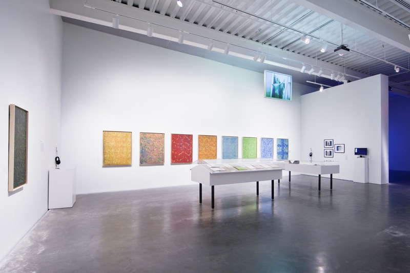
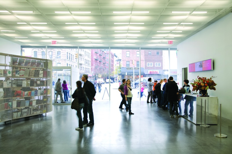
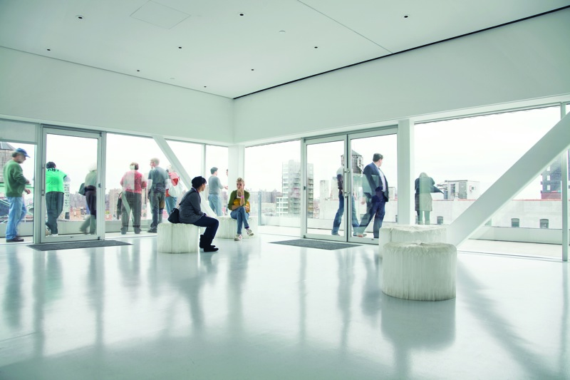
SANAA's seemingly whimsical parti proves practical; each box contains column-free galleries with varying ceiling heights that accommodate a range of exhibition types. A relatively small budget required the designers to conserve on interior materials, continuing the industrial-strength theme. They placed the guts of the building on full display, including infrastructure, ducts, sprinklers, and even fireproofing material. Pristine white walls and polished concrete floors stand in contrast, establishing a neutral backdrop for art.
Although art-friendly, the interior spaces don't offer visitors interaction with the mesh facade or provide the pixelated views of downtown Manhattan that one might anticipate. Aside from a single glass wall on the fifth floor and the Sky Room on the seventh floor -- which provides panoramic city views from an outdoor terrace that is (regrettably) closed to visitors during the week -- the only connection with the outdoors is via narrow skylights. The designers at SANAA cleverly took advantage of the offsets resulting from the shifting boxes to admit natural light into the galleries. Unfortunately, it works better in concept than in reality: even on a sunny day the skylights allow limited light that is diminished by fluorescent tubes.
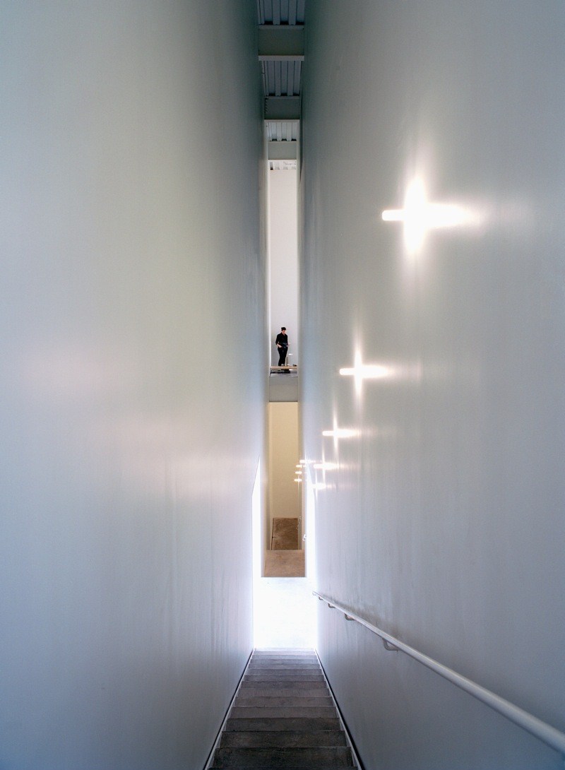

Ways and means of circulating through the building are limited, demonstrating the downside to "building up." Visitors may take the delightfully chartreuse-lined elevators to the top, but then they must descend enclosed concrete stairs to access lower levels. A single rewarding exception is a 50'-long, 4'-wide stairway that slices through the building to connect the third and fourth floor galleries. Pausing on a small landing in the middle of the stair, visitors can take in the dramatic city view through a punched opening. The raw, exposed edges of the mesh cladding look dangerous to the touch, a reminder that the Bowery was once known as Skid Row.
Despite these minor misgivings, the New Museum has become a beloved icon that is both rough and refined. It doesn't deny the Bowery's colorful past nor does it� succumb to fleeting trends. Fittingly for an institution that prides itself on discovering fresh talent, the New Museum chose SANAA in part because they fit the bill of a young firm who hadn't yet built in New York. The New Museum project certainly put them on the map, at least in the United States, and Kazuyo Sejima and Ryue Nishizawa, SANAA's founders, were recently chosen as the 2010 Laureates of the esteemed Pritzker Architecture Prize. Much like the New Museum took the Bowery, SANAA has ascended from new kids on the block to international design stars.

Murrye Bernard
Murrye is a freelance writer based in New York City. She holds a Bachelor's degree in Architecture from the University of Arkansas and is a LEED-accredited professional. Her work has been published in Architectural Record, Eco-Structure, and Architectural Lighting, among others. She also serves as a contributing editor for the American Institute of Architects' New York Chapter publication, eOculus.
Website: www.murrye.com
