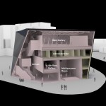
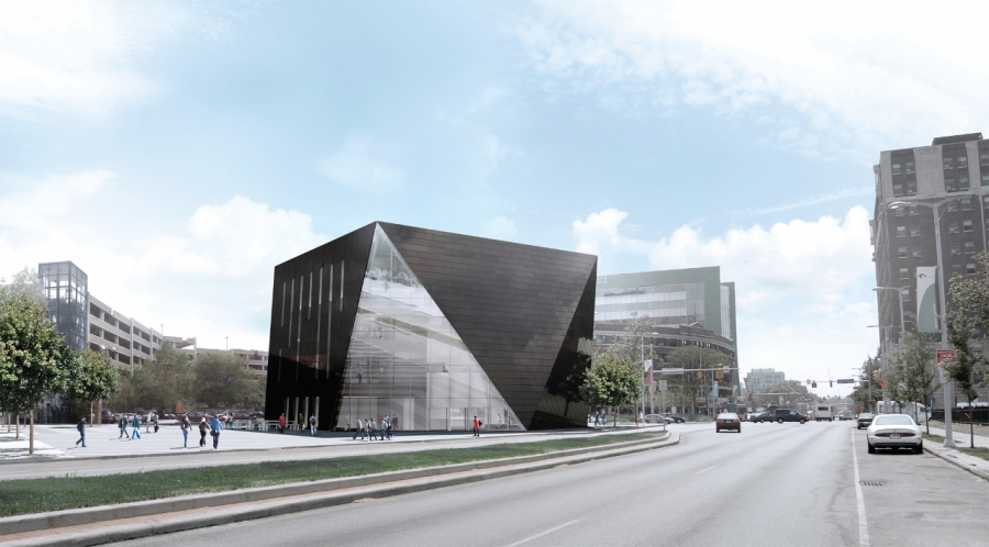
Recently unveiled are plans for a new building to house the Museum of Contemporary Art Cleveland (MOCA Cleveland). London-based Foreign Office Architects (FOA) is the design firm for the project, and Westlake Reed Leskosky acted as the architect of record. Currently the museum is tucked away on the second story of the Cleveland Play House complex; the new facility will give MOCA Cleveland 44% more space as well as a commanding presence at a prominent intersection in University Circle.
As early as the 1960s, urban renewal was identified as a strategy that inner-city universities could use to manage the expansion of their campuses. As college enrollment grew during the latter part of the century and blighted neighborhoods threatened the quality of life on downtown campuses, university administrators responded by increasing outreach efforts in their communities. Several years ago, Case Western Reserve University joined the ranks of schools attempting this kind of outreach, announcing a plan to work with other local institutions and developer MRN, Ltd. to create an Uptown district in Cleveland�s University Circle. In addition to providing commercial and residential development, Uptown will substantially enhance the cultural value of the area.
MOCA Cleveland is expected to become a civic and cultural hub for community members. Farshid Moussavi, principal of FOA, stated in a press release, �Museums today are not just homes for art, but serve multiple functions and host a variety of activities. Our design for MOCA Cleveland aims to provide visitors with a museum that is a dynamic public space in which to experience contemporary art in its infinite manifestations.�
alt=""
The design is, unsurprisingly, contemporary. The almost 34,000 sq. ft., four-story building has a hexagonal footprint, a square roof, and facets "cut" along facade walls to give it a gem-like appearance.
Rhonda Hansal, project director at Westlake Reed Leskosky, says, �The hexagon was chosen to open up the perimeter area at the base of the building. It maximizes usable space on both the exterior and interior. And having the top of the building be square in shape was the most efficient. It enabled us to have a column-free space in the fourth floor main gallery; we developed a bow truss system to support the roof and create a long, uninterrupted space.�
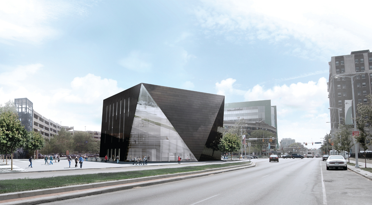
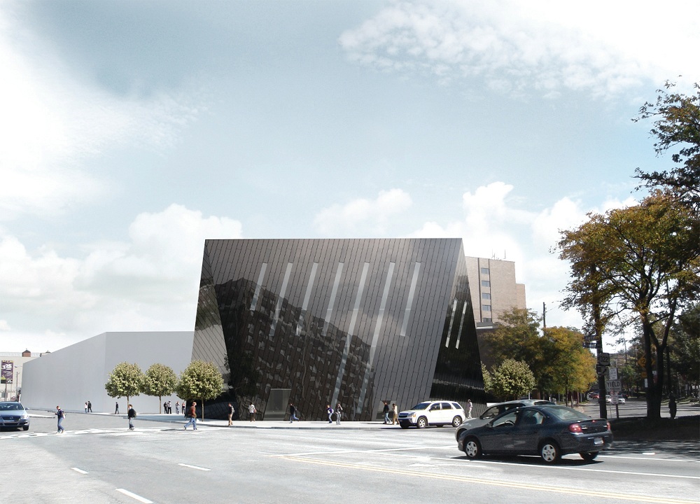
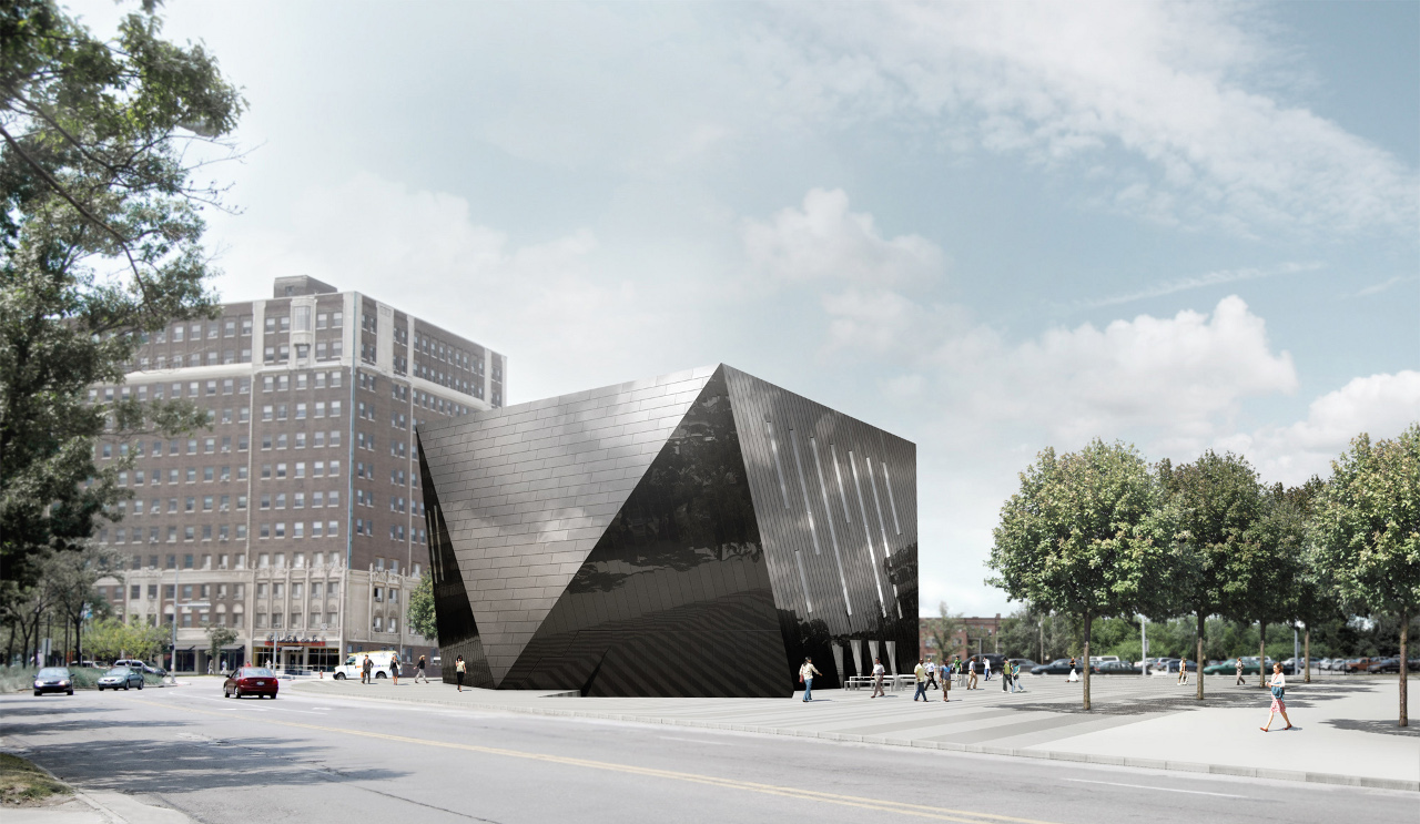
Cladding is of mirror-finish black Rimex stainless steel. Current design plans call for most of the glazing to be tinted in order to make the building skin appear monochromatic; an exception is that one of the three surfaces facing the public plaza will be transparent, making the structure more penetrable and inviting to pedestrians. At night, light emanating from the slanted strip windows will make the building volume a highly visible and vibrant part of the streetscape.
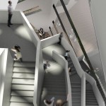
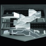
In contrast to the monolithic exterior, the interior of the structure is sinuous and multiform. A sculpted staircase winds up through the building�s atrium. �This is actually a double-decker stair,� says Hansal. �The floor-to-floor clearance required for the gallery levels allowed us to stack a monumental staircase on top of a fire stair. At the third floor level, where administrative spaces are located, the floor height isn�t quite as high, so there the fire stair diverges a bit from the main stair, then joins back up with it again. This secondary stair will be set up so that the public can access it as well.�
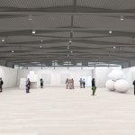
At every story, the spaces are carved to offer views into ancillary areas. The fourth floor main gallery provides a dramatic terminus for the structure�s flow of space. In addition to having an expansive, column-free layout, the building has a roof and walls outfitted with Epicore structural steel decking, which, as Hansal explains, is exposed to create a "cage" effect. "The decking is manufactured to tight tolerances so it looks good; insulation and acoustic deck can be installed with it. Having this exposed structural deck instead of drywall gives the space a nice aesthetic,� Hansal says. Gallery walls installed in the 6,000 sq. ft space will be moveable. �This will allow the space to be reconfigured and subdivided,� says Hansal. �Since museum walls are normally fixed in place, this is an unusual feature.� Hansal points out that, in addition to providing flexibility, �the museum won�t be having to constantly purchase and throw away wall materials.�
"Museums today are not just homes for art, but serve multiple functions and host a variety of activities. Our design for MOCA Cleveland aims to provide visitors with a museum that is a dynamic public space in which to experience contemporary art in its infinite manifestations." Farshid Moussavi, Principal of FOA
The building�s lobby is designed to be an �urban living room,� and no admission will be charged to access the building�s first floor space. A multipurpose room will host cultural events, drawing visitors into the Uptown district during the evening hours. �When the multipurpose room isn�t in use, there�s what we refer to as a �guillotine� wall that can be raised and stay open, allowing the public to use that space as well,� says Hansal. As part of its new, more prominent civic role, the museum will be increasing its educational and public programs.
The building is expected to achieve LEED silver certification. �The main green benefit is the building�s site,� says Hansal. �This is a dense urban location with access to several public transit stations.� This includes two train stations and several bus stops. LEED 2009�s Sustainable Sites category heavily rewards access to public transit: Hansal notes, �We were able to start earning some Innovation points for this project because of its exemplary transit.� Another green feature is the building�s geothermal system, which is located under the public plaza.
Construction on the $26.3 million museum is expected to begin by the end of this year.

Kristin Dispenza
Kristin graduated from The Ohio State University in 1988 with a B.S. in architecture and a minor in English literature. Afterward, she moved to Seattle, Washington, and began to work as a freelance design journalist, having regular assignments with Seattle�s Daily Journal of Commerce.
After returning to Ohio in 1995, her freelance activities expanded to include writing for trade publications and websites, as well as other forms of electronic media. In 2011, Kristin became the managing editor for Buildipedia.com.
Kristin has been a features writer for Buildipedia.com since January 2010. Some of her articles include:

