Henning Larsen Architects' state-of-the-art Denmark Herlev Hospital
The healing power of nature plays a large role in Henning Larsen Architects’ winning design for an extension to Denmark’s Herlev Hospital. Here exterior spaces are as carefully planned as interior ones, affording occupants in all areas of the extension some contact with the outdoors. The organizing principles of the new addition also accommodate state-of-the-art developments in patient care.

Henning Larsen Architects teamed with architecture firms Friis & Moltke and Brunsgaard & Laursen, engineering companies NNE Pharmaplan and Orbicon, the consulting company Norconsult, and landscape architects SLA to win the hospital’s international design competition. The program features a new emergency department and a maternity services center with a pediatrics unit.
"This kind of hospital is losing relevance, and hospitals are now operating in completely different ways. High-rise buildings and the distinct division in functions are no longer optimal.” Lars Steffensen, partner at Henning Larsen Architects

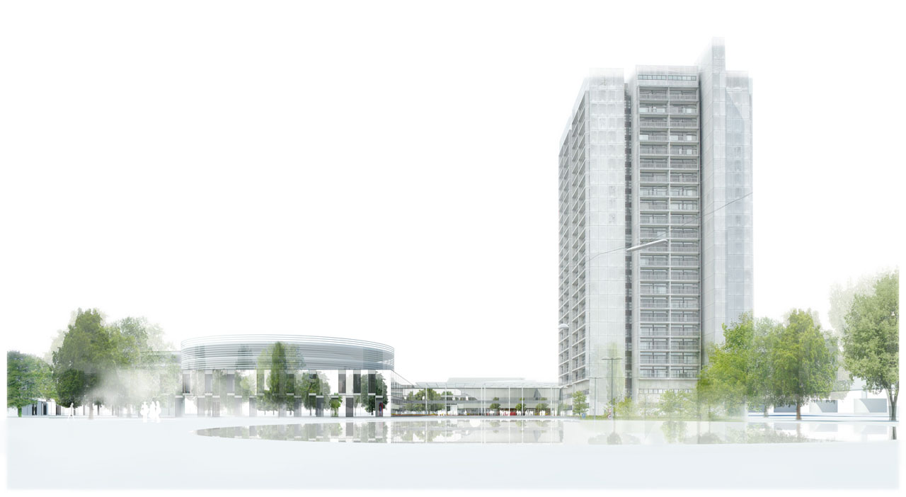
The existing hospital tower, standing 26 stories tall, is of “typical late-modern construction – the ultimate building of its time,” according to Lars Steffensen, a partner at Henning Larsen Architects. “But this kind of hospital is losing relevance, and hospitals are now operating in completely different ways," Steffensen explains. "High-rise buildings and the distinct division in functions are no longer optimal.”
Steffensen describes the current trend in hospital care as being focused on outpatient and acute care services, with a corresponding drop in inpatient admissions. To respond to this shift, the architects separated the new hospital into zones: “a lower, ‘city-like’ base for treatment, outpatient departments, etc., and upper bed wards, or ‘buildings.’ The lower city conveys a high frequency of visitors while the upper buildings provide peace and concentration for prolonged stays,” says Steffensen.
"The most essential architectonic aspect in the relationship between the existing tower and the new design by Henning Larsen Architects is contrasting geometries.” Lars Steffensen, partner at Henning Larsen Architects

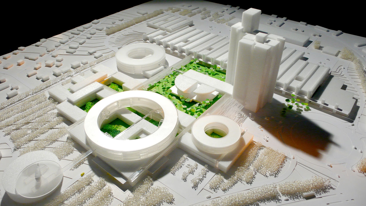
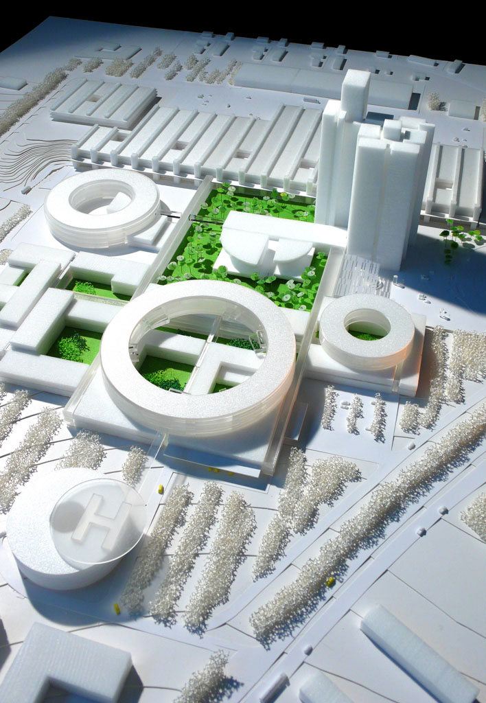
Adding a total of 52,000 m2 to the site, the designers used layered spaces and smaller building volumes to accomplish their "city" scale. Notably, they also incorporated larger-scale circular elements. “In the design phase, the architects tried to develop a new and different distinct geometry that would match the rectangular monumentality of the existing buildings,” explains Steffensen. “The seeds of the new circular elements are actually to be found in the existing buildings: for example, in the quarter circles of the lecture rooms, the curved shapes of the columns, and in the fine curvatures of the windows. The most essential architectonic aspect in the relationship between the existing tower and the new design by Henning Larsen Architects is contrasting geometries.”
Weaving the building into the site
At ground level, corridors will connect existing buildings with a new foyer and the network of small-scale, angular buildings. These hallways will frame a large green, with a historic auditorium at its center, establishing nature as a prominent theme in the new design. Below grade, according to Steffensen, technical and logistical functions will be connected.
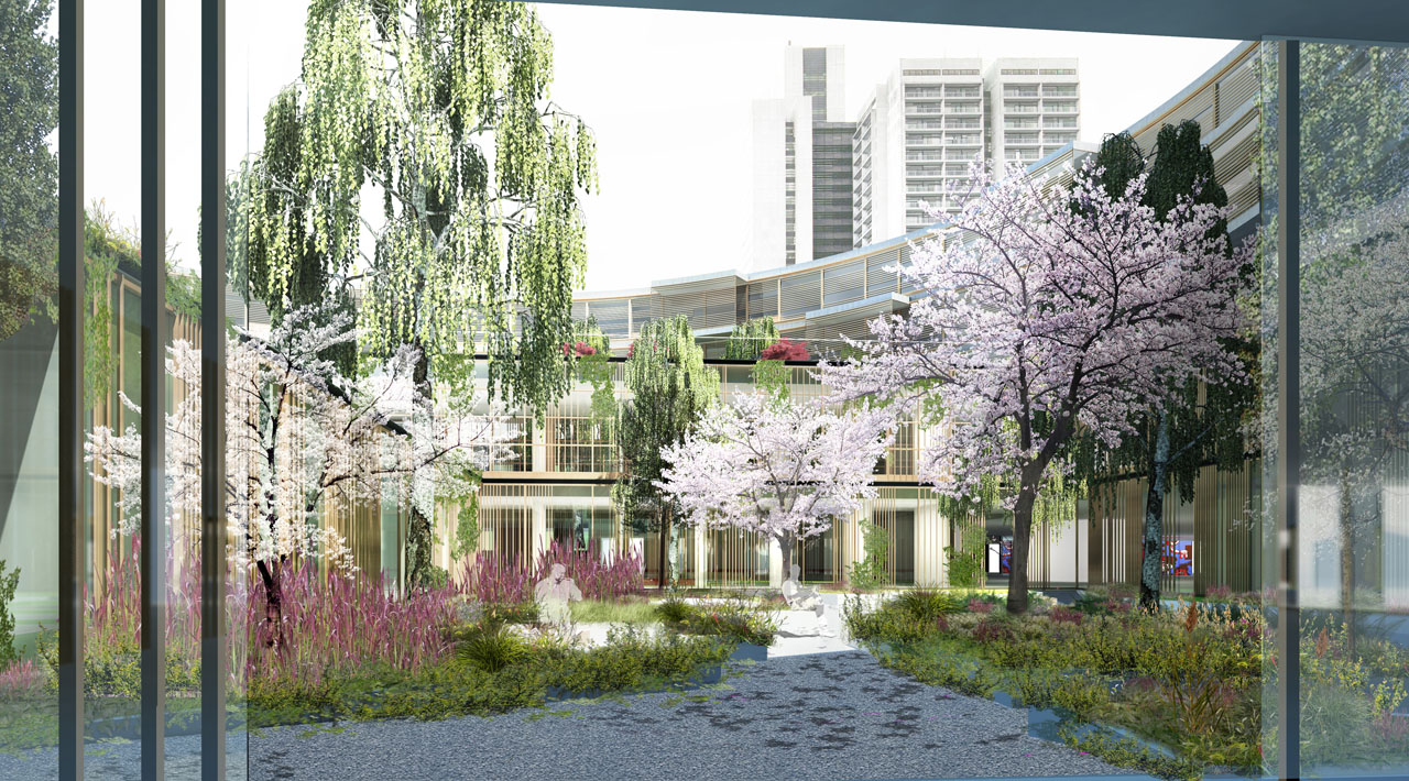
“The luxuriant thematic gardens and courts relate the processes of nature to the patients’ stay at the hospital. These patios are in many ways the hospital’s ‘cathedrals,’ compared to the many smaller rooms which a hospital naturally consists of. Gardens and courts constitute, together with the green roofs of the buildings, an important fifth façade which can be seen by many people from the existing buildings.” Lars Steffensen, partner at Henning Larsen Architects

Across the rooftops of the addition’s spreading, low-profile structures rest larger building forms that are in the shape of rings. Steffensen explains that “the architects wanted the buildings to be a protective exterior to the surroundings and, by that, make the interior seem more sheltered and warm. Functionally, ‘inner flexibility’ is a key theme, and the circular shape will certainly allow this flexibility between the sections in the future.”

In addition to providing a pedestrian scale to the site, the separate volumes of the Herlev hospital addition sculpt outdoor areas, establishing an interplay between interior spaces and exterior ones. The gentle curves of the large cylinders embrace the courtyards below, and their open, latticework rainscreen permits a visual connection. Consideration of views from within the hospital also partially determined the buildings’ interior layouts; windows frame carefully composed "pictures" of the landscape.
Says Steffensen, “The luxuriant thematic gardens and courts relate the processes of nature to the patients’ stay at the hospital. These patios are in many ways the hospital’s "cathedrals,' compared to the many smaller rooms which a hospital naturally consists of. Gardens and courts constitute, together with the green roofs of the buildings, an important fifth façade which can be seen by many people from the existing buildings.”
The overall vision of the competition team was to create a symbiosis between the hospital and its surroundings, according to a company fact sheet. The resultant “sensory hospital” and its ability to connect patients with nature are expected to result in improved healing and prognosis for the patients.
As one of Denmark’s largest hospitals, Herlev’s new approach to design, and to healing, should make an impact on the delivery of medical care overall. According to Steffensen, more buildings are planned for the site in the future: a patient hotel, different research facilities, offices and educational facilities, among others. Construction on the current addition is expected to be completed in 2017.

Kristin Dispenza
Kristin graduated from The Ohio State University in 1988 with a B.S. in architecture and a minor in English literature. Afterward, she moved to Seattle, Washington, and began to work as a freelance design journalist, having regular assignments with Seattle’s Daily Journal of Commerce.
After returning to Ohio in 1995, her freelance activities expanded to include writing for trade publications and websites, as well as other forms of electronic media. In 2011, Kristin became the managing editor for Buildipedia.com.
Kristin has been a features writer for Buildipedia.com since January 2010. Some of her articles include:

