Dow Jones by STUDIOS Architecture
In 2007, Rupert Murdoch�s News Corp. acquired Dow Jones, publisher of the Wall Street Journal. Within months, the announcement was made that the Wall Street Journal offices would be moving from their long-time home in the financial district to a building in midtown Manhattan, where News Corp. was based. The firm STUDIOS Architecture was hired to design the new space, which occupied 240,000 sq. ft. (22,297 m2) across five floors of a building located on the Avenue of the Americas.
 Credit: Albert Vecerka/Esto
With the merger of the two newsgroups, three teams were brought together: online, print, and wire services. Uniting these groups functionally, culturally, and aesthetically was the overall ambition of the design. According to the STUDIOS website, �STUDIOS was hired to meld the groups together, to facilitate faster and more efficient communication among the leaders through the planning and design of the space. A significant cultural change took place, as a new transparent and non-hierarchical environment would be created.�
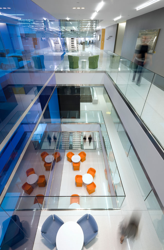

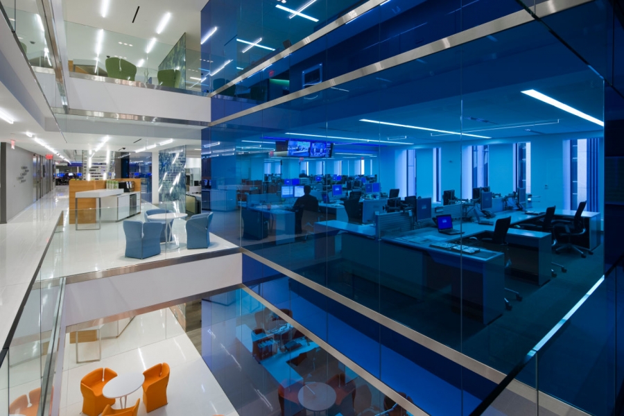
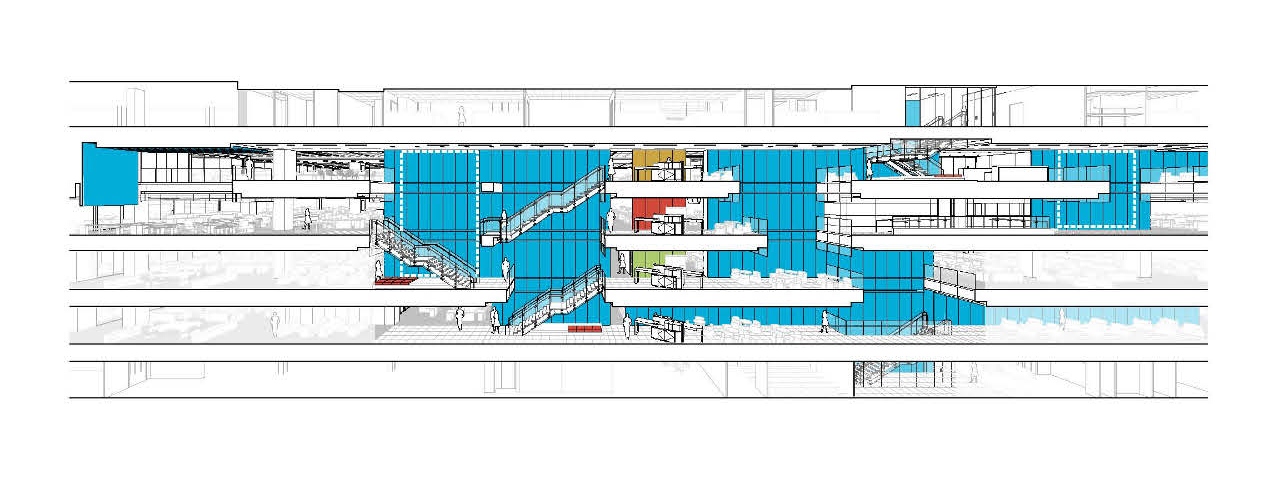
STUDIOS chose to forge a connection between work areas -- and between people -- in a remarkable way: they carved out portions of the floor plates to create a vertical volume of space. Unlike an atrium, where a building�s design revolves around a central light well, views here are oriented toward multiple cells of space within the five floors of offices. Lighting is diffused and fixtures are largely concealed. Vertical planes of glass (some of them ocean blue) showcase the individual compartments, with thin metallic bands giving subtle articulation to each floor level. The result is a layering of visual impressions, all concentrated on nodes of interaction (groupings of comfortable chairs, worktables, etc.), promoting a sense of togetherness and connectivity.
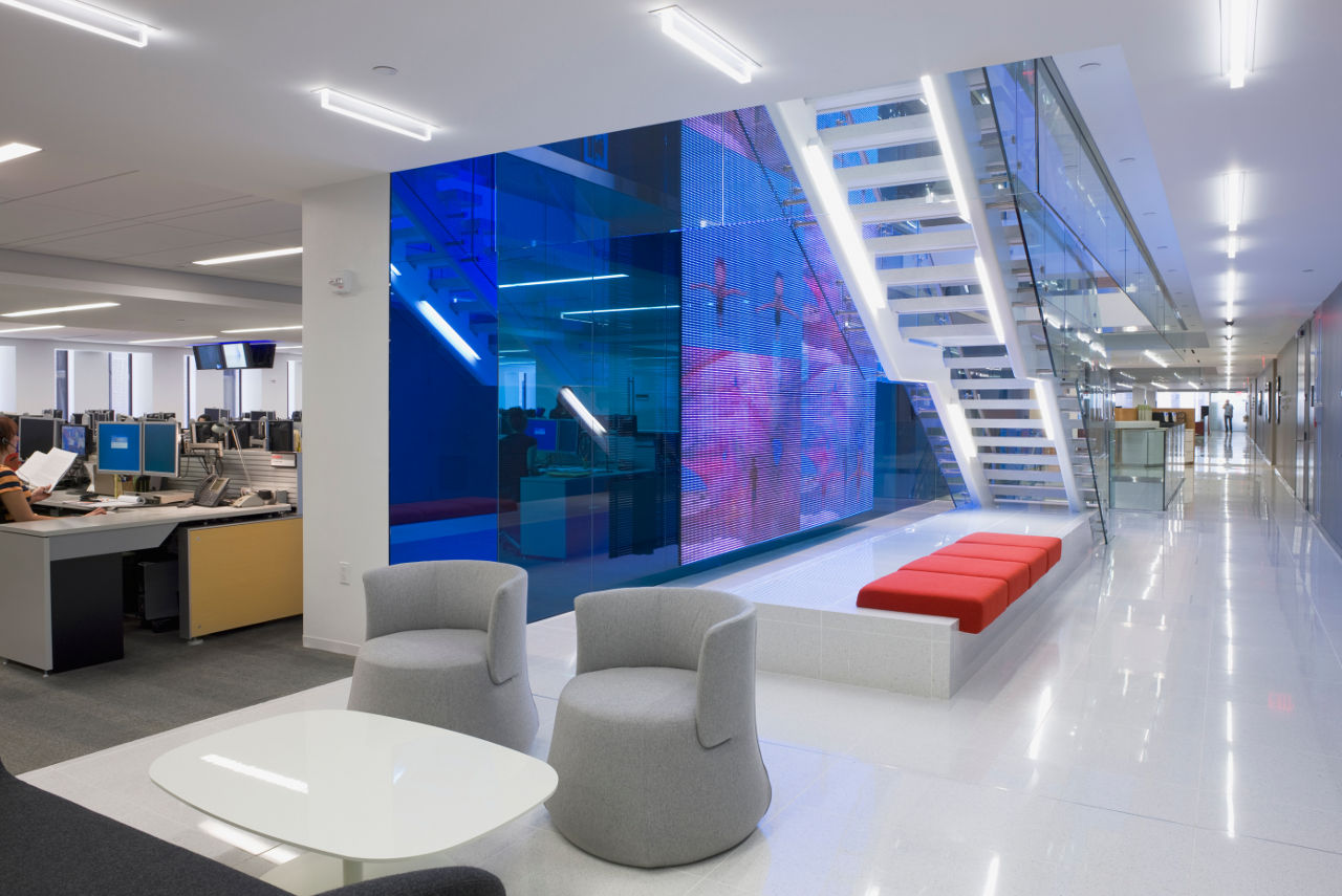
A central reception area is linked to this vertical zone. It is frequented by employees as well as visitors, since it is adjacent to the caf�, social areas, and the stairwell. The reception area also provides a glimpse into the virtual world: a display wall with transparent LED pixels feeds data from the company website.
The theme of transparency extends even to private offices and conference rooms, which have floor-to-ceiling glass partitions. Floors and other horizontal surfaces in the shared spaces are a glossy white, including the stairs, which are surrounded by glass balustrades. Color weaves through the space, however, mostly in the form of brightly hued chairs and other furnishings.
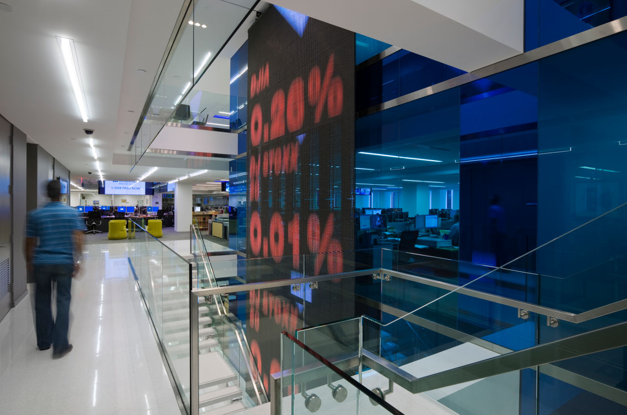
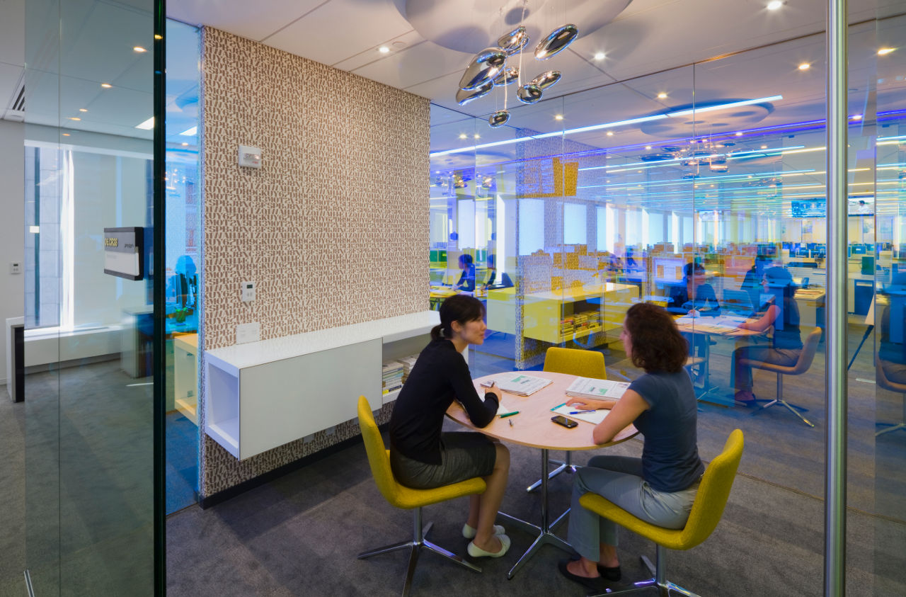
Naturally, the offices support the most up-to-date technology. Audio-visual screens are among the most visible components of the design. But in the editors� media hub, desks are arranged in a honeycomb configuration to ensure that, at eye level, one�s primary connection is to co-workers. The array of LCD monitors is suspended a floor above, from the edge of a floor slab.
According to information made available by STUDIOS, �Sustainable design elements include a reflected ceiling plan used for energy savings and cost savings, green finishes, high efficiency lighting, and methods to maximize daylight within the space.�
The design won a 2010 AIA New York Merit Award in interior architecture.

Kristin Dispenza
Kristin graduated from The Ohio State University in 1988 with a B.S. in architecture and a minor in English literature. Afterward, she moved to Seattle, Washington, and began to work as a freelance design journalist, having regular assignments with Seattle�s Daily Journal of Commerce.
After returning to Ohio in 1995, her freelance activities expanded to include writing for trade publications and websites, as well as other forms of electronic media. In 2011, Kristin became the managing editor for Buildipedia.com.
Kristin has been a features writer for Buildipedia.com since January 2010. Some of her articles include:

