Interior Design Trends and Ideas
The interior space of our homes is where we will spend a considerable portion of our time in the coming months -- perhaps poising it for a bit of scrutiny in our traditional time of making fresh starts. Here we talk with experienced interior designers and architects about the trends and ideas that they expect to have an impact in 2011 -- an appropriate way to start your year.
�
�
Optimism
Robert Donaldson, of award-winning Cleveland-based architectural firm MOD{all} Studio, tells us: "We�re starting to see not just in design in itself, but reflective also in music and culture, that people are trying to be more optimistic. We see this in color trends, where colors have moved from a neutral, earthy palette. In fact we�re starting to see more invigorating, vibrant colors, those that really catch your eye and instill excitement into the space.� Michelle Workman, the woman behind the designs that have graced the homes of John Travolta and J. L, points out the link to the economy. �I think that interiors can be a way to uplift someone�s spirit, and we kind of need that right now. If you can change something about your interior to make it happier and brighter, do it. Even if you�re doing fine, your friends may not be -- and that�s a chance to help uplift them. In the depression there were a lot of drab, boring colors. Brown and gray were huge and these were the standard colors being used in interiors at that time. Only when we started to come out of that did color become in vogue,� Workman says.
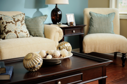
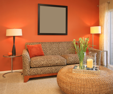
Tip: �Express your liveliness,� says Workman. �Everybody has something about them that is happy, lively, and good. Even the most miserable people have something about them, and that�s what their home should express.� The easiest and cheapest way our designers suggest: Paint. Whether it�s an accent wall or an entire room, get some color into your home!
Human-Centered Design
Make no mistake, designers have discovered that people do, in fact, live in homes. The desire for the �McMansion,� with its unused space and constant competition with the Joneses, has gone the way of the formal dining room. Residential spaces are being designed to fit the needs of the families living in them, rather than sitting as an abstract, mechanical symbol of what one is supposed to have in our culture. Houses are becoming smaller, more efficient, and geared toward the people who reside within them. Lori Gilder, an award-winning architectural interior designer who has broadcast her expertise through several appearances on HGTV, tells us: �Incorporating subtle Universal Design principles, by creating more open and flexible floor plans with wider doorways, main floor master suites and user-friendly kitchens and baths, is a new trend appealing to Baby Boomers and Gen Xers alike. Homes are becoming smarter, smaller, and simpler, making for an easier transition for the changing family.�
"As the house size decreases a bit we�re also seeing desire for double-duty with rooms. The home office starts to move into the living room because you can now do more things on your television that are Internet-based. The dining room has kind of gone away, too. As the great room started to go away, the dining room was part of that combination. The question is where does the dining room go? We�re pushing around, pushing in, things are getting pushed out. There�s a lot of fluidity." Jim Fish, architect at MOD{all} Studio
The family, here, plays an essential role. Although form is not lost, function will dictate much of design -- attempting to aid in managing the daily tasks of the family. Jennifer Scully, of design firm Redesign for a Dime, explains to us: �My clients are mostly working parents with children. They want washable! Gone are silks, wools, and linens, and in are indoor/outdoor fabrics and cotton rugs. No one wants the maintenance of an upholstery cleaning service, and no one wants to have rooms in their home that their children are not allowed to be in.� It seems that not only are fabrics and furnishings being affected by family needs, but the organization of the home space, too, has been altered to streamline the process of everyday life. �We see laundry rooms moving more toward the area where the bedrooms are, particularly the master bedroom -- closer to where the dirty clothes are generated,� says Jane Frederick, of Frederick + Frederick Architects. She also highlights the continuing rise of the home office, explaining that more people are working from home.
Tip: Really make your space work for you. DeAnna Radaj of Bante Design LLC pleads, �De-clutter! Get rid of anything that isn�t serving you � why have that negative item take up space? Make room for items that bring you joy and serve a purpose.� Efficiency is key now, and there�s been no better time to really personalize a space and make it truly yours.
Interactivity
It comes as no surprise that interactivity is an evolving trend in interior design. Like the dynamic, growing structure of social media, our homes are entering a time when public and private boundaries are in flux -- and perhaps our homes are standing as a �profile� that can be worked and manipulated and is incredibly fluid. Combining this concept with the trend of smaller homes with higher efficiency results in modular design, a specialty of architect Donald Rattner of Studio for A.R.T. and Architecture. �Modular design incorporates parts that are designed to combine with others to create a larger picture. It has been adapted to the whole range of interior design concepts -- in everything from tableware to wall tiles to candlesticks. An amazing range of products have been recast in a modular fashion. In an urban or smaller context, it works very well in conserving space and can be adapted to a wide range of sizes in terms of available area. People want to have some sense of interactivity, rather than passive consumption of things. It�s possible to rearrange, mix colors. You see it everywhere. The onslaught of 'my this' and 'my that' is about individualization across the cultural spectrum.�
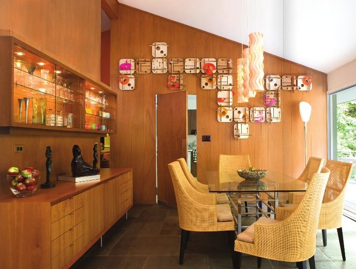
Although technological metaphors and conceptualizations inform aesthetic choices in terms of space, the real deal is certainly still a prevalent influence in its organization. Donaldson�s partner in crime at MOD{all} Studio, architect Jim Fish, explains: �It�s still plug and play. People want the latest Blu-ray, the latest game console, upgrade the home theatre. It�s not very sustainable, but as architects we have to provide flexibility for these spaces -- particularly these gaming systems like the Kinect and the Wii where the users are being actively engaged with the gaming system. They want to be able to have open space. At the same time, we are challenged to set up the space to be functional while these systems are not in use, have the furniture and have an area transform itself. That�s something we�ve been taking to a more extreme level.�
Fish adds that technology is incorporating itself into regulatory systems within the home and still evolving. "The idea of being able to control your mechanical systems, your sustainability systems, with your electronic systems is very exciting -- but scary as well," Fish says. "It�s exciting because you�re given this duty to help the person who lives in the house have control over how they use their environment. It�s not like you give them this box and say, �This is your bedroom.� You can make it incredibly malleable and use space differently. You can use any room as a bedroom. You can use any room as a greenhouse. Just the idea that it is so flexible is really exciting.� Given the rising popularity of the green technologies that lead to lower energy consumption and carbon footprints, it is safe to say that this interactive feature in the wiring of houses will have great potential for this sort of fluidity.
Tip: Even if you are on a budget, big box stores all over are increasingly offering more products of modular design. This allows you to not only personalize your space but update it easily and effectively, to keep it fresh and energized.
Making a House a Home
According to Radaj, the home has become nothing short of a personal sanctuary. �Due to the economy, more people are staying put. They can�t sell their current home or are hunkering down until things pick up," she says. "Therefore, they are upgrading and/or paying more attention to their current space -- making it comfortable for them, their family, and their lifestyle.� Within the sanctuary of the home, even deeper sanctuaries exist, according to Scully, who has seen the �Mom Cave� make a larger appearance. �I believe this phrase was coined by the store Home Goods," Scully explains. "We have all heard of Man Caves and that phrase evokes a visual image of black leather, chrome and glass, hard surfaces, and lots and lots of large electronics. A Mom Cave is either a room or just a part of a room within the home that is usually a small, cozy spot filled with warm colors or textures and usually has no electronics at all! It tends to be a quiet refuge where a mom can relax, regroup, decorate how she wants. A place she can call her own. My clients have requested spaces within rooms to call their own like reading nooks, small hidden offices with cozy seating, or even window seats.� It seems safe to say that, mom or not, these individual havens are becoming more prominent in the American home.
"Due to the economy, more people are staying put. They can�t sell their current home or are hunkering down until things pick up. Therefore, they are upgrading and/or paying more attention to their current space -- making it comfortable for them, their family, and their lifestyle." DeAnna Radaj, Bante Design LLC
Breaking free of the rules and personalizing space is an element that Workman has witnessed and advocates. �I think that the real trend in design is expressing," she says. "Prior, it would be either modern or traditional style, but no person is either all modern or all traditional. Every person has their quirks and loves and hates. I think the real trend is showing off your personality. That means mixing it up -- introducing an older piece from your grandma�s attic into a modern home but finding a way to make it flow in the space, incorporating meaningful, nostalgic pieces. This is a form of expression, using it as a statement as opposed to something that is expected. I think people should walk into their houses and say, 'Oh! I�m home!' It should someplace where you�re happy.�
Tip: Feng Shui consultant and home expert on the television show "Live it up!," Laura Benko, explains how to improve the quality of your home. �Try to be aware of the symbolism that you surround yourself with. Take a closer look at the subconscious message that is energetically imbued in your space. Are you hanging onto stuff that you don�t even like but cannot bear to give away or get rid of? Let it go. Are you living in the past and have not updated your d�cor in decades? Time to refresh. Do you waste hours looking for keys and miss paying bills on time? Dedicate an area for organization and make a place for everything,� Benko says. Making everything in your home have meaning and serve a purpose will help you transform your house into a home.
Transition
Workman has noticed the occurrence of a shift from the standard traditional/contemporary style to a striking and aesthetically interesting mixture throughout American homes. Gilder, too, has seen a resurgence of natural materials in the home. �The endless selections of hemps, silks, linens and metallics are striking in both traditional and contemporary interiors -- instantly adding texture and character to the space," Gilder explains. "This material is the epitome of understated eco-chic.� As the green movement continues to play an integral role in design, recycled, natural, and sustainably constructed pieces and materials will play a greater role in the home. Rattner feels that this shows a transition from �the mechanistic, abstract, machine-inspired d�cor that we�ve seen in the last 5-10 years. People will search out a more humanized, modernized style. They�ll use more organic elements to offset the more mechanical design.�


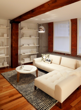
This transition is seemingly breaking down barriers in room definition as well and perhaps with the barrier between public and private spaces. Rattner explains, �The so-called living room, or main public space -- open to family and non-family members -- is becoming much less formal, much more fluid. The divisions between spaces are not as concrete -- both physical and figuratively.� Fish has also seen a shift toward transition through definition. �As the house size decreases a bit we�re also seeing desire for double-duty with rooms," Fish says. "The home office starts to move into the living room because you can now do more things on your television that are Internet-based. The dining room has kind of gone away, too. As the great room started to go away, the dining room was part of that combination. The question is where does the dining room go? We�re pushing around, pushing in, things are getting pushed out. There�s a lot of fluidity.�
Tip: Stay flexible. Remember that your home is your space -- let your quirks shine, don�t feel limited to one style or another. This goes both for d�cor and utilization of your space. Apportion space appropriately to your lifestyle, not conventional wisdom.
As you can surmise, there is much change and movement going on in residential design -- and perhaps this is exactly what we need in the New Year. Regardless of your style, flair, or New Year's resolutions, create your space to achieve your goals and speak of your personality. Happy New Year!


