Behnisch Architekten's Winning Design for the University of Baltimore School of Law
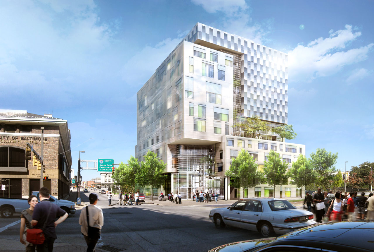
Having constraints can actually lead to creativity. This assumption has been confirmed by research into human psychology and can be empirically observed in many creative disciplines. Constraints were plentiful in the international design competition for the University of Baltimore�s (UB's) new John and Frances Angelos Law Center. The winning design, by Behnisch Architekten, is now under construction on the UB campus.
 Image courtesy of Behnisch Architekten
Because of UB's urban location, space devoted to the School of Law � the sixth-largest public law school in the country � has been spread throughout various buildings. A 1982 structure currently serves as the school�s primary home, but because enrollment has increased by 20% in the years since the building was built, and faculty and staff positions have more than doubled, many portions of the curriculum have been removed to remote locations. The urban environment of the campus also means that room for expansion is limited.
Maximizing a Limited Expansion
The site of the new school is basically �a leftover piece of land,� says Matt Noblett, the partner at Behnisch Architekten who was in charge of the project. �It is at the intersection of Charles Street, which is a significant commercial and urban street, and Mt. Royal Avenue. There is also a freeway that cuts across the site. And having a six-lane freeway there brings up acoustic and air-quality issues.� The triangular site, with its proximity to heavy traffic, determined both the shape and size of the building�s footprint, causing it to �become vertical,� explains Noblett. Fortunately, the freeway grade is lower than the courtyard of the School of Law building, and views will look over the top of the roadway toward the historic Penn Station transportation hub.
Also impacting the design of the building were changes that have come about in law education itself. �There is a new level of integration,� says Noblett. An emphasis on this theme of interaction and integration, combined with the verticality of the available space, ultimately led to a building layout that is organized around a central circulation core. �Environmental concerns, especially the necessity of getting daylight into the broad floor plan, also played a part,� says Noblett. The glazed atrium provides an ideal solution, Noblett explains: �The spaces become clear and visually connected. It also provides a strong visual connection for faculty and students; the faculty offices are not out-of-the-way cells.�
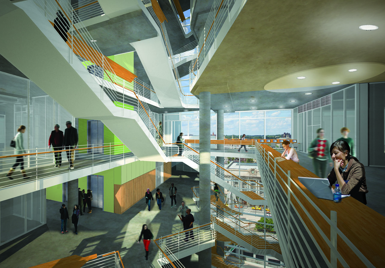
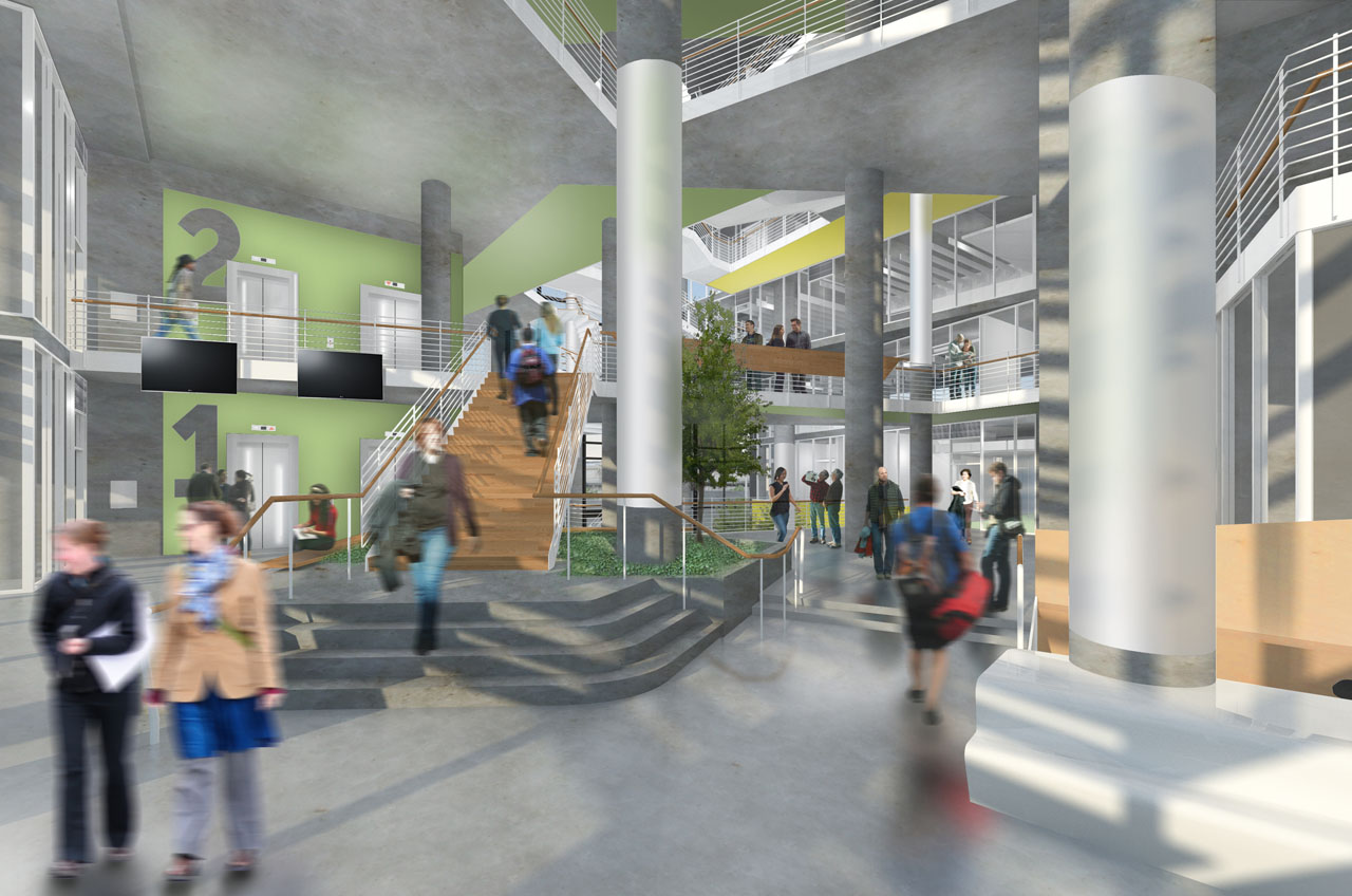
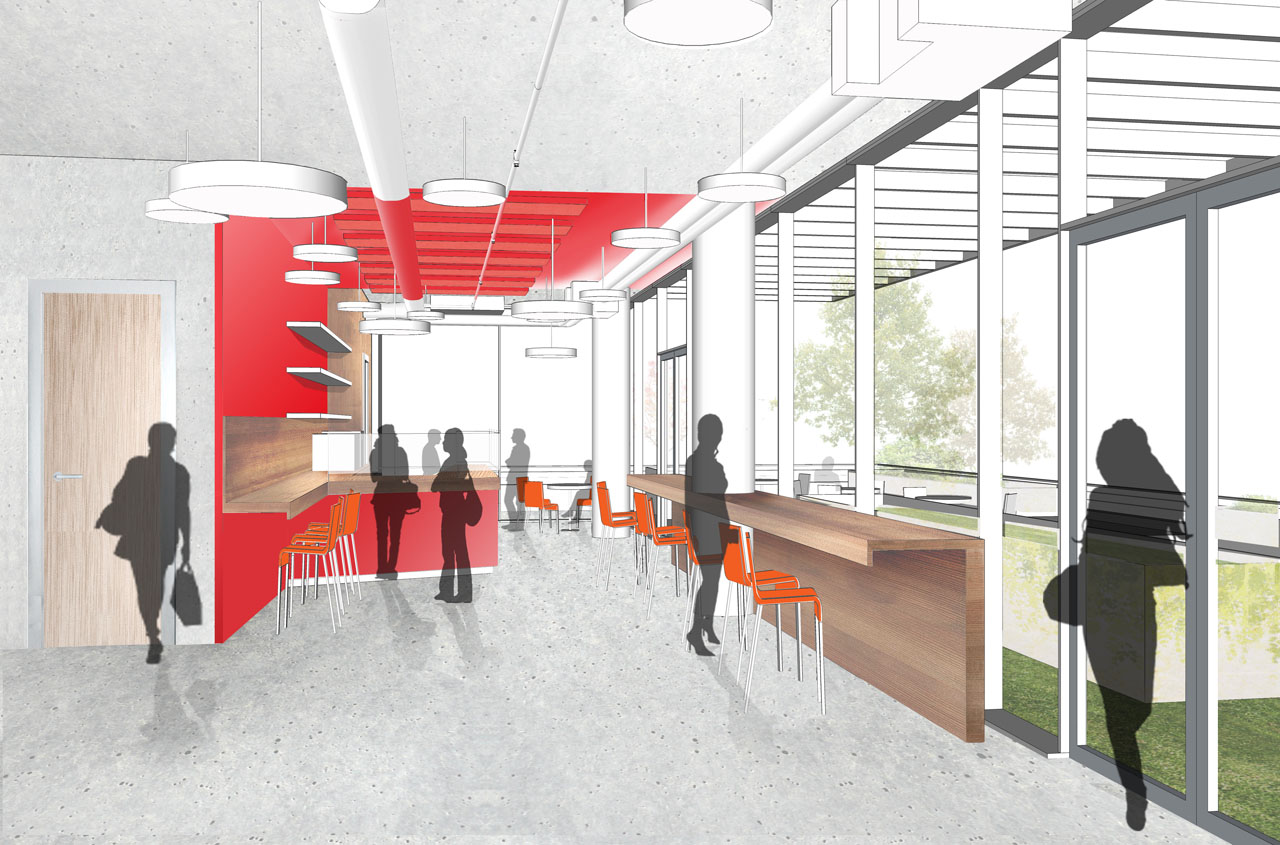
Circulation in the atrium is comprised of a series of angular stairs and ramps. Their circuitous layout, says Noblett, makes it more pleasant to move around the space, and allows the circulation zone to become a place that facilitates interaction. On one of the two elevator banks, glazed front and back walls increase transparency and emphasize the importance of movement within the space.
Certain programmatic requirements constrained the building design still further. A legal clinic that serves the public on a pro bono basis, for example, needed to have easy access to an entrance. A large moot, or mock, court and its ancillary spaces �needed to be in the lower regions of the building. We sunk it down a half-level, creating a �garden level,� so as to not kill the street life,� Noblett says. And whereas law libraries used to function primarily as book storage, �new digital formats have reduced this need for storage, so there has been a trend to reduce the library size,� says Noblett. For this building, though, the library has flexibility designed in: as needs continue to evolve, the space can get either bigger or smaller. The final building form displays a tripartite breakdown: a volume containing classroom space is interlocked with a block containing clinic, faculty, and administration space, and an upper bracket of library space caps the building.
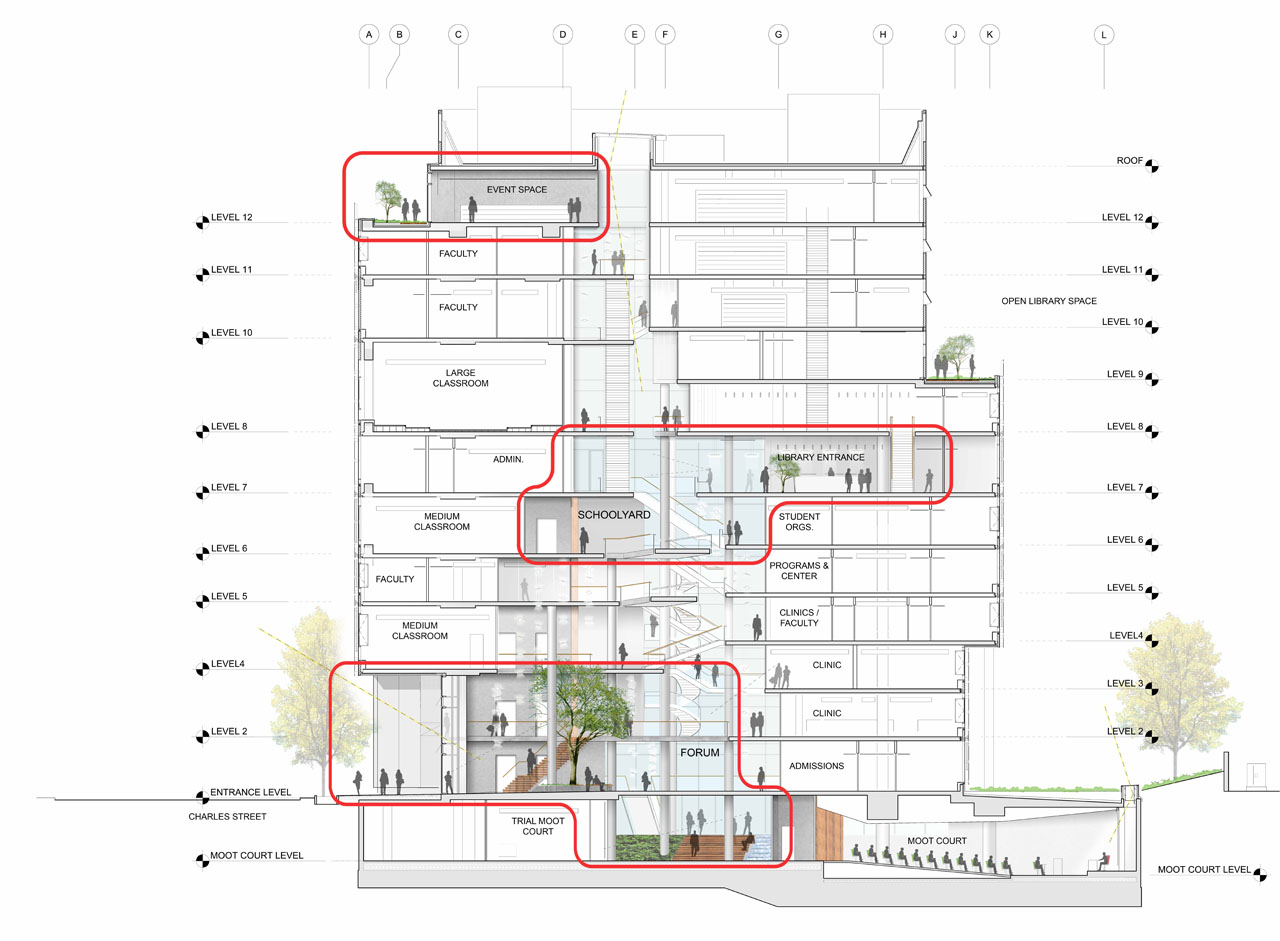
The envelope of the library area, articulated as a grid, serves to emphasize its separateness. �This fa�ade was conceived of as a veil,� says Noblett, �because of the library�s flexibility and different program. It has a ceramic frit gradient to make it read as one volume.� All three of the building�s fa�ade systems are constructed of glass and metal; extra glass was incorporated in some areas to provide acoustic protection. The office and classroom volumes have a glass rainscreen to unify them, and the transparency of the atrium fa�ade has exposure across almost the full height of the building."
Sustainable Rules for This School of Law
�Interior materials are direct and raw,� according to Noblett. Exposed concrete predominates, and its aesthetic fits well with practical requirements; radiant slabs house tubing for the water that provides climate control. After dark, the atrium shaft is lit from within by LED lights, which match those used throughout the building. �They are efficient, and give good color,� says Noblett. Other green elements include geothermal wells and solar collectors on the roof. Stormwater is reused. LEED Gold certification is targeted for the building, although it may possibly achieve LEED Platinum.
The finished building, expected to be complete in 2013, will be a highly visible landmark. It will make a statement about UB�s commitment to sustainability and about the John and Frances Angelos Law Center�s role as a premier school of law. The structure�s three-part composition will differentiate the functions housed within, while also alluding to their unity.

Kristin Dispenza
Kristin graduated from The Ohio State University in 1988 with a B.S. in architecture and a minor in English literature. Afterward, she moved to Seattle, Washington, and began to work as a freelance design journalist, having regular assignments with Seattle�s Daily Journal of Commerce.
After returning to Ohio in 1995, her freelance activities expanded to include writing for trade publications and websites, as well as other forms of electronic media. In 2011, Kristin became the managing editor for Buildipedia.com.
Kristin has been a features writer for Buildipedia.com since January 2010. Some of her articles include:


