House of the Month: Captured Spaces: An Exercise in Modernism
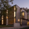
The Fairfield House, designed by Webber + Studio, is located on a tree-lined street in the Austin, Texas, neighborhood of North Hyde Park. The Hyde Park Historic District is listed in the National Register of Historic places, and the area’s popularity has been growing in recent years due to its proximity to the University of Texas. In many respects, the 3,180 sq. ft. home, an Architectural Record House of the Month in 2009, draws upon the district’s rich architectural traditions, just as its neighbors do. In response to Texas’s hot, humid climate, for example, the house is separated into small building masses that are open to ventilation. A breezeway – another classic architectural element – connects the front and the back portions of the building, but that is where the nod to tradition ends. In every other aspect of its design, the Fairfield House is an exercise in modernism.
The program lent itself to the creation of separate massings. The clients wanted a main house with three bedrooms and two-and-a-half baths because they anticipate a growing family. “They also wanted an in-law suite for a father-in-law who lives out of state and comes for extended periods, and needs his own suite,” says David Webber, Principal Architect of Webber + Studio. “The father-in-law was also interested in owning property in Austin,” Webber explains, adding that this made the inclusion of his own suite a desirable option.
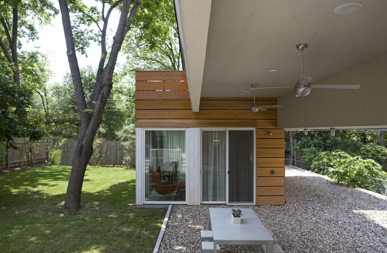
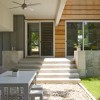
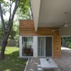
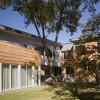
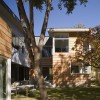
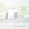
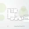
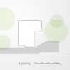
In a concept diagram, the Webber + Studio show how they took a typical cubic house volume dictated by the program, then unfolded and extruded portions of it. Doing so allowed them to integrate, or capture, extra space within the site. “The house stretches along the length of the property and then kicks back into the backyard, essentially wrapping around a large pecan tree and capturing that space as its own discrete area. The bridge, by crossing from one part of the house to another, captures a space below it which becomes a breezeway,” says Webber. Overall, the weaving together of interior and exterior space creates a house that is “intertwined with its site, since it wraps around edges of the site to create an enclosed backyard. Yet it still allows an easy flow from the backyard, under the bridge, to the front of the property. Also, from inside the house’s first floor, several windows and doors allow easy flow out into the backyard spaces,” Webber continues. Several small patios extend daily living into the outdoors, and the ground floor living area of the in-law suite is glazed to allow a visual flow of space between the interior and exterior.
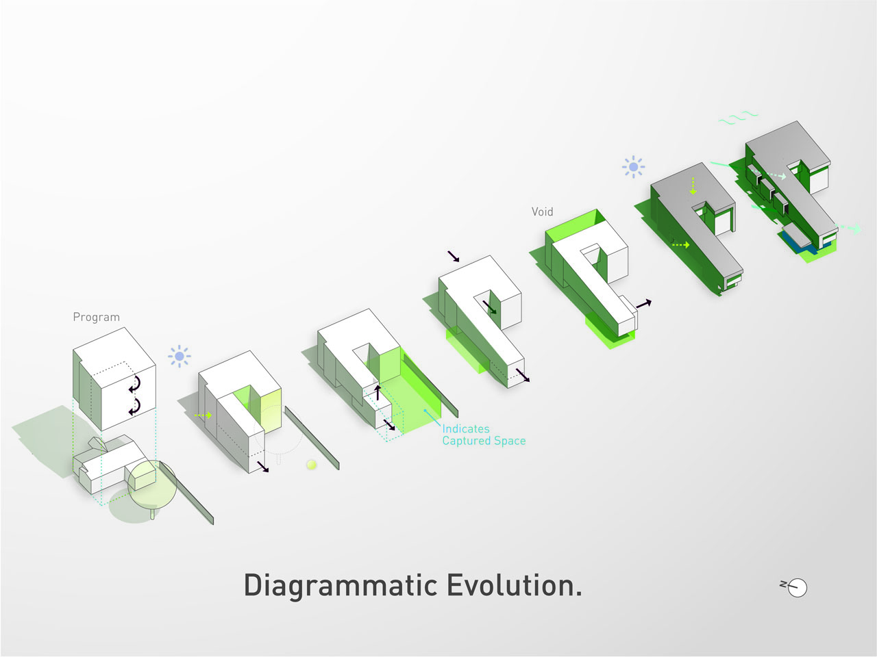
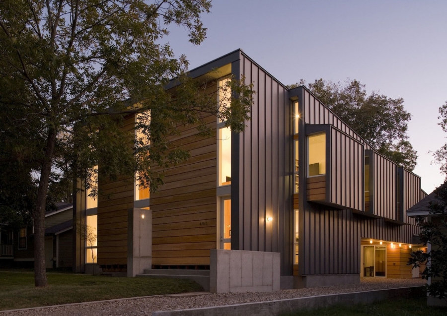
The building volume is further broken down at its western elevation by "pop-outs." These allow the bedrooms along the bridge to have north- and south-facing windows, thereby avoiding solar gain from the western exposure. Along this side of the site, a driveway is pushed to the edge of the property line, providing ample access and parking without bisecting the 60’ x 125’ lot and sacrificing valuable space.
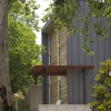
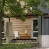
The western façade is clad in metal siding with vertical standing seams. “Metal resists harsh exposures,” explains Webber, “and it has a long legacy in Texas, like many places in the south. Many metal manufacturers are based in Texas.” This fact meshed well with Webber + Studios’ desire to use materials with local origins. Webber explains that wood siding was chosen for use on the home’s more prominent facades because wood gives a humaneness to the building; local cypress keeps the material sourcing regional.
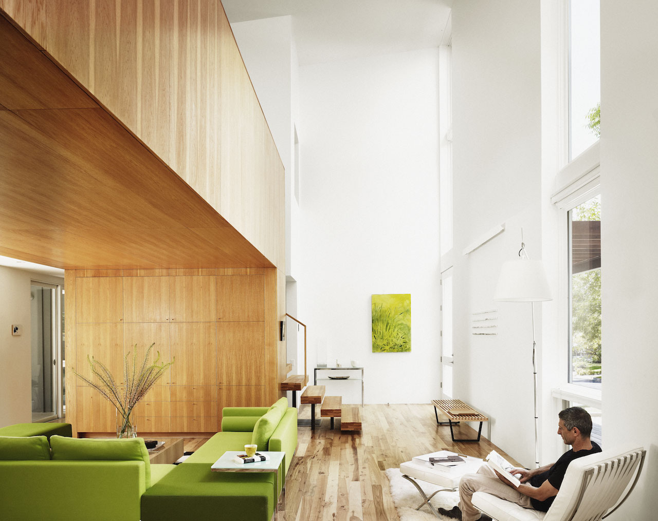
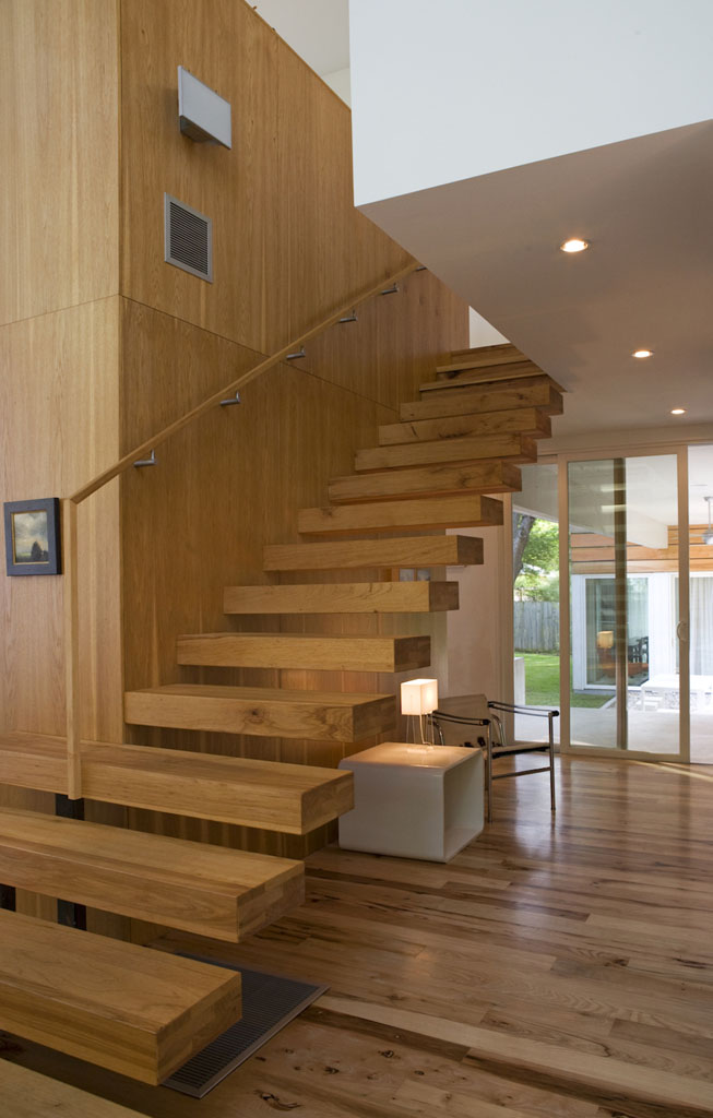
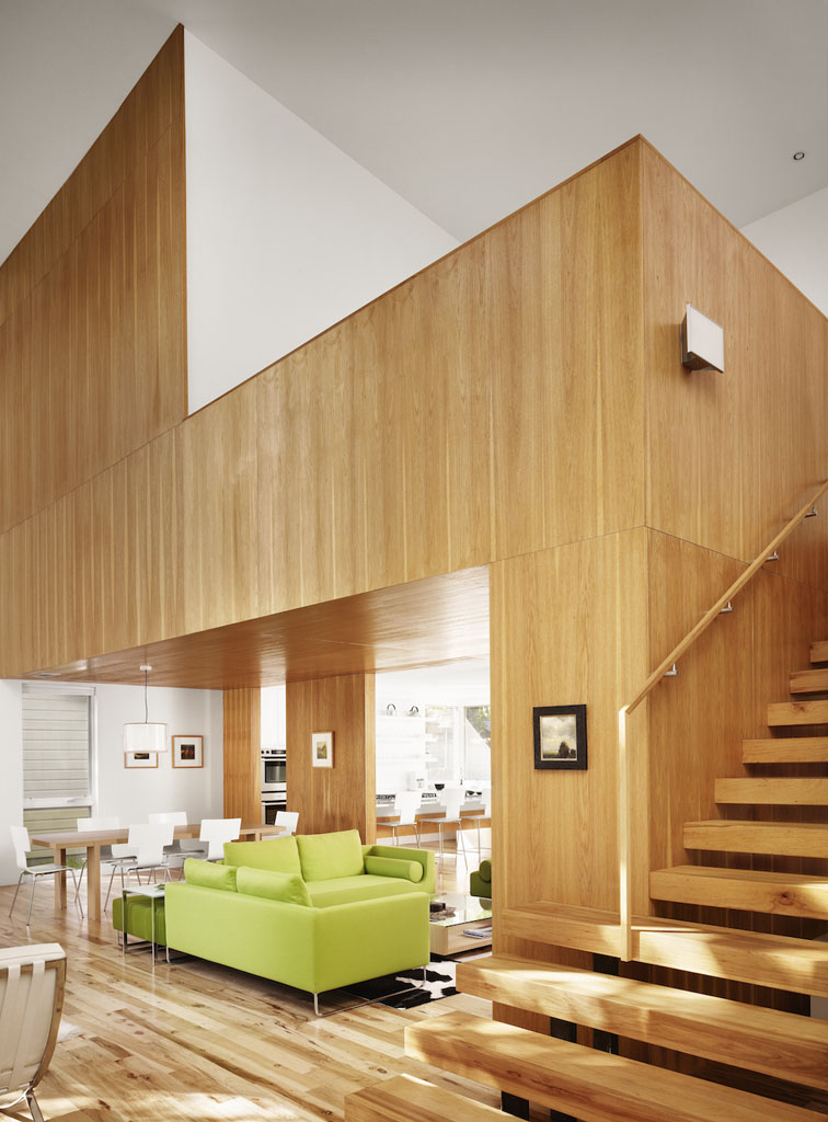
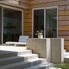
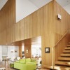
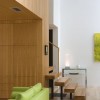
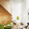
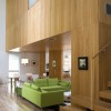
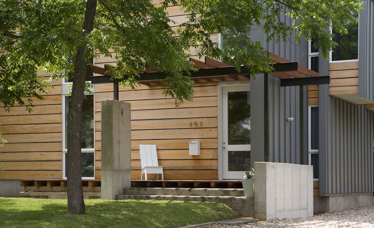
One of Webber + Studios' captured spaces is a double-height interior space. Representing the front portion of the conceptual programmatic volume, the extra height gained here makes for a dramatic entryway. Three vertical "columns" of glazing make the volume read on the planar front façade. Even the front porch and pergola don’t interfere with the purity of the volume, thanks to the use of contrasting materials (concrete, redwood, and ebony-colored steel) and minimalist styling.
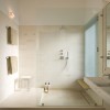
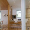
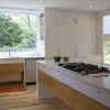
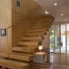
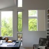
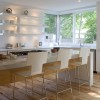
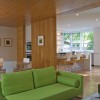
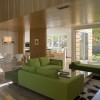
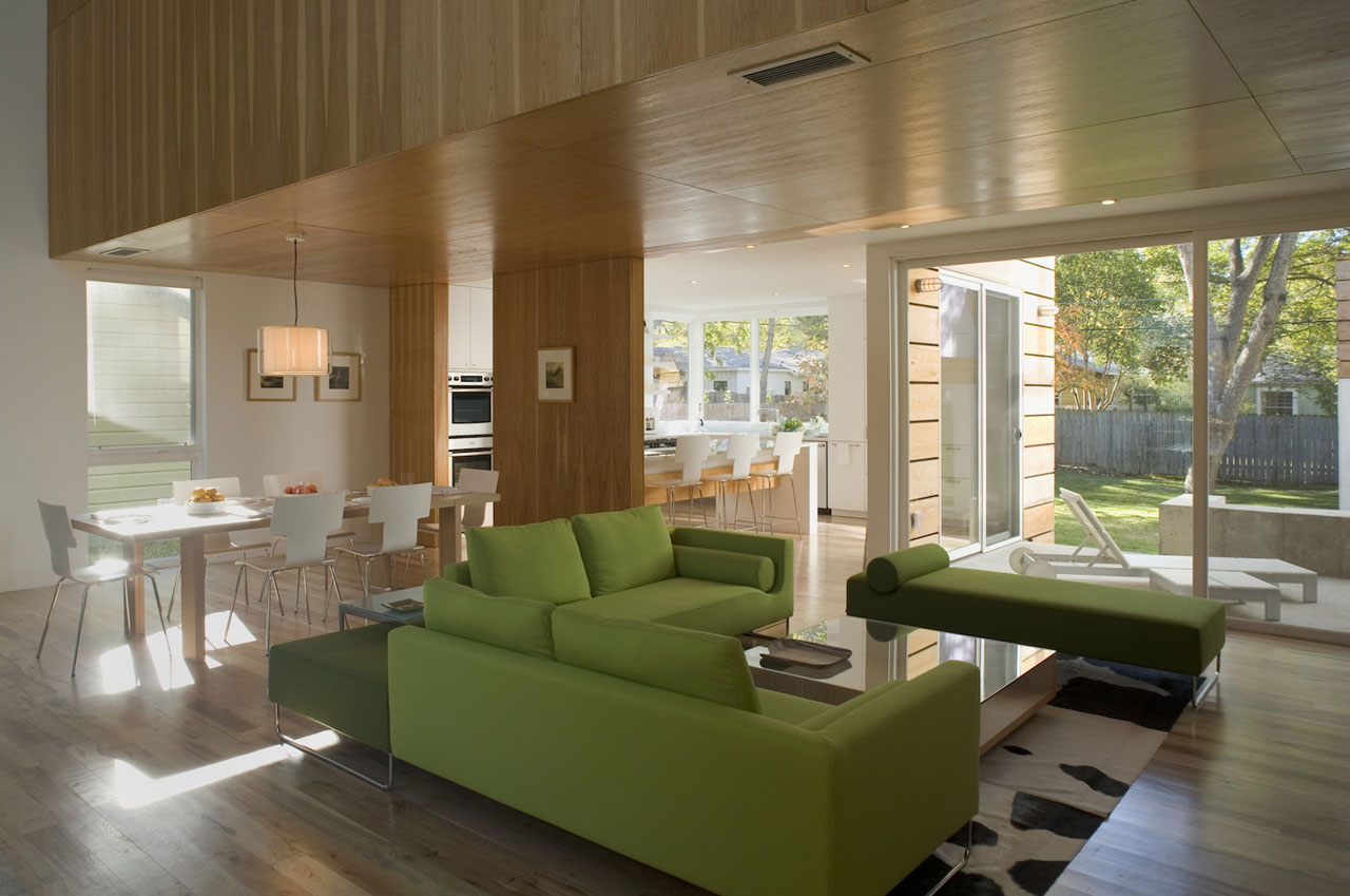
Local materials were also used inside the house: pecan for interior hardwood flooring and cabinetry, and Lueders Limestone tile for bathroom floors and walls. A countertop in the powder room is made of mesquite wood.
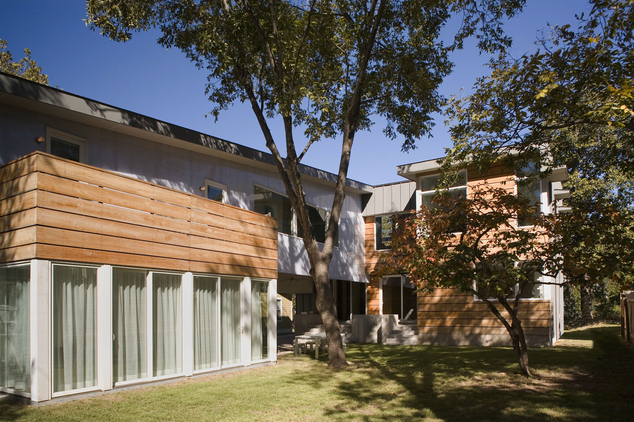
By marrying modernism’s diagrammatic flexibility to some traditional architectural solutions, Webber + Studio not only maximized usable space but achieved a separation of the home’s two distinct living areas, while still allowing them to maintain a dialogue.

Kristin Dispenza
Kristin graduated from The Ohio State University in 1988 with a B.S. in architecture and a minor in English literature. Afterward, she moved to Seattle, Washington, and began to work as a freelance design journalist, having regular assignments with Seattle’s Daily Journal of Commerce.
After returning to Ohio in 1995, her freelance activities expanded to include writing for trade publications and websites, as well as other forms of electronic media. In 2011, Kristin became the managing editor for Buildipedia.com.
Kristin has been a features writer for Buildipedia.com since January 2010. Some of her articles include:

