Talking with Sarah Nettleton About Building a Simple Home
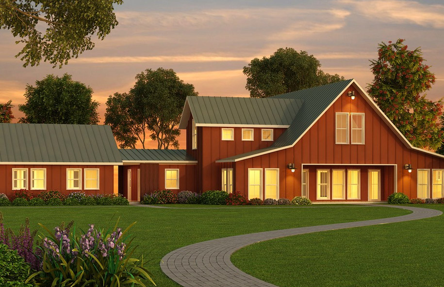
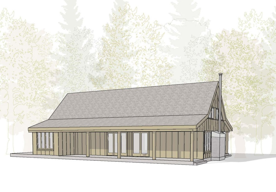
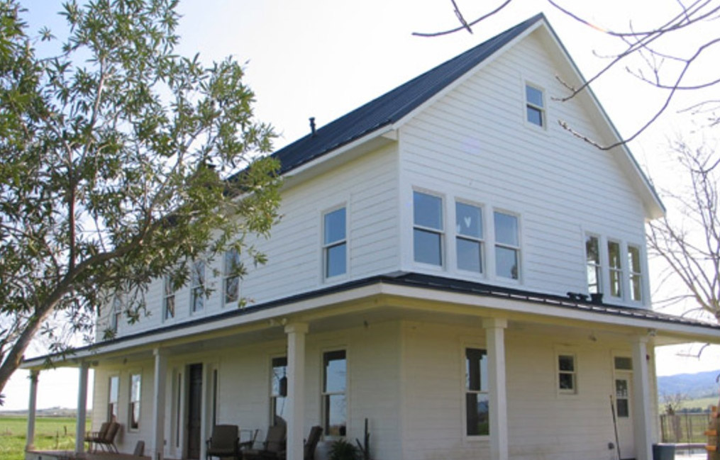
Architect Sarah Nettleton’s keynote speech, presented at Inside Out: Transforming the Built Environment, posed the question, "How do you want to be in your building?" Answering this question can help us develop a more focused and deliberate approach to building. The process of considering how we experience our built environment not only informs us as to what to include in a design, but shows us how to eliminate the extraneous features which contemporary buildings -- especially houses -- have taken on. In 2007, Nettleton authored the book The Simple Home: The Luxury of Enough, published by The Taunton Press, which examines 21 different homes located throughout the country and explores the topic of building simply.
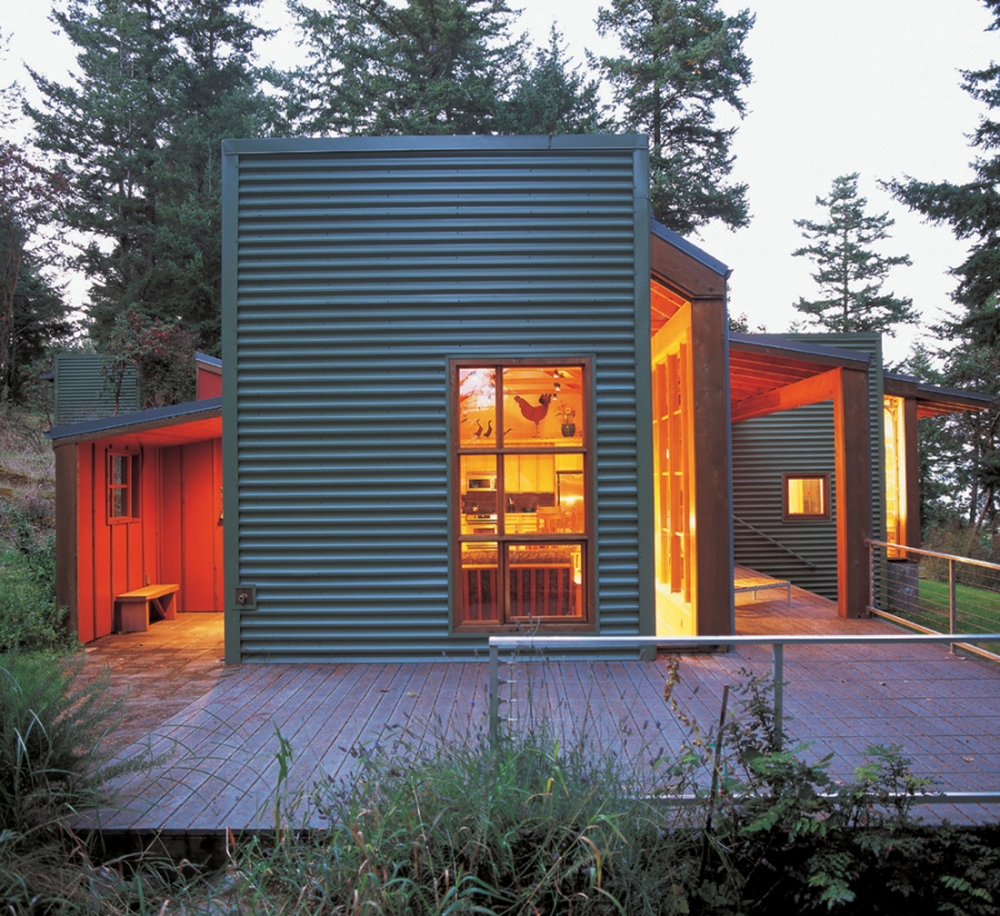 **Caption at Bottom
Photo Credit: Randy O’Rourke
It is of primary importance to understand how we arrived at a point where we no longer have the ability to construct simple homes, places that can meet our needs in a straightforward manner. Over the past few decades, there has been a push for building houses with increased square footage at a price middle class homebuyers could afford. "The financial model of value in real estate is what has driven this," says Nettleton, "Value is based on square footage. Throughout the system -- appraisal, banking, financing -- bigger is better. So, it’s the marketing of the financial model that has created this situation, because bigger is considered more impressive."
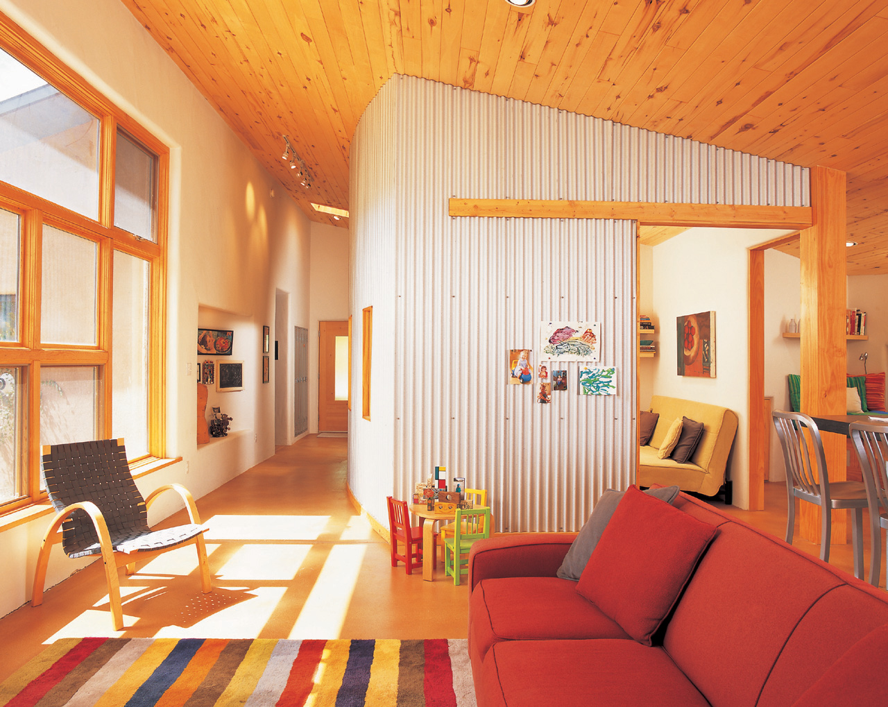 "Rather than formal and informal zones, this house has a main activity area and an 'away' activity room tucked behind the corrugated metal wall. The away room does double duty as Gina’s office.*" Photo Credit: Randy O’Rourke
However, building bigger homes and filling them with more stuff has had unintended consequences. The extra space and the extra things have come with their own set of demands. Now the pendulum is swinging back; people are looking for a balance point. As Nettleton puts it, we need to identify what is enough. "The marketplace is still very confused. We still buy big everything -- big furniture, big cars -- but there is a growing awareness that all of this is daunting. That awareness marks a real shift," says Nettleton.
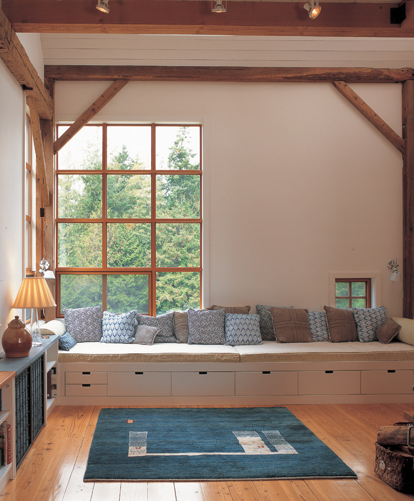 "The owners have an apartment in the large timber-frame barn. Playing with scale, the large corner window provides an expansive view over the property, while a small punched barn window offers a more intimate peephole to the outside world. The full-length window seat converts to beds for overnight guests.*" Photo Credit: Randy O’Rourke
 The Simple Home offers six steps that can help those who are considering building or remodeling to achieve a simpler living environment.
- Simple is enough. Make decisions based on what you really want, not something you think you should want. Says Nettleton, "It’s about finding your own authentic desires. For example, instead of building a fancy stair hall, trade that space for something you really want -- maybe that’s a room for dining that opens onto the back terrace."
- Simple is flexible. The easiest way to control the amount of square footage that must be built is to design spaces that can serve multiple purposes. "Even pieces of furniture can make a room more useable," points out Nettleton, "One client chose a glass dining table so that it could also be used as an art table where the kids finger paint. It’s a high-quality piece of furniture, but it’s well-designed and can serve this other purpose, so there’s no need to build a separate area for the kids’ activities."
- Simple is thrifty. Thrifty doesn’t necessarily mean cheap. The key to real thrift is careful planning, so make a conscious decision regarding what will add value. "The root of the word thrifty is to thrive," says Nettleton, "It’s about finding the best solution."
- Simple is timeless. "Whatever style the building is in, be it traditional, modern, or any other style, it can be timeless and move forward into the future. Timelessness is about how well designed a building is. Think of an Italian farmhouse: it was done well at its time," say Nettleton.
- Simple is sustainable. "Use good materials and think about maintenance issues in advance," says Nettleton, "and build in a common sense way. For example, position windows where they can let in daylight in the winter but shield the rooms from excess sun in the summer."
- Simple is resolved complexity. The idea of building a simple home can mean many things, but it does not mean easy or automatic. "What takes so long with design is thinking through multiple levels," says Nettleton, "A good example is a yacht. All of the necessities fit into a very limited space, and in the end it’s a pleasure to be there."
In The Simple Home, Nettleton makes the point, "Seemingly simple things, like maple syrup or a good single-malt scotch, are surprisingly complex to make." Similarly, by distilling our spaces down to be just what we really need and want, we can make them both simpler and more enjoyable. We can make them better.
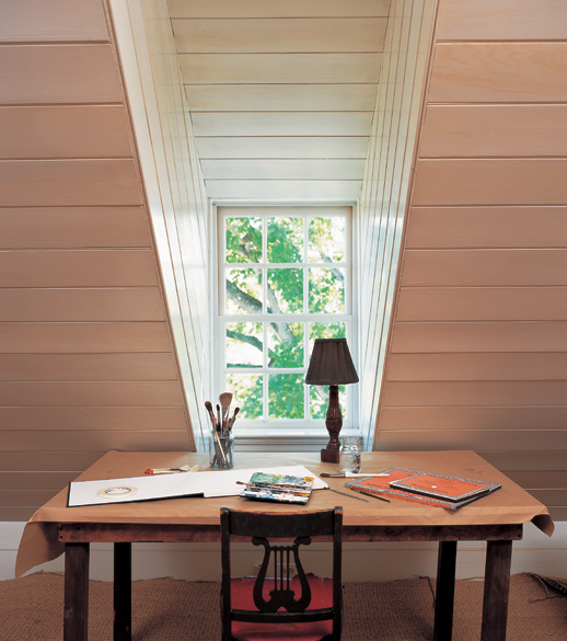 "The drama of the deep bedroom dormer contrasts with the intimacy of the table Nicola likes to use for sketching.*" Photo Credit: Randy O’Rourke
 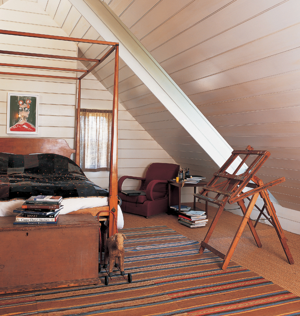 "Retaining historic materials from the 1840's, the walls and ceiling boards are painted a crisp white and a portrait by Nicola hangs over the bed.*" Photo Credit: Randy O’Rourke
 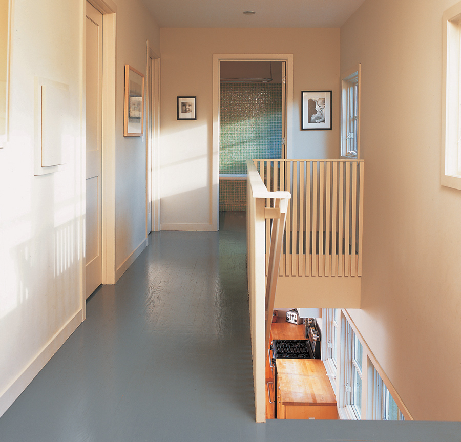 "The second-floor hallway connects the three bedrooms and leads to the only bathroom upstairs. Midway along the hall, a laundry chute dumps dirty clothes into the utility room below, a simple, everyday efficiency.*" Photo Credit: Randy O’Rourke
 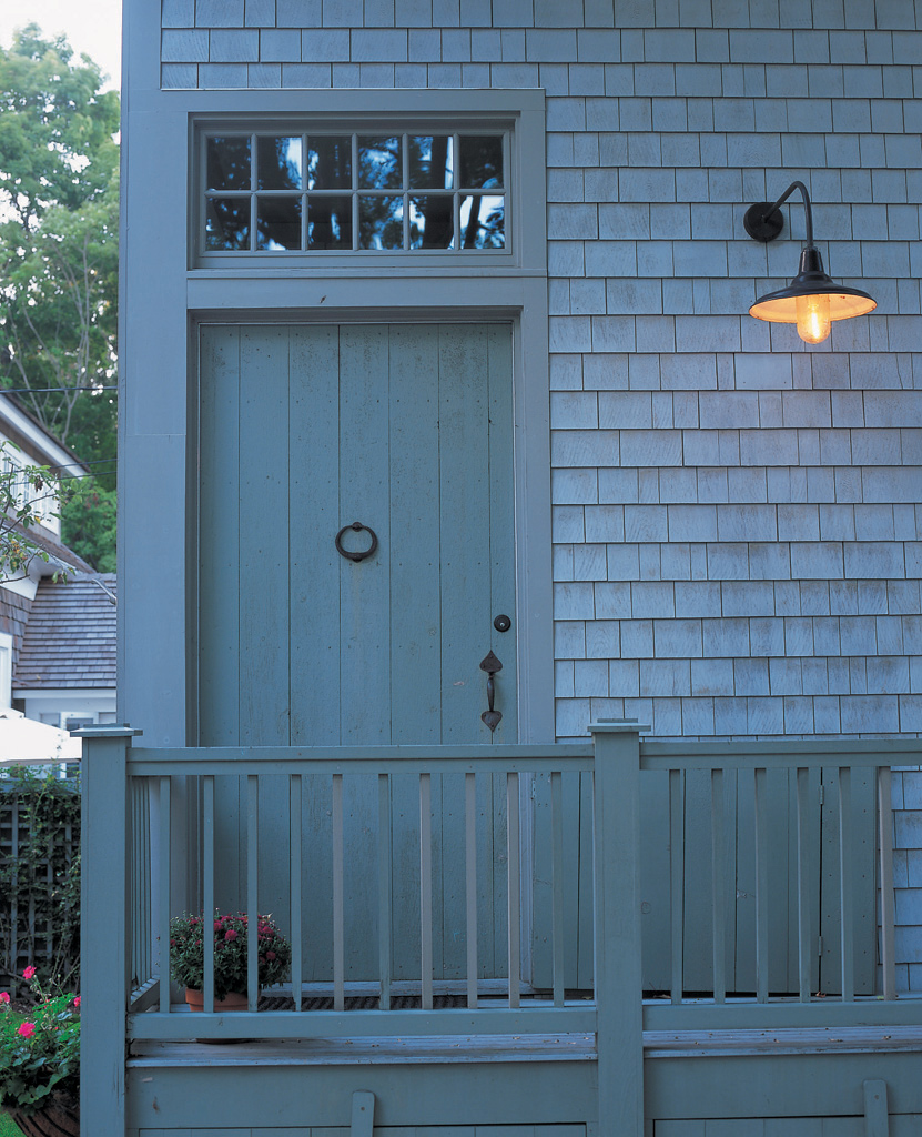 "The modest detailing of the front entry -- with simple plank door, full-width divided light transom, and hand-wrought hardware -- borrows from nearby colonial houses. The no-nonsense light adds an authentic barnyard touch.*" Photo Credit: Randy O’Rourke
 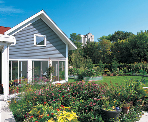 "A covered walkway leads from the main house to the screened porch, which is attached to the garage and enjoys a clear view of the garden. Behind the garage, galvanized metal watering troughs hold raised vegetable beds, while in the background, a grain elevator, icon of the Midwestern skyline, is a reminder that this urban farm is not far from its roots.*" Photo Credit: Randy O’Rourke
 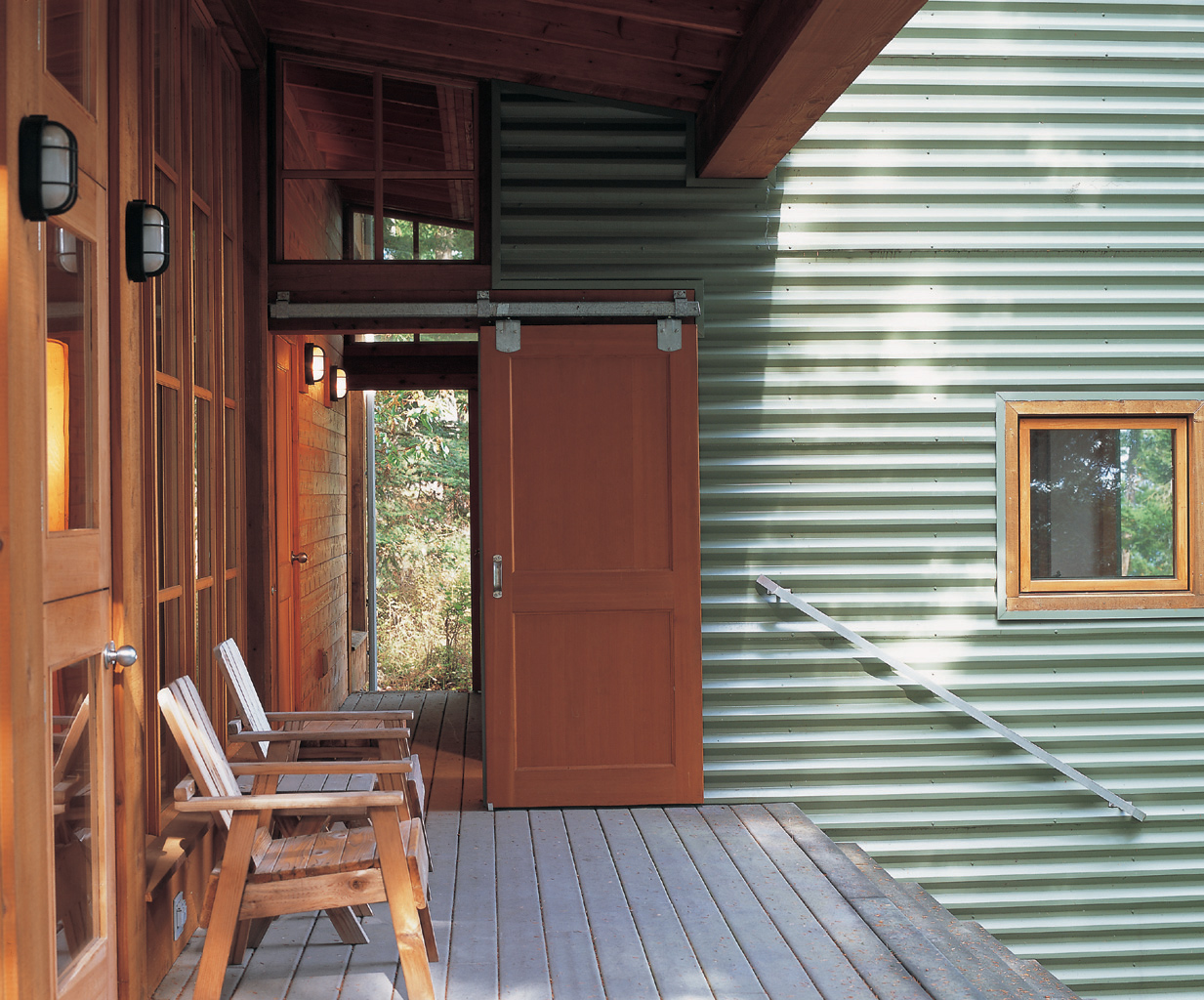 "Part of the delight of this house lies in its creative use of doorways, as seen here in the sliding door that opens a vista through the studio wing. The deck is made of recycled wood and plastic fibers, a product known as Trex.*" Photo Credit: Randy O’Rourke
 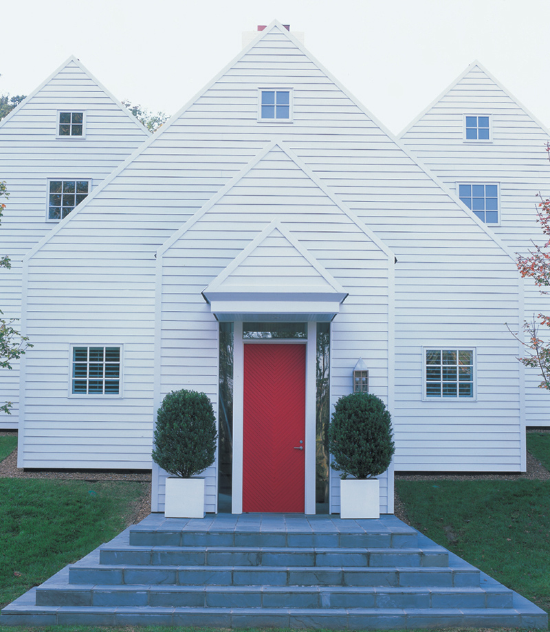 "The red of the herringbone-patterned door is the one splash of color on the exterior of this perfectly symmetrical seven-gabled home. As a counterpart to the gabled geometry, the front steps rise in a pyramid shape to the front door.*" Photo Credit: Randy O’Rourke
** "This island house is a contrast of new and old. Green corrugated-metal walls act like a Wild West storefront, essentially concealing a gable form. Inside, a warm wood interior glows in the early evening light. Both interior and exterior add up to a unified whole, an expression of how simple design can bridge the materials of many eras."
Photograph Captions Credit -- The Simple Home: The Luxurary of Enough

Kristin Dispenza
Kristin graduated from The Ohio State University in 1988 with a B.S. in architecture and a minor in English literature. Afterward, she moved to Seattle, Washington, and began to work as a freelance design journalist, having regular assignments with Seattle’s Daily Journal of Commerce.
After returning to Ohio in 1995, her freelance activities expanded to include writing for trade publications and websites, as well as other forms of electronic media. In 2011, Kristin became the managing editor for Buildipedia.com.
Kristin has been a features writer for Buildipedia.com since January 2010. Some of her articles include:


