AEC Pros

Through These Photographer’s Eyes: The Glass House, Part Three

Written by

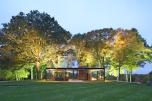
In September 2011, publisher Rizzoli New York released The Glass House, a photo tour of Philip Johnson’s famous estate. The book includes text by Philip Johnson himself and by architecture critic Paul Goldberger, and is the official Glass House book of The National Trust for Historic Preservation. Robin Hill’s photo “Glass House Dawn” was selected to appear on the book’s cover.

Below is the final piece of a three-part installment wherein Robin Hill shares his experience of photographing the Glass House estate. View Part One and Part Two for the rest of the story.

My journey continues in its roundabout way, and I am now upon a gate, the likes of which I have never seen before. It is most unusual. I try to find a historic connection to its design but find none. What I do find is a beautifully scaled, welcoming structure that entices one to enter. It is everything that an entrance way to a gated community is not. Even when the barrier is down, it feels open. The Pillars rise high on both sides and are painted a welcoming tone of brown, quite different from the brown that smothers the library. Slung low across the bottom quarter is a brushed aluminum tube that splices the composition perfectly, both in terms of its height and its color. The gate is also quite a trick of visual play, as it actually consists of four pillars, not two as it appears from the full frontal view. The pillars on either side stand back to back with their identical twins behind them. This is a very clever way of hiding the mechanism that lifts and lowers the gate. The wires are hidden from the front view and delicately balance the gate between the two pillars. The engineering is sublime and gives a gentle equipoise to the whole structure. There are not enough Os in the word "smooth" to describe this gate.

Through These Photographer’s Eyes: The Glass House, Part Two

Written by

In September 2011, publisher Rizzoli New York released The Glass House, a photo tour of Philip Johnson’s famous estate. The book includes text by Philip Johnson himself and by architecture critic Paul Goldberger and is the official Glass House book of The National Trust for Historic Preservation. Robin Hill’s photo “Glass House Dawn” was selected to appear on the book’s cover.

Below is the second of a three-part installment wherein Robin Hill shares his experience of photographing the Glass House estate. Read part one here.

Now I am making my way the few steps toward the lakeside pavilion. Here Johnson is up to new tricks. As I approach the lakeside, I am reminded of the London Underground loudspeaker system, which brusquely ejaculates "MIND THE GAP" every time you board or deboard a train. Instead of designing the pavilion to gently nudge the shoreline, there's this intentional but irritating gap that Johnson has deliberately placed in one's way. Why? My first thought is "to mess with your head" or perhaps it is to make you pay attention. OK, so now I'm paying attention, and the impression is that ordinary scale has been obliterated by the architect's hands. This is a perfect modern folly. It is barely functional, save to sit underneath and have an uncomfortable picnic. Through these photographer's eyes excellent framing opportunities are created by the multiple archways. The visual pun is too obvious for my taste, however, and the pavilion does nothing for me in an architectural sense. I begin to feel that this is a dud, a Johnson experiment that doesn't really work very well in either form or function. Perhaps, this is indicative of Johnson's uneven career as an architect, brilliant one minute and mediocre the next. In the space of a few steps I have gone from momentous elevation to ungarnished mediocrity, from design excellence to controlled vacuousness. Still, the adventure of being here leaves my intellect alone for a while and I am left in solitude in the middle of a 46-acre design campus. Heaven! There is a serenity here that is both palpable and meaningful.

Through These Photographer’s Eyes: The Glass House, Part One

Written by

In September 2011, publisher Rizzoli New York released The Glass House, a photo tour of Philip Johnson’s famous estate. The book includes text by Philip Johnson himself and by architecture critic Paul Goldberger and is the official Glass House book of The National Trust for Historic Preservation. Robin Hill’s photo “Glass House Dawn” was selected to appear on the book’s cover.

Below is the first of a three-part installment wherein Robin Hill shares his experience of photographing the Glass House estate.

A handful of iconic houses have reached the public imagination, and the Glass House is among the finest. In this transparent pavilion, surrounded by nature, Philip Johnson designed an architectural gem of quiet depth and epic simplicity. Its power arises from the Earth and exerts itself into a natural auditorium that can suffuse the visitor with a sense of grateful contemplation. It is a chapel in a cathedral of nature. One could be tempted into thinking that the Glass House is just a brown rectangular box with see-through walls, but to follow this line of thinking is to miss the point, because its simplicity hides a raw architectural sophistication that transcends an ordinary interpretation of space, providing the visitor with a unique opportunity to experience nature and architecture as a continuous whole.

Architecture for Those Who Need It Most: The Parque Biblioteca España

Written by

A "library park" in a Colombian barrio serves functions beyond those of either a library or a park. State-funded programs operated through the institution provide an underprivileged community with educational and other services, making the Parque Biblioteca España a symbol of hope for the city of Medellín.

Giancarlo Mazzanti’s Parque Biblioteca España is located in the city of Medellín, home to more than 3.3 million residents and capital of the coffee-producing province of Antioquia. The city is situated in the Aburrá Valley of the Andes Mountains, in the geographically diverse country of Colombia. Medellín runs the length of the Aburrá Valley, extending fingers and palms up steep slopes to the ridges that contain and proclaim its identity as a highland haven and, per the prevailing weather conditions, the City of Eternal Spring. Its unique geographic qualities allow the entire span of Medellín to be seen from the surrounding mountain ridges; conversely, these ridges can be seen from any point along the river bisecting Medellín’s core, the Rio Medellín. Along Medellín’s western slope in the Santo Domingo Savio barrio sits the Parque Biblioteca España, articulating through its rough-hewn envelope the city’s mountainous boundaries – a distinct point of pride for its inhabitants.

Incremental Urbanism and the Art of Revitalization

Written by

Sometimes, large-scale urban changes need to be made one step at a time. The concept of incremental urbanism is gaining traction in some communities.

Although economics and planning are considered sciences, it seems that "quality of place" is best captured when revitalization is approached as an art. Science is filled with models, many of which are all too familiar. However, it seems that many of the models employed in our economic revitalization efforts are just not working. As some groups try to identify a magic bullet that will turn around struggling (read: surviving) communities, others look to a more organic, connected solution that is better suited to our economic, political, and social culture. We talked with architect Alan Pullman of Studio One Eleven about the use of the incremental urbanism approach and its potential for revitalization.

Alarcón New Cultural Centre

Written by

As Madrid’s population continues to expand, its suburban areas are becoming more and more popular with those looking for affordable housing outside the city limits. However, these neighborhoods, while more economically practical, have long been plagued with the cookie cutter design all too often seen these days. Full of generic residential developments and chain restaurants, these areas have very little character and no touristic value; as such, they have been dealt a short hand in the design game.

The Critical Nature of Specifications When Bidding and Billing Contract Work

Written by

Welcome to the On Site channel’s Construction Administration Column. Who should pay when work is done out of contract? Here David A. Todd, P.E., CPESC, gives his opinion.

Columnist David A. Todd, P.E., CPESC, has 37 years of experience in the architecture, engineering, and construction (AEC) industry and has performed much construction administration during that time. He will answer questions from our readers or from his own practice and will provide answers based on his understanding of the construction process and administration of the construction contract. The focus will be on the customary duties of the owner, contractor, and design professional as typically described in the contract documents.

An Interview with Stuart Silk Architects: What Makes for Commercial Design Success?

Written by

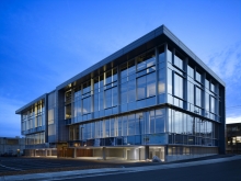
What are some of the challenges – and pathways to success – when it comes to designing commercial architecture?

Stuart Silk Architects, based in Seattle, Washington, has more than 25 years of experience producing residential and commercial architecture. We spoke with John Adams, AIA, Principal of Stuart Silk Architects, to learn more about the latest challenges associated with commercial design. Although commercial design certainly has its nuances, his firm has successfully bridged residential and commercial design with a simple and unified insight: the client is always passionately and personally invested.

Framing Out Openings

Written by

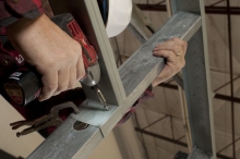
Contractor to Contractor: Follow professional interior contractor Robert Thimmes as he demonstrates how to frame-out openings. This third installment in a series of articles, Framing Walls With Light Gauge Metal Studs, visits the common practices for the framing of window and door openings.

When plumbing your openings and transferring your layout to the top track, turn your stud 90 degrees and attach your level high on the stud flange. Align the bottom edge of your stud with the edge of your opening, get the bubble "dead-on" and mark the top. Attaching your level to the flange rather than the webbing gives you a straighter surface that is less prone to bow, thus reducing variables and improving quality. Since one side of your opening has been plumbed, now just measure over the actual width of the opening and mark to establish the top of the other side.

BIM for Small Businesses: The Benefits to You

Written by

You’ve been reading about BIM. It’s being used by all of the big companies, and they’re talking about the benefits they’ve reaped.You know that BIM will be coming to your workplace soon, too, but how and from what direction? Are you just supposed to buy a software suite and hope for the best?

As it turns out, that’s an approach not even the product makers and suppliers would recommend. Building information modeling (BIM) is increasingly being described as a "disruptive" technology, even by its biggest promoters, for a reason.“Most people now understand that BIM is a process, not a product,” says Catherine Palmer, Sr. Industry Marketing Manager, AEC Solutions at Autodesk. “It’s a paradigm shift.” When asked how small to medium sized firms should handle the move to BIM, Jim Lynch, Vice President, Building Product Line Group at Autodesk recommends education as a first step. “Position yourself by beginning with the concept,” says Lynch, “Then embrace it.”

The Aqua Tower

Written by

The Aqua Tower in Chicago brings the fresh perspective of a young architect, Jeanne Gang of Studio Gang Architects, to bear upon century-old skyscraper design challenges.

The Aqua Tower, looming over 1.9 million square feet, is an 82-story mixed-use high-rise complex that includes 55,000 square feet with a hotel, apartments, condominiums, offices, and parking. This aesthetically pleasing Chicago skyscraper is the tallest building designed by a woman-owned architectural firm and the first skyscraper from Jeanne Gang, principal and founder of Studio Gang Architects (SGA), which is based in Chicago.

Timing Your Change Orders

Written by

Welcome to the On Site channel’s Construction Administration Column. What should you do if a contractor fails to ask for a change order in a timely manner? Here David A. Todd, P.E., CPESC, gives his opinion.

Columnist David A. Todd, P.E., CPESC, has 37 years of experience in the architecture, engineering, and construction (AEC) industry and has performed much construction administration during that time. He will answer questions from our readers or from his own practice and will provide answers based on his understanding of the construction process and administration of the construction contract. The focus will be on the customary duties of the owner, contractor, and design professional as typically described in the contract documents.